Colour Contrast 101 – why is it important for eye health?
When we refer to colour contrast, we mean the tone, brightness and amount of text, images and background on a webpage or website.
Essentially, it’s looking at how easy is it to read regarding the colours, the fonts, and the background colours and images.
These all impact our vision, and ultimately the health of our eyes.
The regulation that colour contrast falls under is WCAG 2.1, which is why you will see it mentioned plenty of times throughout this site. It’s an important proponent of website accessibility and on-screen eye care.
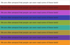
A quick look at this website and you will see numerous technical definitions used for colour contrast when creating webpages. There are plenty of numbers, codes and geek speak but also some excellent examples of poor colour contrast that make reading the text much harder.
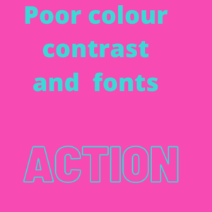
Above is an image we have put together to illustrate poor colour contrast and poor use of text. The word ‘action’ is in outline, and in that blue colour on that pink background, it’s hard to read and many of us will need to look away.
WCAG 2.1
The WCAG 2.1 regulations tackle contrast ratio, especially the luminance or brightness between colours.
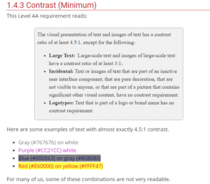
1.1 is white on white which means you can’t read it. But a ratio of 21.1 is black on white, and you certainly can read that – though you might be surprised that that can be damaging long term to the eyes.
4.5: 1 is the minimum colour contrast suggested in the latest regulations.
Font and outline also play a role as we showed in the example above, and this excellent video below, put together by the University of Southampton explains colour contrast and accessibility very well.
Is it a lifestyle thing?
Colour contrast if done well, will mitigate (reduce) the harm done to our eyes, a harm that is being done by stealth, and very much down to the way we live our lives.
We now spend on average 4866 hours a year using either a phone, tablet, tv or pc.
This means before they open their laptop/phone they are at a disadvantage when it comes to the digital world.
Plus, 6.3 million people in the UK suffer from dyslexia, with 1 in 6 people with a reading age of 11.
That’s a lot of people struggling to read.
difficulty reading
What do these stats, (which are real people with real lives) have to do with colour contrast?
Get the colour contrast right, and it mitigates the above issues, plus soothes irritated and tired eyes.
Colour contrast can help reduce the distortions of the printed word and can increase reading ease and speed, plus, as already mentioned it mitigates the harm done by looking at a screen all day, where the eyes are dealing with sharp colour contrasts, vertical and horizontal lines, flashing images and screen glare.
When did they discover colour contrast was a thing?
Colour ‘therapy’ for reading goes back to the late 1950s, but it was in the 1980s that Meares & Irlen, two Australian graduates discovered coloured overlays improved reading fluency.
“Scotopic theories” (meaning vision in low light setting) and coloured overlays were then picked up by a businessman called Peter Irons who unsuccessfully put forward his own theories called TintaVision, but thankfully this was then followed by Professor Arnold Wilkins from Sussex Uni, who in 2014 developed the more successful “Colorimeter”. His Colorimeter helped readers to subjectively find the right coloured tinted glasses.
tinted glasses to aid reading
Meanwhile, back in 2004, we had the first iteration of ScreenRisk’s colour contrast validation tool, the only objective Display Screen Optimiser. This was then improved upon and patented in the UK & US in 2016, as a novel, therapeutic treatment for eye-strain, myopic and asthenopic disease.
Asthenopia, (also known as eye strain) can be and is being induced by over-exposure to the near or close-up, (think phone in front of your face, working too many hours on screen), and/or exacerbated, ( made worse) by the standard poorly calibrated out of the box, display screen settings, i.e. back-lit bright white background or contrast to text display screens that haven’t been altered since the factory settings.
Why highlight the words subject and objective?
The objectivity of testing is vital. Colour contrast therapy works when it’s individualised. Objectivity means you don’t choose a colour you like – it means the software chooses a colour that works for you. One that will soothe your eyes, that will aid in reading and working on a screen.
You might not like the colour orange, but what if an orange tone is an optimal colour for you?
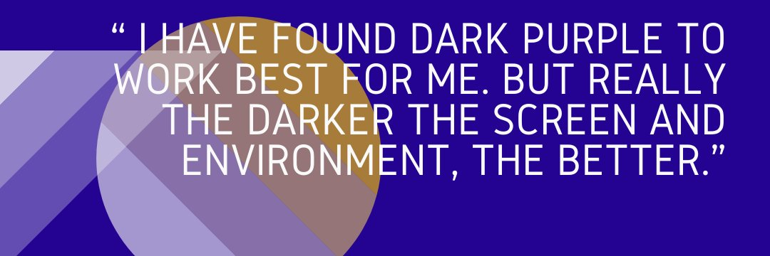
One of our beta testers had this to say about the optimal coloured background for him:
“ I have found dark purple to work best for me. But really the darker the screen and environment, the better.”
How does colour contrast therapy work?
Scientists are still looking into how coloured backgrounds and tints can help with reading, and there is still plenty of debate around it, but what they are finding is that it reduces the excitation to the brain.
The following excerpt is taken from our White Paper:
“Professor Wilkins gives the example of the word MUM, made up of vertical stripes. This sensory input can cause overexcitement in the visual cortex, causing cognitive and related visual discomfort which is measured by an increase in oxygen use. The body’s natural response is to turn away from this discomfort. High oxygen use is a sign of high energy expenditure, which can then lead to fatigue. However, when you are learning to read, or having to read, to turn away is nowadays seen as an inability to focus and concentrate, it is not seen as a natural physiological response. Coloured overlays dissipate excessive excitation and lower visual stress. This calms down the central nervous system, and increases ease of access to the text, and thereby reading speed, which is transformed from halting to fluent.”
ScreenRisk is all about mitigating the risk to our eyes – but the secret to it is to individualise the coloured background because we are all as unique as our faces.
If you look at the market today, there are apps to change the background colour of your screen, and they do a fine job, initially.
Google Chrome has an app called Screen Shader, made by Marc Guiselin. You might want to give this a try and see what you think.
But none of us are the same, our DNA shows us that, and what works for one person, might not for another – which may explain why colour contrast apps don’t work if not all of the colours are available.
Remember our guy above who needed the dark purple?
Many apps have a limited choice of 12 colours.
Just think how many colours and hues are missing from that?
A few questions to ask yourself…
Questions to ask yourself when surfing or working online regarding colour contrast.
Can you read the text?
Is the text over a picture and so obscured?
Is the colour too pale, too strong?
Does it make you screw up your eyes in order to focus?
Our colour contrast validation tool is specifically designed as a therapeutic intervention for early-onset eye-strain. It was initially created for the visually impaired, Neurodiverse and Dyslexics, but we are finding more and more are signing up for it due to our modern lifestyle of living life through our screens.
If you come away at the end of the day suffering from screen fatigue, a colour contrast validation challenge might not be a waste of your time, and it might just save your eyesight.
We use cookies to ensure that we give you the best experience on our website. If you continue to use this site we will assume that you are happy with it.
 Text
Text