minus font size Text reset font size Size plus font size


Background
 
 
HIDE BARS

What on earth does display screen optimisation have to do with colour therapy?

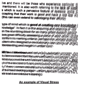
In a world where ever-increasing hours are spent on display screens of all shapes and sizes, it seemed odd that they all deliver text in black on a white background.

This is why we need to look at colour therapy.

Is it bottles of two-toned colours lined up on shelves in a holistic clinic?

Perhaps it’s interior design for institutions to modify behaviour?

It’s actually related to your health, and more specifically your eyesight.

The ancient Egyptians were using colour therapy back in 3100BC.  The Greeks built solariums for it, and practitioners of the Ayurveda medical system will be well versed in it.

Yet it is a relative newcomer to the west, (some say around 1916) and is still treated with a degree of scepticism.

However, by 1941 colour therapy was becoming more popular, and today, there is an active College of Syntonic Optometry that’s been operating since 1933, with researchers discovering over the last 100 years just how colour impacts your health.

Alongside this, doctors have been gaining more insight into the Autonomic Nervous System (ANS) and how an imbalance within it could be the cause of most diseases.

Together, they’ve discovered that colour can correct the imbalance. (That was where we started when we thought up the idea of display screen optimisation).

So, what is colour therapy, and what relevance does it have to your health?

Firstly, colour therapy is yet another methodology and proven science that underpins our work and the mechanisms behind the Display Screen Optimiser (DSO).

This post aims to explain why we urge you, via the DSO to use a background colour, that is unique to you when using Microsoft applications.

The academic name for colour therapy is syntonic phototherapy.

 Syntonics or optometric phototherapy is the branch of ocular science dealing with the application of selected light frequencies through the eyes.

It has been used clinically for over 70 years in the field of optometry with continued success in the treatment of visual dysfunctions, including strabismus (eye turns), amblyopia (lazy eye), focusing and convergence problems, learning disorders, and the after-effects of stress and trauma”.

By studying how the human body reacts and interacts with colour, we now know certain colours calm what can be an overexcited, or exhausted visual system.

Examples: green is considered restful, while blue is considered peaceful, and we can even detect these colours through our skin.

Note: (A fair part of the information shared in this post is taken from this article written by Raymond Gottlieb, O.D PhD.)

Gottlieb describes light as a healing agent.

Noncoherent, nonpolarized, non-narrowband light, is delivered into the eyes to treat visual dysfunctions, brain injury, headache, strabismus, eye pathology, learning disabilities and mood”.

As described by  the Optometrist network  website,
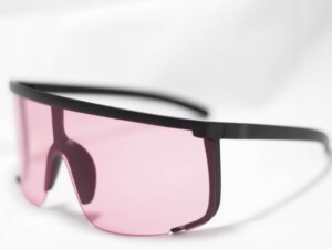
Coloured filter goggles are placed on the eyes for the duration of the light therapy treatment— usually up to 10 minutes (our note: some say it can be up to 20 minutes). The filter colour applied to the goggles is determined based on the presenting visual problem.

Why use the eyes if we can ‘see’ colour through our skin?

The eye is one area of the body where blood is directly exposed to daylight.

The light/colour therapy utilises this area to irradiate (as in to illuminate – shine a light), which in turn relaxes the blood vessel walls, increasing blood flow and reducing hypoxia (low oxygen).

Haemoglobin is similar to chlorophyll in structure, and both are reversibly altered by light”.

What appears to be happening is that the light, by reducing hypoxia, influences oxygen-carbon dioxide exchange, vasodilation, neurotransmission, oxidation, inflammation and other basic physiological functions.

Syntonics, Gottlieb believes, may work through the eye by optimising the above and our internal bodily rhythms.

He writes, “Multiple physiological rhythms are vital to the health and functioning of the organism.”  By rebalancing these, we restore health.

This post gives a very simplistic explanation of how colour therapy works.

Hand drawn image showing how light enters the brain and affects the body
Light and the brain and body

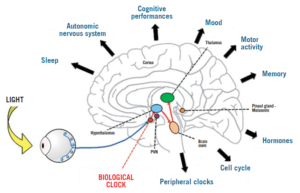
Image from: pointsdevue.com

In a nutshell: a specific-coloured light, shone in the eyes for a prescribed amount of time, calms the autonomic nervous system.

This rebalances bodily rhythms that are out of kilter, and therefore restores harmony to the body, which then positively affects health.

(Can you see now what we are doing with the DSO?)

Some of the benefits noted from syntonic phototherapy are:

Improved visual attention

Increased energy

better sleep and reduced eye strain.

Syntonic phototherapy is especially helpful with visual problems.

Myopia, treated in Russia, used low-intensity red and infrared light, for 6 minutes per eye on 10 consecutive days.

In a more recent study, involving 264 children aged 8 to 13 years, where the researchers concluded:

“Repeated low-level red-light therapy is a promising alternative treatment for myopia control in children with good user acceptability and no documented functional or structural damage”.

This leads us to Physics and vibrational frequencies, and the ‘how’ of colour therapy.

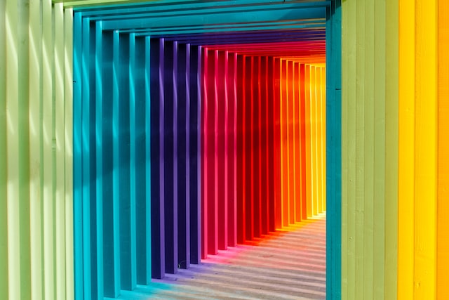
Colour is simply light of different wavelengths and frequencies.

It’s made from photons, and we see the visible spectrum made up of 7 colours.

Light through a prism

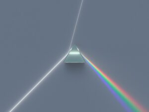
Image from byjus.com

Each colour has its own frequency and wavelength, measured in waves per second.  Counting the number of waves determines the frequency.

Vibrational frequency of colours
Chart showing the vibrational frequency of colours

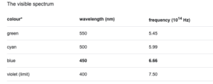
Image from: Britannica.com

You have probably heard the phrase everything is energy, and indeed we are energetic beings, that also emit vibrational frequencies.

“If you want to find the secrets of the universe, think in terms of energy, frequency and vibration”.

Nikola Tesla (1942)

A body out of balance affects the autonomic nervous system,  so affecting your “frequency “.

As the Scientific American magazine writes, “The Hippies Were Right: It’s All About Vibrations, Man!”

Therapists believe that colour frequencies and vibrations can harmonise and rebalance the frequencies and vibrations of the body.

Knowing and understanding the theory behind colour therapy,  we developed our unique software (DSO) that chooses, objectively, the optimal colour for your visual system when working on screen to balance it,  ensure it doesn’t become overexcited, exhausted and throw you off balance and into computer vision syndrome/screen fatigue.

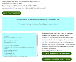
To find out your optimal and unique colour, take our reading challenge and then download your tailor-made theme.

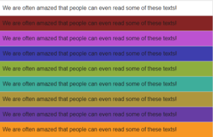
Every individual has their own optimal screen background colour which calms the visual system and helps to restore convergence, visual stability, and stereoscopic vision.

Resulting in greater comfort reading text on the screen.

9 FAQ’s re the effects screens have on your eyes.

Double vision after time on screen?  

To understand why this happens, we need to look at Binocular vision.

Binocular vision occurs when using two eyes with overlapping fields of view, allowing for good depth perception.

It allows us to see in 3D which is vital for coordination and hand-eye skills.

Depth perception is incredibly important (you wouldn’t be able to catch a ball without it), plus the fusing of two images gives us a wider view.  One eye can give us roughly a 130-degree field of vision. With two eyes, we can see 180 degrees.

However, digital display screens make the eyes work hard.

It’s like a gym session that lasts the entire time you are on screen.  This tires out the eye muscles that are involved with binocular vision, to the degree that the binocular vision stops working as well, hence the tired eyes and double vision.


Tired eyes after scrolling?

Let’s look a little more at those poor muscles we mentioned when describing binocular vision.  

 The eye muscles involved in reading and writing are called the extra-ocular muscles.

There are six extraocular muscles.


The contributions of the six extraocular muscles are to vertical and horizontal eye movements. Horizontal movements are mediated by the medial and lateral rectus muscles, while vertical movements are mediated by the superior and inferior rectus and the superior and inferior oblique muscle groups.


Every movement that your eye makes, be that looking up from keyboard to screen, looking from one side of the screen to the other, these muscles are responsible.

And, as we’ve already mentioned, looking at a screen for longer than you should, tires out these muscles, leading to screen fatigue – dry eyes, blurred vision, double vision ( as mentioned above), and headaches.

image of the extra ocular eye muscles
Eye muscles


Asthenopia. What does this word mean?

It means eye strain. It’s the medical name used in Ophthalmology to describe the fatigue or tiring of the eyes, usually characterized by discomfort, dimness of vision, and headache, caused by overuse of the visual organs, dysfunction of the ocular muscles, and incorrect refraction.

You will see it referred to a lot in articles about computer eye strain, and it involves those muscles we’ve just mentioned.


Is my bright screen damaging my eyes?

In a nutshell, yes.

From one of our blog posts:

“ (eyesight) is effectively disabled by “Glare”. Think of how you screw up your eyes and want to look away at bright headlights in the dark.

If there is also a flickering light which can trigger photophobic reactions, or very high contrast and/or very low contrast that causes discomfort,  this prompts visual stress with avoidance strategies such as looking away,  and natural “adaptations” due to eyestrain will appear.

They must, as your body is trying to defend itself. The warning signals of this will be loud and clear – pain, headaches, blurry or worse double vision, dizziness, migraine, even nausea and vomiting”.

We know more now since the pandemic started, but this quote is from TIME magazine in 2014.

Dunaief says. “There’s evidence that bright light can damage your retinas irreversibly. That might mean staring at a computer screen that is very bright could damage your eyes.” He says there’s also some experimental evidence indicating regular exposure to computer-strength light could be damaging in similar ways.

We firmly believe your digital display screen should come with a warning. 


Why do some colours hurt my eyes?

The human eye evolved in nature and is perfectly suited to looking at it and its natural colours. That we can apparently see over 4 million colours  ( some sites say over 7 million), is another interesting fact. But there are colours that  will make some of us look away in discomfort,

This post from social media is a case in point:

I don’t like bright or flashy colours. I just despise these colours with a strange passion. These colours hurt my eyes every time I look at them.

Pure lemon yellow is said to be the most fatiguing colour.

Why?

It’s all down to physics and the wavelengths of different colours and how your visual system interprets them.

Again, this is well known, as these two websites show.

 Worst colour combination for designers and this one,

 Eye pain pallet Please do NOT look at it if you know that bright, neon colours cause you visual pain/stress.


Can colours cause visual stress?

Yes, as we have seen in the snippet above. And we have an entire post about it and why it’s important to calibrate your screen, not only for brightness, glare and font size, ( all things that can cause visual fatigue/stress if not optimised for you), but glaring colours tire you out.


Best background colour to reduce eye strain?

For this, we need to look at colour contrast.

Colour contrast refers to the tone, brightness and amount of text, images and background on a webpage or website.

The simplest explanation of colour contrast is black text on a white background. If you have black text on a pale purple background, you still have colour contrast, but it is to a different ratio than black on white, and your visual system will react differently to it. Some will find it easier to read, others won’t.

And when it comes to colour contrast, you need to let your visual system decide this.

As we are all unique, your visual system is unique, and what works for you will not work for anyone else. Plus, a colour you may love, your visual system may not love it as much if it’s a background colour – for hours.

So, we suggest you find out using our Display Screen Optimiser and find the optimal coloured background for your Microsoft/Windows applications.

It takes just over 15 minutes, has a downloadable theme for Windows, and within the hour you can start to prevent your eyesight from being badly affected by your screen.


Exercises/hacks to prevent screen fatigue?

Most of us work with PCs, laptops etc, and despite the advice to not spend more than an hour or two per day looking at one, that’s not feasible in 2022.

 But there are things you can do to mitigate the harm.

The most well know is the 20-20-20 – and we advise this strongly.

The 20-20-20 involves looking away from your screen, at something 20 feet away, for 20 seconds.

There are also apps to remind you to take a break from your screen and we have a list of things you can do now, to help your eyes and prevent screen fatigue/computer vision syndrome/computer eye strain.


How far away should my screen be?

 This is interesting, as we have regulations about setting up your office space, the ergonomics of it and how to do it – refer to DSE Regulations 1992. But what about your eyesight? Well according to one post we found, it doesn’t matter how close you are to your screen visually, it matters more about how you feel, and how easily you can read/see the screen. And when you think about how close we are to our phone screens, they can sometimes almost be in our faces.

This means it’s going back to the symptoms we have described so far and taking a break from your screen to let your eyesight recover.


Why the Display Screen Optimiser is NOT a digital accessibility overlay

(And why it’s essential to understand what it is).

When you enter the world of vision, accessibility and colour, you often come across the word ‘overlay’, and indeed there are products called overlays.

Initially, you find they are coloured pieces of plastic or coloured glasses that people, generally with Dyslexia, use to help them read.

But then you start to enter the minefield of research, anecdotes, and ‘serious science’ (whatever that qualification means). You become acquainted with software companies that market accessibility overlays as a ‘quick fix’ for your website yet are often anything but.

And this makes our job just that bit tougher because the Display Screen Optimiser (DSO) is not an accessibility overlay, nor is it a sheet of plastic that you put over your PC screen, yet it is a piece of software.


So, to prevent any further confusion and uncertainty – let’s explore what the others are and how the DSO differs.

First up are the digital accessibility overlays.

They appear to have this name because they use a short bit of code like a plugin or a widget that is supposed to correct specific accessibility issues business or government websites may have.

It is supposed to ‘overlay’ the problem.

One definition of overlay is:

e.g. cover the surface of (something) with a coating.

“Their fingernails were overlaid with silver or gold.”

And it sounds great, doesn’t it? Add a plugin, and boom – your website passes all the accessibility guidelines and regulations.

Only as many have found, they can make the matter worse for some users.

Woman looking at her laptop, feeling stressed
When widgets make things worse


The most recent and high-profile case involved a company called Eyebobs.

To quote accessibleweb.com:

“Eyebobs, an online glasses company, was slapped with a lawsuit for failing to meet web accessibility requirements in January 2021.

In September 2021, ADP was sued by LightHouse for the Blind and Visually Impaired over persistent accessibility issues with ADP’s HR and payroll platform.

Both companies were using overlay products provided by one of the largest accessibility overlay companies on the market. Despite this, their websites were not still accessible for blind users.”


The companies in question provide a line of code that, according to nbcnews.com, interferes with many accessibility products.

They write:

“When they visit those sites, it can prevent screen readers — which read out loud what’s on websites, including image descriptions, menus and buttons — from reading the pages correctly and has rendered some websites they used to use unnavigable.”


Some accessibility overlays don’t allow for accessibility products already in use by some users, disabling them and doing the opposite of what has been advertised.

It’s a shame they’ve coined, taken, or have the term accessibility overlay.

As one of our colleagues stated, “Overlays aren’t functional unless they can be attributed to the user’s actual/matched needs. If they don’t, they are just fluffy attempts at pacifying the accessibility regulations”.

To truly make your website accessible, you need to get into its nuts and bolts, down to the coding and ideally work with a professional who understands what needs amending.


A plugin /widget super duper bit of blah won’t work, and they certainly won’t help with the WCAG compliance.

For example:

When we turn our gaze to the USA, where suing is as much a part of life as breathing – ADA claims regarding section 508 have gone up by 23% in 2020 alone

Section 508 is part of the US Rehabilitation Act, which requires US federal agencies to make their information and communications technology accessible to people with disabilities. Access must be in a “comparable manner to the access experienced by employees and members of the public without disabilities.”


Next, we look at the plastic overlays used by some people with Dyslexia.

Please note the word some – Dyslexia is a broad diagnosis, and as we are all individual human beings, a one size peg does not fit all.

And it’s here we need to look at visual stress.

Eyesite.co.uk describes visual stress as:

“Visual Stress is a perceptual processing condition that causes reading difficulties, headaches and visual problems from exposure to patterns in text, such as lines of text. Visual Stress is linked to Dyslexia and similar visual learning difficulties. Sufferers experience print distortion and fatigue when reading”.


Visual stress occurs when the visual cortex (an area at the back of the brain that is part of interpreting what the eyes see) is oversensitive to specific coloured wavelengths.

Using a plastic coloured overlay can help filter the problem wavelengths, making text clearer for the reader, and often reducing headaches at the same time.

The coloured overlays help the brain interpret what the eyes are seeing without the problem wavelengths interfering.

Some heavily invested in the Dyslexia world are suggesting that visual impairment may not be the cause of Dyslexia, and it may well not be, and as such coloured overlays do not help everyone,  yet there is no denying that coloured overlays have helped many people with visual stress and that are Dyslexic to improve their reading.

image of pink plastic overlay on text
Pink plastic overlay for assisting with reading image from Dyslexic.com


Below is a link to an excellent video showing what a person suffering from visual stress experiences.


Editor’s note:  Watching this video will give you a much better understanding of the profound role vision plays in our quality of life.

Messing with your binocular vision/brain’s perceptions of how things should be naturally, versus learned experience can produce some very uncomfortable symptoms.

So WARNING – watching this may cause nausea, you may need to look away, you may need to spend time away from the pc after you watch this, and if you have epilepsy – DO NOT WATCH:


https://youtu.be/olsLiMXjpEs


For those that have chosen not to, or cannot watch the video – the following image gives a glimpse of what it is like to experience visual stress.

Image of blurred text
Example of visual stress


Dyslexia appears to be a multi-faceted condition, there is much ongoing research, and as we learn more and more about it, then understandings and therapies ( including colour therapy) will, we hope, inevitably improve.

So, we have two mentions of the word overlay, meaning two very different things.

But back to visual stress.

According to crossbow education,


About 30% of the population are uncomfortable with black text on white backgrounds because their visual cortex is oversensitive to certain wavelengths


The WHO state that 2.2 billion people are visually impaired, but it has yet to recognise visual stress as a medical condition.

However, we would argue that doesn’t stop visual stress from being experienced by many people (ref: the video above) and documented.


Why talk about visual stress?

Because too much time on screen can cause, although in the main temporarily, visual stress.

This manifests as Screen Fatigue when the visual stress becomes a habitual act of self-harm.

And by self-harm, we are referring to the everyday habit/routine/work-related needs you have to keep looking at your digital display screen for over 8 hours a day.

It’s affecting your vision, but you keep rinsing and repeating.


The Display Screen Optimiser.

By understanding the increased visual stress that’s been placed on display screen equipment users, The DSO took the idea of the plastic coloured overlays used for reading on paper and brought it into the 21st Century to assist those with mild to more serious photophobia (eye discomfort in bright light).

The DSO colour contrast calibration is of the background contrast to text, it is not an ‘overlay’ tinting everything on-screen, or like an overlay for placing over the screen, or even tinted glasses the user may have.

DSO Finished in Viewer
Example of how the Display Screen Optimiser looks when installed


Reading text against a very high, or low contrast background can be challenging and stressful.

By developing a simple and quick risk assessment to determine the degree of deficit or impairment experienced by the user, the Display Screen Optimiser is an interactive, objective screen calibration application that not only improves accessibility to text, at the same time it mitigates the risk of early-onset eye strain, screen fatigue, computer vision syndrome, myopia (short-sightedness) and asthenopia (eye strain).


Reading and working online means a bright white lit background; screen glare (that may surprise you to know can cause discomfort and produces a natural avoidance strategy directly linked to the body’s survival response of fight, flight or freeze),

moving images, colour contrast that hurts the eyes and much more ‘visual noise’ that overexcites the poor visual cortex, all ultimately leading to fatigue.


(The fatigue occurs due to the natural visual adaptations as the body attempts to reduce the eyes strain by suppressing the vision in one eye or the other.)

The DSO is designed to provide visual comfort and accessibility for the individual screen user. Created with the Display Screen Equipment regulations in mind, it is a “personal custom reasonable adjustment” to the “ergonomics of the screen interface” for anyone on-screen for longer than an hour a day, which is the recommended maximum time spent on standard DSE settings found on public access machines.


It’s designed to mitigate the harms of repetitive visual stress that, in 2017, 58% of DSE users reported experiencing.


And that 58% will include 10 to 15 or even 20% classified as Dyslexic and functionally illiterate with a reading rate below 180wpm.

And here’s a not so fun fact:  Anyone with preexisting visual impairments is at a ‘4’ to ‘7’ fold increased risk of early-onset 3D vision stress when compared to those without, after only 20 minutes looking/working on screen.

 What Screen Risk has discovered (and is being thoroughly tested in clinical trials) is that by finding the objective colour contrast validation for you, as a living, breathing individual, the DSO reduces your visual stress.

The DSO is not a one size fits all, hence needing to complete a reading exercise, and it’s not a website band-aid plugin.

By focusing on the colour contrast validation, (that is finally coming more and more into website design awareness), the DSO can help users to decipher the foreground from the background, make visual sense of the on-screen environment and help the visual system to interpret what it’s seeing, be that lines of text or images. And it does this by finding the unique colour that helps calm and soothe your visual cortex.


This leads us to Screen Fatigue.

Screen Fatigue, also known as computer eye strain and computer vision syndrome, are manifestations of visual stress.

Whatever label you give it, by staring at a screen all day, you will inevitably experience it.

Screen Fatigue tires you out, which reduces your productivity and increases the risks of mistakes, and who wants to spend their lives with sore eyes, blurred vision and headaches?


In conclusion

Carrying on regardless of a repetitive stressor that causes discomfort or pain will simply result in the body adapting to cope and/or tolerate said stressor until it reaches the point of “adaptation exhaustion”.

This is when the body presents more serious incapacities/symptoms of one kind or another enforcing an escape from the stressor.

With Screen Fatigue and visual stress, you can no longer look at or work on a digital display screen. You become too fatigued, your vision is blurry, you have headaches, productivity drops, mistakes are made, and there you are, the embodiment of presenteeism.


The Display Screen Optimiser is software that’s designed for the individual’s screen. To mitigate the harms of what spending your life on screen can do to your visual system. And for one more added benefit for the coders and designers out there – it allows for images to be displayed naturally and design work to happen uninhibited


Scanning versus reading. Is there a difference?

(Yes, and why we prefer scanning over reading may surprise you.)

Scanning; we all do it, especially when scrolling through social media or skimming through a post. We visually bounce from word to word to understand the ‘gist’ of what’s being conveyed.

Scanning involves the internal recognition of letters and words, and it identifies patterns of text. So, it is not necessarily about comprehension (though that does happen).

It closely mimics a user’s natural reading speed for personal consumption, which is important to note. However, reading speed is reduced when the user is asked to read the entire text and then reduced further when reading aloud.

Reading aloud is a less fluid process, as vocalising words lags behind the brain predicting what’s next and modifying what’s being spoken as a result.

Looking ahead can cause incorrect predictions, leading to some stumbling over words, especially for slow readers.

Interestingly, “If you watch a person’s eyes scanning text at a normal rate, the eyes seem to be ahead of the voice when we read aloud.”

Diving deeper into the science of scanning:

Rayner and Pollatsek, two researchers from the Massachusetts Institute of Technology, spent 20 years studying how the eye moves when reading. They discovered that it fixates on what they call content words, e.g., nouns and verbs in a quick succession of stops and jumps called fixation and saccades

A saccade “is a rapid, conjugate eye movement that shifts the center of gaze from one part of the visual field to another. Saccades are used for orienting gaze towards an object of interest. Saccades may be horizontal, vertical, or oblique.”

Imotions.com describe the fixation as “Between saccades, our eyes remain still for around 200-300 ms – this known as a fixation (“still” is a bit of a relative term here – our eyes often continue to move around as a result of optokinetic nystagmus, which aids visual processing in the brain).”

image of text showing eye movement of scanning
Showing the eye focus when scanning

(Image from readingrockets.org )

Why do our eyes jump around like this?

Up-close we have a very narrow field of vision.

Try looking at both of someone’s eyes at the same time without flicking from one to the other. This narrow field makes us very sensitive to misalignment and being uncomfortable when wondering which of their eyes is looking at us.

Even when reading, our eyes move around to take in a larger view.

If you can scan quickly and easily, your eyes are not only seeing the text easily, but you are interpreting the text efficiently and with a degree of visual comfort. 

Reading, on the other hand, is comprehending the words.

If it’s silent reading, it can include creating visual images to help understand the words, and we can often ‘hear’ the word in our heads. So, for example, when you read a novel, you’ll imagine the characters in your mind; you might even imagine how their voices sound.

Reading, primarily when out loud, engages the brain and the vocal system and, to a degree, comprehension.

However, with reading out loud before reading silently, there is a difference in understanding, with a greater degree of comprehension gained from silent reading first.

Ok, so why are we telling you all this?  

When our software is choosing the individualised contrast colour background to text for your digital display screen, we are looking at set data to find the “one” most visually comfortable or accessible colour contrast for you.

One that aids in your scanning and reading.  

The correct colour contrast does this by helping sustain the synchronicity of both eyes, mitigating binocular discomfort and loss of stereoscopic vision due to eye muscle fatigue.

It’s a fatigue that presents as early-onset blurred or double vision.

Different coloured backgounds for the same texts
black text with different coloured backgrounds

Here’s (very simply) how it works:

There are two primary types of photoreceptors in the human retina – rods and cones.

Rods are responsible for vision at low light levels (scotopic vision). They do not mediate colour vision and have a low spatial acuity.

Rods don’t help with colour vision, which is why at night, we see everything in grayscale. The human eye has over 100 million rod cells. Cones require a lot more light and they are used to see colour.”

Cones are active at higher light levels (photopic vision), are capable of colour vision and are responsible for high spatial acuity.

The correct colour contrast background aids in your scanning and reading by engaging the colour “cones” in the eyes, as opposed to the monochrome rods.

It’s about your individual photopic sensitivity.  

Photopic sensitivity refers to visual sensitivity under conditions of bright light, where radiant energy stimulates the cones  – the retinal photoreceptors responsible for colour perception.

The cones, with their high acuity, are better placed to deal with text but are not invoked by black on white text.

Black text on a bright white computer screen only turns up the volume of any discomfort or fatigue.

Bringing in the colour contrast background brings the cones to the party and help you read and scan much more easily.

Now to your screens:

 The visual system (eyesight) is effectively disabled by “Glare”. Think of how you screw up your eyes and want to look away at bright headlights in the dark.

If there is also photophobic flickering light, or very high contrast and/or very low contrast that causes discomfort, prompting visual stress with avoidance strategies such as looking away, natural “adaptations” due to eyestrain will appear.

They must, as your body is trying to defend itself.

The warning signals of this will be loud and clear – pain, headaches, blurry or worse double vision, dizziness, migraine, even nausea and vomiting.

These signals should not be ignored.  

 Every individual and display screen for that matter is different, so it is simply a question of matching the screen colour contrast settings/calibration to the user operators most comfortable, expressed by RGB background screen colour values or HEX number.

By analysing the eye systems responses, we look for any evidence of eye muscle fatigue. We measure screen to brain sets of functions and timescales – namely the focus and refocus of the eye muscles and look at any deficits in speed when scanning.

We’ve found the simplest way to do this is to use a block of no-sense text. This prevents the individual’s natural capacity “for predicting what comes next”, to allow repeat scanning of the same subject matter without becoming familiar with its content.

“With the DSO scanning challenge, we are looking at specific data points, and we are looking at the speed of scanning, as this simply points towards gains in accessibility, comfort and ease”.

 The gains in accessibility to text on-screen, increase comprehensibility, increase the comfort within your visual system for longer and reduces the risk of early-onset eyestrain, mitigating vision system deterioration.

Until our brains are chipped to interface with our computers directly to the screen, users will still need to use their eyes to read.

Until that day, users contend with screen brightness, glare, colour contrasts, and moving images, all of which can overexcite the visual system and cause fatigue, which leads to all the symptoms of screen fatigue/computer vision syndrome.

We aim to calm the visual system more than aid in dyslexia/comprehension by bringing on board the cones to help the eyes to focus and refocus, not leaving the poor rods to do all the heavy lifting.

That it helps in these areas too is a bonus.

In optometry terms, we aim to increase binocular stability, as we all know looking at a screen for too long causes binocular instability, essentially visual fatigue.

(Anecdotally, we notice an average 20% gain in accessibility/reduction in eyestrain and risk of screen fatigue / CVS by using the DSO, which is being investigated further in our clinical trials.)

What about biometrics?

We currently use AI to drive the DSO, and soon we will be adding biometrics screening and voice recognition to next-generation packages of Score My Screen.

What’s missing from your screen?

Most of us will know about increasing the font size if needed.

A few might know about reducing the brightness on a standard, very high contrast white screen.

But how many of us are aware of addressing the user operator’s (as in you) “personal, custom and reasonable adjustments for accessibility”?

For example, the WCAG Website guidelines offer us and suggest Colour Contrast Validation.

But what does this mean in real life and in relation to your screen?

How does it affect you?


The WCAG describe it as reducing the discomfort of e-learning material or any material presented on-screen using colour contrast as a tool.

Colour contrast is essential, as poorly contrasting colours can cause us physical pain. This is why some people will screw up their eyes and even look away if they find a colour causes discomfort.

Plus, those with preexisting visual impairments, Neurodiverse and Dyslexic suffer a 4-to-7-fold increased risk of eyestrain and early onset binocular vision stress when using a screen, or “the near or close-up”, before they even get to thinking about colours.


So, add some colour contrast that’s painful for them, and there’s no way they will engage on screen.

This stark comparison has been found in as little as an average 20-minute task on any standard, unmitigated for best or optimal Colour Contrast Calibrated screen.

But it’s not just the WCAG that is mentioning this.

“Brightness and contrast” are mentioned in Working From Home Guidance along with fostering user operators to adjust “My Computer My Way”, but, interestingly, carefully avoiding the “why”.

It appears they are simply suggesting this small action is “Removing Visual Barriers” to digital exclusion in the workplace.

They are not looking at the possible long-term harms that an unadjusted computer screen can cause.


Screen fatigue is simply one consequence.

There are more.

Looking at the “chain of causation” (joining the dots), 30% of teenagers are still leaving education pre or post ’16’ to enter the UK adult population with reading rates of an 11-year-old. There is evidence that this is partly due to difficulty reading, and often when traced back, is due to early-onset binocular vision stress, caused by too much time on the near and close up and not being diagnosed early enough.

Take that to the next level: The economic cost of functional illiteracy is estimated to be not far short of a £1 bn.

The cost of presenteeism (20% lost productivity) is also in the billions, with 58% of DSE Operators experiencing CVS or Screen Fatigue.

Myopic and asthenopic (eye strain) disease is predicted/projected to affect 50% of the population by 2050.

Effectively we will all be one-eyed with the loss of 3D vision.

This all sounds more doom and gloom, yet the solutions are simple and easy.


What’s missing from your screen are the adjustments and additions that can mitigate visual stress and screen fatigue/computer vision syndrome.

Reduce visual stress by reducing the brightness, adjusting the screen, and correcting the colour contrast.

And yes, we can help with that.

Screen Fatigue, Computer Vision Syndrome or Computer Eye Strain. Do we have an invisible pandemic?


You can call it what you like; you can diagnose it as whatever you want – but it’s a vast, unacknowledged problem that’s only getting worse. 

Call it blurred or double vision – or call it by its medical name, AMBLYOPIA in children, and PRESBYOPIA in adults.


But it refers to the gradual loss of eye-muscle stamina to sustain “convergence and accommodation”, when focusing on the near indoors or close up on the screen. This could be in any indoor space, less than 20ft in size, with little natural daylight.

It could be at the office, or at home.

Reading and working in these conditions leave you with tired eyes, and generally fatigued as your eyes do their best to adapt.

The eye muscles become tired and then stop working as efficiently.

Some of us will experience stress-related vision suppression over time.  Others will wake up one morning effectively monocular, living in a 2D world without depth. This is because the image from one eye has been ‘re-directed’ somewhere else, leaving the other eye dominant.

The visual system and brain process that dominant “single image”, ignoring the other fainter double image.


Then there’s Astigmatism, the suppression of the vision from one eye, with or without visible lazy eye.

Strabismus; misalignment of the eyes or unstable alignment of one eye

Asthenopia; weakness, or debility, of the eyes or vision

The list goes on and on, and you can find out more @ WHO ICD-10

Call them by their generic or medical names, but all are mirrored in Computer Vision Syndrome, more commonly known as Screen Fatigue, tired eyes and/or eyestrain.

Screen Fatigue/Computer Vision Syndrome is the name given to a cluster of symptoms that arise from looking at a digital screen for prolonged periods.

The symptoms can include eye strain, dry eyes, headaches, overall tiredness with reduced productivity, blurred vision, and often includes other musculoskeletal disorders, e.g. a sore, stiff neck, from being unable to sustain an ergonomically comfortable posture while struggling to see clearly


Screen fatigue is also cognitive fatigue.

The visual system has to work harder processing uncomfortable, distorted, blurred or double images, demanding more blood-oxygen as fuel to the brain to support the additional processing demand.

The more ‘close up’ work you perform, the more oxygen is required, the more fatigued you become, and round and round it goes.

It’s a thoroughly unpleasant merry go round.

28% of the population are immune from eyestrain or vision stress. Still, the rest of us, the 72% are not, and so easily succumb to visual repetitive stress fatigue and/or stress-related adaptations.

We are at a four to seven-fold increased risk of earlier onset of associated adaptations when over-exposed in early life or later to the near indoors and/or close-up at our school desks and on-screen.

China and now Instagram are seeking to introduce Exposure Control Measures, either by cutting off access to the internet after a period or having pop-ups advising “Take a Break”.

Instagram is bringing this in due to political pressure. China, for the simple fact that they are noticing 80% of students are graduating with severe myopia.

Linked to the ‘take a break’ concept is the well-known occupational health advice of the 20-20-20 rule for DSE operators (look away from your screen every 20 minutes, at something 20 feet away and for 20 seconds) when working with standard, unmitigated, inaccessible display screens that have not had their contrast optimised for the user in education or the workplace.


Computer Vision Syndrome is serious.

For example, in 2007, 58% of Display Screen Equipment users suffered from vision issues related to their screens.

What’s the number now, as 2021 draws to a close?

But more importantly, what can be done about it?

Sure, we put the smartphone down, look away, and take a coffee break. We all know about not being ‘online an hour before bed’, and many of us know about getting out and moving about in natural daylight – but how many of us actually do this?

But unless we adjust the screens we are looking at, we go straight back to the problem. 

It then becomes a repetitive stress injury.


We need to adjust our screens because colour and light play a massive role in screen fatigue and cannot be left out of the conversation.

Researchers became aware of colours and sensitivity to light in the 1960s. As more and more has come become evident, we realise that every one of us experiences colour and light differently.


We use light; we don’t necessarily ‘see’ it. Instead, we interpret the waves of colours that surround us individually, as we interpret the speed at which they uniquely arrive in our visual system.

One person will see glare; another will not.

One person will find dark purple hurtful for their eyes; another will not.


Photosensitivity is an immune system reaction triggered by sunlight, which unsurprisingly

manifests in a high degree of visual discomfort and, for some, may trigger migraine, fits or convulsions, especially when presented with flickering lights/screens or strobe lights, or even sunlight flickering through trees beside the road, depending on the speed of travel.


Irlen Syndrome,  first described by Helen Irlen, is a sensory disorder of how the brain interprets bright white light, whether reflected off white paper or from an illuminated background to text on-screen.


Visual Illusions are often created by playing with light and dark or shadows to challenge our visual perceptions and constructs of the brain’s typical or expected responses. Experience of typical images can also leave impressions on the retina interpreted as changing colours.


We all experience these differently, to one degree or another.

But Helen Irlen spotted a connection between visual stress and visual stress relief.

 Through trial and error, she found that existing or early-onset eyestrain when reading could be relieved by selecting the best effective contrast other than a “high contrast white” background to text. The ‘normal’ white background with black text is painful for many.

Clashing contrasts of often unnatural (as in not found in nature) colours are uncomfortable and painful for many.

Hence her coloured overlays and coloured glasses for reading, aimed at reducing glare, and thereby reducing the discomfort experienced by the brain and visual system.

Other pioneers in colour therapy, including Arnold Wilkins, have sought similar methodologies for subjectively selecting the best contrast, thereby improving reading skills and abilities.

No one should experience vision stress, discomfort or painful headaches when reading.


But this is where ScreenRisk has joined the dots but flipped the script.

We don’t do the things we are supposed to do for our health, and in 2021 our lives are run through our screens, and those screens are damaging our eyes and causing us stress.

Understanding that many visual issues are replicated in screen fatigue and understanding that we are all unique in interpreting light and colour means we need an individualised response.

Knowing that stress affects the eyesight and all parts of our body and that digital screens that we are now addicted to cause cognitive fatigue – we created the DSO.

A tool that considers all of the above and chooses the best-coloured background objectively for your eyesight and visual system, providing you with that coloured theme for your screen.

Objectively choosing means your body, not your personal colour preference, selects the optimal colour that soothes your visual system. Reducing all of the above stresses also means that you are not repeatedly self-harming when working/studying online.


The induced near or close-up indoor eyestrain and 3D vision stress, created and exacerbated by hours on-screen, where no reasonable adjustments have been made, can be mitigated.

 It’s simply a question of joining the dots as to what’s going on and then creating an app to make the eyes and visual system as comfortable as possible.


Twitter – helping or harming your eyesight?

Twitter is like marmite – you either love it or hate it. But no matter where your personal opinions are,  Twitter has over 300 million active users a month, and last year (2020), it generated over $3.7 billion in revenue.

That’s a lot of eyeballs generating a lot of money.

So let’s look at the eyeballs and how twitter’s accessibility policy made the headlines during the summer.

In August 2021, and with much fanfare, Twitter announced accessibility changes to their platform with the idea that it would make Twitter more accessible.

Accessibility is the capacity for everybody to have access to something, regardless of any conditions they might have.”

They created their own font – cheesily called Chirp.

They also created higher contrast between text and background colours and reduced visual clutter.

These don’t sound much; they were welcomed by many and have provided a cleaner reading experience for some.

But if you have visual issues, these new changes prove challenging and highlight that websites can cause physical harm.

As Sheri Byrne-Haber wrote in her article for UXDesign.

  1. Animation and multimedia flashing can trigger epileptic seizures. Pseudoflashing (black and white optical illusions) that don’t actually move but appear to be moving can do the same. Someone who seizes might fall, which can cause a skull fracture. This is literally the only WCAG guideline where failing to follow it can result in someone’s death.
  2. Font changes and certain contrast can trigger eyestrain and headaches.
  3. Certain types of motion, such as parallax and optical illusions, can make some people motion sick. 

So what are the problems?

Twitter’s new font is said by many to be squished up, making it harder to read.

The stark contrast of black against white, instead of blue against white, is causing migraines in some users, and too much white space can be jarring on the eyes, again triggering pain.

Interestingly, this is not the first time Twitter has made attempts at accessibility.

In 2019, Twitter installed a new colour contrast button for high contrast – so only suitable for those with low and poor vision.

You can find it in settings.

Twitter
Twitter colour contrast control

And it’s the colour contrast issues that we are concerned with and are highlighting because the colour contrast on Twitter has been changed for you – with no option to reduce it.

As the Verge stated: Accessibility isn’t one size fits all.

We describe in one of our blogs how colour contrast refers to the “tone, brightness and amount of text, images and background on a web page or website. So essentially, it’s looking at how easy is it to read regarding the colours, the fonts, and the background colours and images.

It’s important because:

“Colour contrast can help reduce the distortions of the printed word and can increase reading ease and speed.”

But as we know all too well here at ScreenRisk, colour contrast is very personal. What works well for one person will have others running out the door – as Twitter found out.

Looking through the media regarding the Twitter story, Verywell health online website wrote the following:

“While having high contrast between font and text can make it easier for people with low vision to read, some users with photosensitivity (including those who get migraines or tension headaches) have said that Twitter has made the contrast on the site so high that it’s triggering their symptoms.”

“They’ve effectively just transferred the issues with colour contrast to a new group of users, rather than resolving them,” Jessica James, an accessibility consultant at Erudite Agency, tells Verywell.

With revenue in the billions and over 300 million users a month,

Twitter has grown from a relatively small platform in 2010 with around 50 million users a month to where it is now. Their users will be diverse in many ways, which begs the question,  how did they get it so wrong? 

There are a couple of possibilities.

1) They are unaware of the level of users that have visual stress and disabilities.

In 2020, approximately 2.28 million individuals in the United Kingdom were classified as having moderate-severe vision loss, with around 171 thousand Brits registered blind.

6.3 million people in the UK have Dyslexia, and those stats are from 2017. Research shows that dyslexic people tend to read faster when presented with lower-contrast text.

8.5 million people in the UK have visions issues.

How many are using Twitter? Do Twitter even know?

2) They didn’t engage with or listen to the people that it would affect.

In  June 2020, journalist Devin Coldway wrote an article highlighting that Twitter didn’t have a dedicated disability/accessibility team.

In it, he quoted a team member that said, “volunteers behind accessibility at Twitter” were “frustrated and disappointed” at the lack of consideration for people with disabilities, prompting astonishment that there is no dedicated team. He clarified that they are paid employees (not outright volunteers) but that “the work we do is notionally on top of our regular roles.” So the work he and everyone else has done has essentially been in their spare time.”

This article may have shamed the company into doing something because, in September of 2020, Twitter shared a blog post titled  Making Twitter more Accessible. They announced the creation of two new teams and highlighted their accessibility account @TwitterA11y.

 Twitter is not all bad.

According to one website – “Twitter far exceeds the minimum contrast standards set by the Web Content Accessibility Guidelines (WCAG), which provides recommendations for making websites accessible to disabled people”.

And they are making changes to the latest tweaking of colour contrast after customer feedback was so vocal.

Twitter image
Twitter reply to users

WCAG or Web Content Accessibility Guidelines are a set of guidelines seen as the benchmark for website accessibility. They look at improving access to websites for those with visual issues, who are deaf or hard of hearing and those with learning disabilities.

WCAG 2.1 regulations were designed to look at contrast ratio, especially the luminance or brightness between colours, and help those suffering from visual, auditory, physical, speech, cognitive, language, learning, and neurological disabilities access web content more readily.

(We have an entire page dedicated to digital accessibility where we explain the guidelines and  regulations) 

 To those campaigning for website accessibility, WCAG covers the basics, and they are merely guidelines.

The only companies that must follow them are governments and healthcare agencies,

However, for a virtual, private, or high street business, being WCAG compliant is not a necessity.

 Twitter doesn’t have to follow any of them, that they do is testimony to them.

But what this entire situation has highlighted is that accessibility is not one size fits all, that we are all diverse, unique and have our own struggles, and one of the tech giants could, if they so choose, make huge strides with accessibility on their platform.

The question is – will they?

What can I do when ‘don’t do as I do, do as I say’ is dismissed by my children, as clearly, I’m spending as long on screen as they are?

Hmm, good question.

Years before covid arrived on our shores, the WHO classified a global pandemic of a different kind.

One of Display screen users’ 3D vision loss.

A few years later, in 2018, regulations were released to help mitigate this 3D vision loss, in the guise of WCAG 2.1 Colour Contrast Validation Standard for e-learning & websites. (HSE RR5612007)

It was created to recognise the 2007 statistics of 58% of those using digital display screens in the workplace presenting with a range of visual and physical repetitive stress injuries, often referred to as MSD’S – Musculo-Skeletal Disorders.

In 2020, MSD’s which are conditions affecting muscles, nerves, tendons, joints, cartilage and spinal discs, often caused by repetitive stress injuries and adaptations, often caused by manual handling and Display Screen Equipment use – have persisted as the second highest cause of ill health’.

The number of children now presenting with 3D vision loss has skyrocketed and is linked to overexposure to the near and close up, prolonged periods of display screen use, coupled with lack of time outside in natural daylight.

So, it’s not without reason that wellness and health experts are screaming at you to put your phone down, your laptop away and “disconnect” and want you to do the same for your kids.

No one anticipated the 2020/21 pandemic and how that would increase screentime.

Yet here we are, and still today, no one in ‘power’ mentions the pandemic is increasingly disrupting children’s eyesight, in effect mirroring the visual repetitive stress injuries seen in the workplace.

We know the addiction to social media is endemic (it’s designed to be).  Netflix got many of us through lockdowns, and zoom was essential for family contact and work. But what if reducing screentime or exposure control is not an option?

We’ve all read the articles about reducing screen time for your children, but what do you do when life is lived online or through a screen, and you can’t reasonably reduce the amount of time online?

According to a recent study, the incidence of ocular problems has dramatically increased in line with the continuous rise in digital media consumption.

An estimated 49.8% (4.8 billion) and 9.8% (0.9 billion) of the global population will have myopia or high myopia.

Myopia is short-sightedness. But it’s more than simply wearing glasses because distant objects appear blurred. It’s also about distance and depth perception.

Which impacts the way we live our lives.

It’s not able to see loved ones faces at a distance. Driving becomes more challenging, and navigating life becomes more difficult and expensive due to eye checks every year.

But children were learning online before 2020, and with digital literacy programmes sponsored by Apple, computers have been steadily making their way into schools. Then, with the pandemic, online schooling became the norm.

Preschool? Screentime is there, too, with a third of preschool toddlers having their own tablet.

UK  children spend an average of 23 hours a week online or looking at a screen.

UK adults spend over 5 hours a day – and we don’t believe this solely refers to the time at work.

Digital display screens are here to stay, so we need to become savvy about mitigating the harms they do because exposure control alone, limiting time online, is challenging.

So, we won’t tell you to get your kids off their screens. Instead, we will give you the information to make informed decisions for yourself and your children.

The Eye Science of fatigue is similar to sleep fatigue in terms of triggering the HPA Axis of hormones directly linked to stimulating our stress responses.

This means it activates the survival fight, flight or freeze reactions to a real or perceived threat.

In adults, this activation can result in cyclical behaviour.

For example, knowing you can’t reduce the stressors/fatigue related irritability in the workplace, you go home in a mood, too often self-medicate, unwind while still over-stimulated by staying on-screen, and then can’t sleep—the cycle repeats.

Translate this behaviour to children, and they come home moody, slump in front of the pc, and stay up watching videos or playing video games, messaging friends, and can’t sleep.  The cycle repeats.

So how do you do best for your child, knowing they will be online for most of the working week and that it impacts their physical, mental and emotional health?

With less than a couple of weeks to go before it’s ‘back to school’, the first step is to be aware of the school environment and policies regarding screens.

Talk to the school – do they have a policy regarding phone use?
  • Is there one for the amount of online time allowed per session, per day?
  • Do they have enforced vision breaks every 20 minutes?
  • Are they aware of calibrating digital display screens to reduce vision stress and eye strain?
  • Do they know how to make reasonable adjustments – e.g. re-calibrate Screen Colour Contrast, increase the font size, avoid glare and/or ask for help to access accessibility features?
  • Ask too about their school accessibility policy and whether they actually have an Accessibility Statement. For example, do they have a policy of complying with Accessibility Regulations for e-learning and digital display screens? (Spoiler: it’s been over two years since introduced so they should be compliant).
  • Are they compliant with sufficient ambient lighting policies surrounding day and/or supplemental artificial work-lighting, and are the display screen positioned so free from glare?

The aim is to reduce the eye fatigue that leads to general fatigue and the cycle outlined above.

Kids use their phones in school, and they use PC’s – so teach them how to adjust the screen brightness to reduce glare. The glare from an overhead light or screen makes it much harder for our eyes to focus, which cause the eye muscles to become tired as they overwork – much like doing too many reps at the gym.

Laptops, again if it belongs to your child, adjust the screen performance – the brightness, font and text size to suit them, and of course, get them their own personal DSO themed background colour that reduces the colour contrast.

The DSO reduces fatigue and mitigates against the likes of screen fatigue, which will impact their learning.

We have an entire page dedicated to mitigating the risks of digital display screens, plus a post that outlines 14 quick and easy things you can do today.

Of course, reducing time online is essential; using the 20-20-20 rule of after 20 minutes look away for 20 seconds, at something 20 feet away is a must, perhaps you could pass this onto your kid’s school too?

Schools will have a lot o their plates in 2021,  the attainment gap is widening, and some now say children from more deprived areas are a good 22 months behind their more affluent peers. However, further damaging eyesight and increasing stress for children due to poorly calibrated screens don’t need to be part of the issue.

If you’ve reached this far, this video might be worth your time.  We are addicted to our smartphones; we miss out on human interaction when we’re online, and perhaps we can all benefit from turning off the devices now and then?

Ultimately, it’s the human interaction, interpersonal relationships in person or on-screen that is essential for children’s inclusion, growth, learning and development, not their smartphones.

Why your digital display screen should come with a safety warning.

The current understanding is that screen fatigue/computer vision syndrome is temporary. You give your eyes a rest, pop in a few drops, they recover, you carry on.

However, we know millions throughout the ages have ruined their eyesight due to what we call ‘working with the near and close up’, which can be interpreted as reading a book, writing, or working on a digital display screen, hour after hour, day after day.

Dante, the Italian poet, writer and philosopher, who lived from 1256 to 1321 suffered from Myopia (short-sightedness), which he put down to working with the near and close up.

Probably in a dark room lit by candlelight.

Well, too much brightness we believe can do the same damage, and we are also of the opinion that screen fatigue will have an accumulative effect, much like the near and close up work, and could result in worsening eyesight.

(We have a White Paper all about this )

We firmly believe that digital display screens should come with a product warning for your eyesight.

A quick Google search for safety requirements for digital screens comes back, rather interestingly, with a list of articles about digital signage… with titles such as – How can digital signage improve Health and Safety in the workplace?

Not what we were looking for.

So, another search term and another try, and we hit the Health and Safety blurb, this time about laptops and as they have digital screens, we took a look.

And yes, here we go –Unison, a UK Union have created documentation for safe laptop use:

They found:

  • 89% of those who suffered headaches also suffered eyestrain
  • 81% of those who suffered back pain also suffered eyestrain
  • 80% of those who suffered back pain also suffered headaches
  • 79% of those who suffered back pain also suffered neck pain
  • 69% of those who suffered back pain also suffered pain in arms and hands.

Working with a digital display screen is not too healthy it would seem.

The hazards are discussed, there is advice against theft and violence, plenty about work-related stress, with a  checklist.  Tucked in there is this:

“Are users provided with eye tests and glasses where needed? This is important because of working directives: The law says employers must arrange an eye test for display screen equipment (DSE) users if they ask for one and provide glasses if an employee needs them only for DSE use.”

A tacit admission that DSE work is hard on the eyes?

The Health and Safety Executive UK  state :

DSE work does not cause permanent damage to the eyes. But long spells of DSE work can lead to:

  • tired eyes
  • discomfort
  • temporary short-sightedness
  • headaches

Yet we know overworking muscles can lead to long term and persistent damage. RSI of the wrists/carpal tunnel syndrome is a case in point.

We can find nothing about adjusting the laptop for the individuals eyes apart from the odd blog post. And this is something that drives us a little bit insane, because it is one of the easiest and efficient things to do when it comes to eye care, and everyone should know that they need to do it.

We suggest this is actually a safety issue.

Product safety “is the ability of a product to be safe for intended use, as determined when evaluated against a set of established rules.

“The legislation sets out clear test and documentary requirements that manufacturers and distributors placing equipment on the European market, must follow to demonstrate that their products meet defined safety criteria and are safe for the intended use. “

How does this relate to the laptop/digital display screen user?

If you use a digital device and you are NOT made aware of the possible harms that could arise from long term use, this will become a problem for you, your employer and the manufacturer. But the onus will probably land on you.

Admittedly this is a grey area.  In the USA where suing is the ‘thing,’ there are now thousands of court cases against websites for not being accessible enough. Employees are taking employers to court for lack of care in this area because they are noticing the harms of working long hours with DSE.

Post-COVID digital eye strain is becoming a genuine issue.

Next stop – Microsoft and their product safety warnings online.

And  almost at the bottom of a very long page is this:

“Good binocular vision is required to view stereoscopic 3D content. Consider consulting an eye doctor if you are not able to view the 3D effect clearly and comfortably. HoloLens can be worn over most glasses and used with contact lenses. If you have a pre-existing vision disorder, please consult a doctor before using HoloLens. A small percentage of people have a pre-existing vision disorder that may be aggravated when using HoloLens.”

However, HoloLens are mixed reality smartglasses – so not screens then.

Nothing about computer vision syndrome/screen fatigue that we can find in the safety literature.

If you can find it, please do let us know, as we would be delighted to see it.  

We have found nothing in the safety requirements about adjusting the brightness of the screen, nothing about taking breaks, nothing about looking after your vision when working/using a digital display screen.

Should this advice be included?

Knowing what we know now, we believe very much that it should.

It should be one of the first things that you do when you get a new phone, tablet, laptop or PC. You go in and adjust the screen and settings to accommodate your eyesight because if you don’t, you could be open to harm.

Regulations set out to try and mitigate the harms of screen fatigue/computer vision syndrome, but how many know about them?

Compliance with WCAG, particularly ISO 30071.1 DSE Accessibility Regulations, Colour Contrast Validation & Calibration respectively, is required as a reasonable adjustment to prevent and/or mitigate to some degree, the highly predictable risk of Computer Vision Syndrome and/or Screen Fatigue, that results in “visual repetitive stress injuries” (WHO ICD-10), as a direct result of DSE operators under pressure to carry on regardless, which can and does result in presenteeism.

Our founder, Nigel Dupree has said, regarding this very issue:

“So, unless I am clearly deluded, this is a predictable and known “DSE Product Safety issue” and, expediently ignoring occupational health regulations and omitting to be compliant with enabling employees to make reasonable adjustments is negligence.”

There is little to nothing about eyesight care in the safety instructions that we can find. Plenty about overheating, locking it away and musculoskeletal issues – but hardly anything about eyesight.

Yet it is our eyes that do the majority of the work when using a digital display screen.

Here’s what you need to do:

Adjust the screen brightness.

Change the size of the font.

Modify the browser setting so that you can read websites with ease.

Use our colour contrast validation tool that optimises your screen and decreases the excitation in your brain, and thereby helps to restore good binocular vision.

We give a very detailed explanation about this in our White Paper – here’s a brief excerpt:

Binocular Vision disorders arise when the eyes target and focus on different places, the brain is then left to process or interpret conflicting images. If it is unable to fuse them together as a single stereoscopic image when faced with these two separate images, the brain compensates by suppressing one image, fully or partially. This is known as suppression or binocular rivalry driving monocular adaptation.

When reading, these issues present as word displacement, reversal of letters and words, shadowing in the spaces between words, or just alphabet soup.

Binocular vision(BV) disorder can be a condition present from birth but can also be caused by injury or trauma to the head, brain damage or stroke and is also well documented as being caused by headaches, anxiety, and other stressors.

Issues related to BV disorder, as with myopia, are amblyopia and strabismus: all are caused by muscle fatigue, an imbalance between eye muscles, or weakness and potential habitual eye-turns designed to reduce the stress of sustaining 3D vision.

Basically, our eyes are not meant to look at screens that are full of stripes, vertical and horizontal lines, harsh colour contrast and flashing images. These excite, possibly too much the areas of the brain to do with vision.

Research has shown that having an individualised colour contrast background soothes the excitation, is easier on the eyes and makes the entire experience of working with a digital screen more pleasant.  People find it easier to read and presenteeism is reduced or banished.

Taking the steps outlined above will reduce your risks of computer vision syndrome and will save your eyesight as time marches on.

We believe all digital display screens should arrive, as standard with a manual on how to mitigate the effects of computer vision syndrome and have an individual colour contrast option as standard.

Optimised Colours

Different coloured backgounds for the same texts

We are often amazed that people can even read some of these texts!

Find your optimal colour with the Display Screen Optimiser

Colour Contrast

Colour Contrast 101 – why is it important for eye health?

When we refer to colour contrast, we mean the tone, brightness and amount of text, images and background on a webpage or website.

Essentially, it’s looking at how easy is it to read regarding the colours, the fonts, and the background colours and images.

These all impact our vision, and ultimately the health of our eyes.

The regulation that colour contrast falls under is WCAG 2.1, which is why you will see it mentioned plenty of times throughout this site.  It’s an important proponent of website accessibility and on-screen eye care.

A quick look at this website and you will see numerous technical definitions used for colour contrast when creating webpages. There are plenty of numbers, codes and geek speak but also some excellent examples of poor colour contrast that make reading the text much harder.

Colour Contrast
Colour contrast checker

poor colour contrast

Above is an image we have put together to illustrate poor colour contrast and poor use of text. The word ‘action’ is in outline, and in that blue colour on that pink background, it’s hard to read and many of us will need to look away.

WCAG 2.1

The WCAG 2.1 regulations tackle contrast ratio, especially the luminance or brightness between colours.

1.1 is white on white which means you can’t read it. But a ratio of 21.1 is black on white, and you certainly can read that – though you might be surprised that that can be damaging long term to the eyes.

4.5: 1 is the minimum colour contrast suggested in the latest regulations.

Font and outline also play a role as we showed in the example above, and this excellent video below, put together by the University of Southampton explains colour contrast and accessibility very well.

Is it a lifestyle thing?

Colour contrast if done well, will mitigate (reduce) the harm done to our eyes,  a harm that is being done by stealth, and very much down to the way we live our lives.

We now spend on average 4866 hours a year using either a phone, tablet, tv or pc.

Divide that 365 and it’s around 13 hours a day.

But were you also aware that 1 in 12 men and 1 in 20 women have some degree of colour vision deficiency?

This means before they open their laptop/phone they are at a disadvantage when it comes to the digital world.

Plus, 6.3 million people in the UK suffer from dyslexia, with 1 in 6 people with a reading age of 11.

That’s a lot of people struggling to read.

difficulty reading
difficulty reading

What do these stats, (which are real people with real lives) have to do with colour contrast?

Get the colour contrast right, and it mitigates the above issues, plus soothes irritated and tired eyes.

Colour contrast can help reduce the distortions of the printed word and can increase reading ease and speed, plus, as already mentioned it mitigates the harm done by looking at a screen all day, where the eyes are dealing with sharp colour contrasts, vertical and horizontal lines, flashing images and screen glare.

When did they discover colour contrast was a thing?

Colour ‘therapy’ for reading goes back to the late 1950s, but it was in the 1980s that Meares & Irlen, two Australian graduates discovered coloured overlays improved reading fluency.

“Scotopic theories” (meaning vision in low light setting) and coloured overlays were then picked up by a businessman called Peter Irons who unsuccessfully put forward his own theories called TintaVision, but thankfully this was then followed by Professor Arnold Wilkins from Sussex Uni, who in 2014 developed the more successful “Colorimeter”. His Colorimeter helped readers to subjectively find the right coloured tinted glasses.

tinted glasses
tinted glasses to aid reading

Meanwhile, back in 2004, we had the first iteration of ScreenRisk’s colour contrast validation tool, the only objective Display Screen Optimiser. This was then improved upon and patented in the UK & US in 2016, as a novel, therapeutic treatment for eye-strain, myopic and asthenopic disease.

Asthenopia, (also known as eye strain) can be and is being induced by over-exposure to the near or close-up, (think phone in front of your face, working too many hours on screen), and/or exacerbated, ( made worse)  by the standard poorly calibrated out of the box, display screen settings, i.e. back-lit bright white background or contrast to text display screens that haven’t been altered since the factory settings.

Why highlight the words subject and objective?

The objectivity of testing is vital. Colour contrast therapy works when it’s individualised. Objectivity means you don’t choose a colour you like – it means the software chooses a colour that works for you. One that will soothe your eyes, that will aid in reading and working on a screen.

You might not like the colour orange, but what if an orange tone is an optimal colour for you?

One of our beta testers had this to say about the optimal coloured background for him:

“ I have found dark purple to work best for me. But really the darker the screen and environment, the better.”

How does colour contrast therapy work?

Scientists are still looking into how coloured backgrounds and tints can help with reading,  and there is still plenty of debate around it, but what they are finding is that it reduces the excitation to the brain.

The following excerpt is taken from our White Paper:

“Professor Wilkins gives the example of the word MUM, made up of vertical stripes. This sensory input can cause overexcitement in the visual cortex, causing cognitive and related visual discomfort which is measured by an increase in oxygen use. The body’s natural response is to turn away from this discomfort. High oxygen use is a sign of high energy expenditure, which can then lead to fatigue. However, when you are learning to read, or having to read, to turn away is nowadays seen as an inability to focus and concentrate, it is not seen as a natural physiological response. Coloured overlays dissipate excessive excitation and lower visual stress. This calms down the central nervous system, and increases ease of access to the text, and thereby reading speed, which is transformed from halting to fluent.

ScreenRisk is all about mitigating the risk to our eyes – but the secret to it is to individualise the coloured background because we are all as unique as our faces.

If you look at the market today, there are apps to change the background colour of your screen, and they do a fine job, initially.

Google Chrome has an app called Screen Shader, made by Marc Guiselin.  You might want to give this a try and see what you think.

But none of us are the same, our DNA shows us that, and what works for one person, might not for another – which may explain why colour contrast apps don’t work if not all of the colours are available.

Remember our guy above who needed the dark purple?

Many apps have a limited choice of 12 colours.

Just think how many colours and hues are missing from that?

A few questions to ask yourself…

Questions to ask yourself when surfing or working online regarding colour contrast.

    • Can you read the text?
    • Is the text over a picture and so obscured?
    • Is the colour too pale, too strong?
    • Does it make you screw up your eyes in order to focus?

Our colour contrast validation tool is specifically designed as a therapeutic intervention for early-onset eye-strain. It was initially created for the visually impaired, Neurodiverse and Dyslexics, but we are finding more and more are signing up for it due to our modern lifestyle of living life through our screens.

If you come away at the end of the day suffering from screen fatigue,   a colour contrast validation challenge might not be a waste of your time, and it might just save your eyesight.

You can sign up for it here, it will only take you about 15-20 minutes.

Do you know someone like Giselle?

Image for Giselle

She spent her early years in special schools simply because she wasn’t enabled to read.

She was labelled with so many acronyms it made your head spin.

Special Educational Needs, Learning Disability,  and Dyslexic. (ADHD, SEN, SpLD and more…).

Effectively excluded from learning yet her dream was to run her own business.

She started saving her pocket money, then her wages until she bought a business and within five years had paid off the mortgage and owned the building outright, plus the stock.

Giselle didn’t let her eyesight stop her, but think how much easier it would have been had she not seen text like a dollop of alphabet spaghetti?

One day she met Nigel who noticed her unstable binocular vision. He said, “I might be able to do something about that if you are up for it?”, and she said yes.

Giselle tried his Binocular Eye-Trace Kit and, sure enough after a few seconds her eyes were struggling to sustain “convergence and accommodation”, (making sense of the words) on-screen.

Her eyes were back-tracking and re-reading to make sense of the sample passage yet, when the screen background or “Colour Contrast” was customised for her, her reading rate went from 145 words per minute to a fluent 280 words per minute.

Needless to say, this was very emotional for her.

30% of children in the 21st Century are now at risk of eye-strain. You might be, if you notice at the end of the day your eyes are tired from staring at a screen.

If all children are to become functionally literate and fully participate in text-based life-long learning in the digital age, one that’s increasingly dependent on e-learning both during COVID-19 and post COVID-19, they need to have the right tools!

Colour contrast validation is one of those tools.

Find out more our Display Screen Optimiser and the charity work we do to help others that are dismissed as acronyms, where in reality, they simply needed better tools to help them read…