minus font size Text reset font size Size plus font size


Background
 
 
HIDE BARS

RISK THROUGH A NEW LENS – why do smart people do dumb things?

They (smart people) are no more or less likely to suffer the debilitating effects of carrying on regardless of the work/life balance, suffering presenteeism, effectively self-harming, and, at risk of self-medicating their way through the 21st Century with an addiction to display screen devices.

Too often they spend longer on-screen than asleep, and then wonder why they constantly feel fatigued………. Nigel Dupree 2022

Smart people are damaging their well-being via their screens.

Your digital display screen should be classified as a hazard, as long-term use causes dry eyes, blurred or double vision, headaches and fatigue, and many other symptoms and knock-on effects.

But you know this.

Yet…If you know this and are carrying on regardless, the question is, why?

Why are you, as a smart person behaving in a dumb way?

Risk assessment is a term used to describe the overall process or method where you:

  • Identify hazards and risk factors that have the potential to cause harm (hazard identification).
  • Analyse and evaluate the risk associated with that hazard (risk analysis and risk evaluation).
  • Determine appropriate ways to eliminate the hazard, or control the risk when the hazard cannot be eliminated (risk control).

Have you seriously risk assessed your screen? If not, why not?

You know in the back of your mind that doom scrolling is not good for you, you know when you need to step away from the screen as you start to feel tired, your eyes are sore etc, but do you?

We can risk a guess here and state probably not.

And one possible reason for not doing so is bias.

You could be suffering from bias regarding this issue, and it’s probably not your fault, and you’re not even aware of it.

Plus, you’ll be fighting the team of behavioural experts employed by social media giants to keep you on screen and scrolling, and they know all about bias – it’s their job.

A group or troupe of bias?

We all have a degree of confirmation bias – wanting others to approve of our choices.

Then we’ll have a smidgen of Groupthink – aligning with others.  Maybe a dash of anchoring bias where we are informed by things we see (advertising and everyone is always on their phone).

Status quo? Sure, keeping things as they are and not wanting to rock the boat, especially at work.

Then finally, Hindsight – we all can attest to that and realise things could have been different.

We want to prevent you from looking back thinking, well, I knew it was not good for me, I did know better, but I didn’t do anything.  

Going the wrong way
Don’t go the wrong way

Can we rely upon others to assess risk for us?

Yes, up to a point. We all depend upon HSE to ensure our work areas are safe, and we hope they are aware of their biases when assessing.

Yet still…

Occupational Health and well-being hazards and “predictable risks” are expediently omitted or worse, ignored. 

Why?

Is it Stress? Maybe. Lack of money, time, resources? Maybe. Or simply they don’t know? (Spoiler – they do but they are not implementing what they know.)

This leads us to the minefield of self-assessment.

Because if those paid and responsible for assessing risk are not implementing the regulations that will mitigate harm, we must do it ourselves to reduce our risk.

But this is where our bias is even worse, as we all love to think things are either way better or way worse than we imagined.

We need to self-assess our risks, and so it’s wiser to use an objective tool or tools as we can.

Let’s talk about assessing the risks regarding your digital display screen.

You need to assess them, and you also need to evaluate them for accessibility, whoever you are. Accessibility is not just for those we perceive as disabled; it’s for everyone.

Reading/working on a digital display screen is not optimal for humans. Recent research shows that it impairs your comprehension and alters your breathing – as reading on screen is more energy-intensive than reading on paper.

“The convenience of smartphones and other electronic devices is immeasurable, and I believe that much of what we do cannot be replaced by paper,” Honma said. “However, if both smartphones and paper can serve the same purpose, I would recommend paper.”

 So, you need to assess your screen to ensure it’s as optimal for you as possible – and we have an entire page of advice to help you do just that.

Our guide will help you find the correct settings for your pc; most of it is intuitive, e.g., brightness, font, text size, adjusting for glare etc.

But as we said, you need to account for your bias, and this is when you need to become objective and use tools to help you.

https://www.screenrisk.com/ss/scorescreen.php  will help with objectively assessing the accessibility of your screen.

From here, you can take the results your receive to HR/HSE ( or both)  – along with our reference guide of the rules and regulations that should be implemented.

Or you take matters into your own hands and look at what you can do to improve your experience of working on your screens.

This post describes some wonderful inventions that we can all use to ease the intensity of working with a screen all day, and this post will advise whether your screen could be damaging your eyesight or you simply need to get an eye test!

But there is still more you can do.  

 And this is where colour contrast enters the frame.

Our visual system can become overwhelmed by colour contrasts (think black/white, purple/yellow). Legislators are doing their best to encourage best practices for websites to reduce harm and increase accessibility.

Southampton University has created a short video explaining how to ensure the use of colour is both on brand and accessible.

Why look at colours?

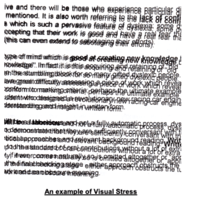
The wrong colour contrast (black text on a bright white background is poor colour contrast) causes fatigue of the visual system, which causes fatigue of the body, which leads to mistakes, which leads to presenteeism. Still, we carry on and on, essentially and unknowingly, self-harming.

Think about all the images you see on screen during the day – social media scrolling, work-related graphs, charts, whatever. It’s a lot – and your visual system, created for scanning the horizon and looking at your hands, must decipher and translate all that it sees on-screen to your brain.

It’s a lot of work and something we all take for granted – until you get tired, have sore eyes, headaches, and no longer sleep well and you, a smart person, are on a dumb hamster wheel.

Colour contrast is an issue – and now we are seeing the likes of Widows creating options to change the colour contrast in your browser, but it’s not perfect, still needs work, which is why people in the industry are discussing it and creating improvements where they can.

There are apps out there where you can choose a background-coloured theme for your pc, and they help – but here’s where you need to risk assess and be aware of your bias because you might not like the colour orange in any hue,  but what if an orange tone is an optimal colour for you?

The objectivity of testing is vital.

Colour contrast therapy works when it’s individualised. Objectivity means you don’t choose a colour you like – it means the software selects a colour that works for you. One that will soothe your eyes, and aid in reading and working on a screen – basically one that helps your visual system do all the heavy lifting.

Here are a few tools regarding colour contrast:

One will objectively choose the optimal coloured background for your visual system, the second to assist with accessibility issues.

  • Patented Display Screen Optimiser, providing a personal, objective assessment of the best background colour contrast values for you. It’s a self-administered, interactive, online test and takes 15 minutes to complete.
  • The Bureau of Internet Accessibility is more web design-related. They state: “The tool is offered free of charge and is intended for website owners and developers to test their web pages for colour contrast issues that can impede usability for people with visual disabilities.”

Risk assessing our environment, especially our work environment is something that HSE ad HR should be doing, but when you realise that only 10% of businesses are implementing Display Screen Equipment regulations, hot desking is a real thing, and many are now working from home – it is down to us to risk assess for ourselves.

 If you don’t want to join the ranks of the 58% (pre-Covid) DSE operators that already suffer from screen fatigue, then you must act and do something about it.

You need to get on your own white horse because currently, there’s no cavalry from HSE insight.

Display Screen Equipment Regulations. Quick-Reference Guide

 If you take anything away from this quick reference guide – let it be these words:

                                  “So far as reasonably practicable.”

Have them etched in your mind because this is what is being asked of you.

DSE regulations have a “reasonably practicable” regulatory solution for most visual repetitive stress injuries.

The evolution

Evolution
evolution from ape to pc ( image from dreamstime.com)

The regulations for Display Screen Equipment have been evolving for decades.

 As you read through this document, you’ll see how they’ve evolved to encompass all aspects of working with DSE, from the chair to the mental health of the operative.

1974

black and white image of digital devices in 1974
Digital Devices in 1974

They began back in 1974 with the Health & Safety at Work Act legislation still current to this day.

The aim of the Health and Safety at Work Act is so that we all know and understand what health and safety measures are needed in our workplaces, where we can find the information for them, and that they have been implemented so far as is reasonably practicable.’

This phrase is not a get out of free jail card – this is a – you need to look and see what needs implementing, and do it as far as is reasonably practicable.

Please note we have provided examples of checklists for each regulation where possible.  

Example of 1974 Health and Safety checklist>>>  https://www.londonofficespace.com/healthsafetychecklist.html

1992 

Personal Digital Assistant 1992
PDA 1992
  • Starting in earnest in 1992 as the digital age begins to take off –

We have The Health and Safety (Display Screen Equipment) Regulations 1992

This regulation is the benchmark for evaluating the workplace for any health and safety risks for display screen users – BUT – as this was the start of the digital age, they didn’t focus too much on the screen – it was more about the office environment and the ergonomics.

The emphasis was on assessing and evaluating the workplace.

The main points are:

  • Analysis and requirement of workstation

·      Daily work routine – a bit Shakespearian in writing, but here’s a sample – 4.  Every employer shall so plan the activities of users at work in his undertaking that their daily work on display screen equipment is periodically interrupted by such breaks or changes of activity as reduce their workload at that equipment.

·      If you work with DSE, you are entitled to regular eye tests and equipment needed to ensure your vision is cared for.

·      The checklist for this regulation >>> https://www.hse.gov.uk/pubns/ck1.htm

1998 

The imac 1998
iMac computer 1998

Six years later and new realisations are emerging. Tech is becoming better; digital is more and more in our daily lives, the office chair and desk are regulated – so now we have the

1998 PUWER Act ( created initially in 1992, updated in 1998, with minor updates in 2021 to reflect that the UK is no longer part of the EU)

These regs move from the workplace environment – office desk and chair etc. to the equipment – asking the questions:

>>>>>>>>> is it suitable, how is it used, and have they been trained? <<<<<<<<<<

From the regulations themselves:

“The use of work equipment is also very widely interpreted and ‘…means any activity involving work equipment and includes starting, stopping, programming, setting, transporting, repairing, modifying, maintaining, servicing and cleaning”.

The 1998 PUWER requires risks to people’s health and safety from equipment they use at work to be prevented or controlled. … safe for use, maintained in a safe condition; “used only by people who have received adequate information, instruction, and training”.

This act is trying to prevent injuries and mishaps.

A brief overview:

  • Selection and conformity of work equipment
  • Maintenance and inspection of work equipment.
  • Training and competence.

An example of a PUWER checklist >>> https://datascope.io/en/template/manufacturing/work-equipment-assessment-puwer?id=167581

2007

digital tech in 2007
iPhone 2007

Nine years later, we are into the new millennium, and being faithful tech people, we are looking at DATA, and the impacts that working with DSE have on our bodies.

HSE RR561 2007 landmark Study  – Think: Presenteeism, carrying-on regardless of visual stress, MSD’s and repetitive physical stress injuries MSK’s/

The opening paragraph tells us most of what we need to know about this study:

A variety of ill ­health symptoms have been associated with work with Display Screen Equipment (DSE), including musculoskeletal disorders, mental stress, and visual fatigue.

The survey found high prevalences in DSE users of self­ reported symptoms, eg.

headaches (52%),

eye discomfort (58%), and

neck pain (47%);

other symptoms such as back (37%)

and shoulder (39%)  pain were also frequently reported.

>>>>>>. Most of those reporting symptoms did not take any time off work. <<<<<<<<<<

All symptoms were more common among respondents who had indications of stress, anxiety and/or depression.

It’s important to note that this is 15 years after the introduction of DSE regs in 1992, and they quite rightly point out:

“However, there are substantial uncertainties, not least over the extent to which the provisions of the legislation have been fully implemented, and it cannot be safely concluded that the legislation has had no effect.”

Has there been an update to this?

Not that we have been able to find, but then we have just been living through 2020/2021, so we are sure there will be an update due to screen fatigue and zoom fatigue now being endemic.

2016

tech in 2016
Digital technology in 2016

WHO ICD 10 Version 2016

Why would we include a list of eye problems in a regulatory quick reference guide?

Especially when this particular ICD-10 list of eye diseases is the basis for identifying the severity of illness in the USA and used by eye hospitals for billing purposes (depending on specific conditions covered by insurance or not).

We’ve included it as a pause, a time to reflect, and ask the question:

How long before this list is used in the UK? Particularly if a DSE operator recognises that their eyesight has deteriorated because their employer has not been implementing the DSE regs?

2017

Digital devices 2017

This year saw the release of a DSE  Safety Alert  as it was noted “ There is evidence of non-compliance in the area of Display Screen Equipment (DSE) assessment as required by current legislation. The purpose of this Safety Alert is to highlight the importance of ensuring all workstations are assessed.”

2018

2018 and tech is everywhere
Digital Life 2018

So, by now, we realise that sitting in a chair all day, staring at a screen, is not great for the body, mind or soul, there is a vast list of injuries used by the USA insurance companies, a safety alert has been raised by Health and Safety England, so we need to start looking at limits.

Not easy with working from home becoming more popular, but we become tired, and when fatigued, we make mistakes, which can be costly.

2018 ISO 45001 “Work Exposure Limits.”

ISO 45001 is the world’s international standard for occupational health and safety.

It was issued to protect employees and visitors from work-related accidents and diseases.

As a result, ISO 45001 is concerned with mitigating any factors that are harmful or that pose a danger to workers’ physical and/or mental wellbeing.

We’ve moved from assessing risks to doing our best to prevent them.

The main points from this regulation – taken  from the BSI website:

  • Increase organisational resilience through proactive risk prevention, innovation and continual improvement
  • Strengthening of legal and regulatory compliance whilst reducing business losses
  • Demonstrates brand responsibility by committing to safe, healthy and sustainable work
  • One global occupational health and safety system for all businesses of all sizes.

An example of the ISO 45001 checklist >>> https://www.qmsuk.com/iso-standards/iso-45001/iso-45001-audit-checklist

Also, in 2018 we have the arrival of WCAG 2.1

Web Content Accessibility Guidelines (WCAG) 2.1 covers a wide range of recommendations for making Web content more accessible.

The website states:

“Following these guidelines ensures content is more accessible to a wider range of people with disabilities, including accommodations for blindness and low vision, deafness and hearing loss, limited movement, speech disabilities, photosensitivity, and combinations of these, and some accommodation for learning disabilities and cognitive limitations.”

They also clearly state:

Following these guidelines will also often make Web content more usable to users in general.

Bullet points:

  • Ensuring non-text is available in text
  • Assistive technology
  • Human language

An example of the WCAG 2.1 checklist >>>>https://webaim.org/standards/wcag/checklist

2019 

Top mobile phones 2019
Mobile phone in 2019

Welcomes ISO 30071.1, which takes WCAG a step further, is the evolution of British Standard 8878 and focuses more on user experience and the more personalised approach, emphasising accessibility.

This ISO applies to all types of organisations. It applies to the breadth of ICT systems (Information and Communications Technology) within an organisation, including, but not limited to: information systems; intranet systems; websites; mobile and wearable applications; social media; and Internet of Things (IoT) systems.

Giving requirements and recommendations for organisations such as:

  • Ensuring accessibility is considered in their policies or strategy by creating an organisational ICT accessibility policy.
  • Embedding the consideration of accessibility decisions through the entire process of developing, procuring, installing, operating and maintaining ICT systems, and documenting these choices.
  • Communicating the ICT system’s accessibility decisions to its users at launch through creating and publishing its “Accessibility Statement”.

2021

Digital Devices 2021
Digital devices in charging dock ( image Esquire.com)

ISO 45003Finally, we arrive at the mental health aspects of DSE regulations.

Remember how the 2007 Data showed people carrying on regardless of illness, injury and poor mental health? Well, this set of regulations attempts to redress this.

Occupational health and safety management Psychological health and safety at work – Guidelines for managing psychosocial risks guide psychological health and safety risks within an occupational health and safety management system.

This ISO addresses the many areas that can impact a worker’s psychological health, including ineffective communication, excessive pressure ( our note: not taking a lunch break, poor lighting, working late – staring at a screen that has not been calibrated for the user – i.e. straight out of the box – for over 9 hours a day), poor leadership and organisational culture.

And here is where we want to take another pause and think more about Exposure Control.

We usually consider exposure control is required for chemicals or toxic substances. Still, here we are referring to exposure to visual health stressors – and yes – high on the list is the display screen, including the hours and hours we all spend looking at one – be that pc – phone or TV.

Overexposure to DSE presents as dry-eye syndrome and binocular visual disturbances (WHO ICD-10), debilitating myopic and asthenopic (eye stress) disease. This often presents as deficits in spatial awareness and blurred, or worse double vision, impairing learning and educational/work performance.

Tying this all together.

You should now see the evolution from thinking about the desk and the chair to the actual human experience working with DSE in the chair.

We know that the office environment needs to be optimal, and risks mitigated.

We know that frequent breaks are required, overexposure leads to physical and mental harm, and we know we need to take care of our most valuable asset – the employee.

And you can do that by personalising their DSE.

The DSO creates the optimal, personal coloured background for the DSE user, mitigating the harms of overexposure and the disease associated with that, reducing stress, and having them shows compliance with the DSE regulations in that reasonably practical way.

Looking after your employees’ wellbeing isn’t a chore; it’s a privilege, and if you do it well, everybody and the company flourishes.

Congratulations if you made it this far!

You probably now know more than most regarding DSE regulations

A brief note about colour contrast validation.

Poor colour contrast has a cascade effect that few people are aware of.

This is what happens:

  • The colour contrast affects your eyes.
  • Which affects the stamina of your visual systems and brain.
  • Which negatively affects your capacity to sustain concentration levels.
  • Which in turn, affects your levels of cognitive fatigue, efficiency and productivity.

Processing (understanding) visual information uses energy. For example, if you work harder to process visual information because certain colour combinations cause you pain or discomfort, you use up more energy, become fatigued and therefore less efficient and productive.

  • You are also prone to increased error rates and making simple mistakes.
  • Poor Colour contrast is also visually uncomfortable. It affects the eye-muscle stamina in sustaining binocular/stereoscopic vision close up, and can contribute to early-onset eye strain.

What is colour contrast?

The term refers to the tone, contrast colours, brightness of the background and amount of text and images on a webpage or website, (now regulated by WCAG).

The most basic colour contrast (out of the box setting), is black text on a bright white background. This is considered very high contrast and should be avoided.

But more and more, people are noticing that colours and colour contrast can either enhance or detract from our well-being due to the amount of visual stress it causes.

Bright colours can grab our attention, but they can also cause pain.

Finding the correct colour contrast can enhance access to text.

And if you are a DSE operator, you want your eyes to work well, you want to be alert, you want to avoid pain, and you want to be as productive as you can be.

If you are in HR, you want these for your staff.

This is why the DSO should be on your DSE

regulation and wellbeing checklist:

  • Does everyone know where the health and safety manuals are? ✅
  • Chair, pc and table and office lighting assessed? ✅
  • Necessary training has been given/undertaken? ✅
  • Have work exposure limits been set? ✅
  • PC has had personalised adjustments for the individual user? ✅
  • DSO installed on company computers? ✅
  • Employee is aware of psychological and wellbeing services? ✅

Download our DSE Regulations Reference Guide here

Colour contrast for visual stress and why it’s important to optimise it.

Poor colour contrast has a cascade effect that few people are aware of.

This is what happens:

  • The colour contrast affects your eyes.
  • Which affects the stamina of your visual systems and brain.
  • Which negatively affects your capacity to sustain concentration levels.
  • Which in turn, affects your levels of cognitive fatigue, efficiency and productivity.


Processing (understanding) visual information uses energy. For example, if you work harder to process visual information because certain colour combinations cause you pain or discomfort, you use up more energy, become fatigued and therefore less efficient and productive.

You are also prone to increased error rates and making simple mistakes.

Poor Colour contrast is also visually uncomfortable. It affects the eye-muscle stamina in sustaining binocular/stereoscopic vision close up, and can contribute to early-onset eye strain.


 What is colour contrast?

The term refers to the tone, contrast colours, brightness of the background and amount of text and images on a webpage or website, (now regulated by WCAG).

The most basic colour contrast (out of the box setting), is black text on a bright white background. This is considered very high contrast and should be avoided.

But more and more, people are noticing that colours and colour contrast can either enhance or detract from our well-being due to the amount of visual stress it causes.

Bright colours can grab our attention, but they can also cause pain.

Finding the correct colour contrast can enhance access to text.


We all have individual preferences for colour contrast, which is why some find dark mode soothing; others can’t stand it.

Computer screens started in dark mode, but due to more and more non-tech users, they migrated to white backgrounds to mimic paper.  However, over the last few years, dark themes have become more popular for several reasons, namely battery power, reducing visual stress and allowing information gathering at a glance – which is easier on a dark theme.


Reducing visual stress is extremely important, and more and more of us are learning about visual hygiene when using a digital display screen.

But here’s the kicker. If the colour contrast on your digital screen is not adjusted/optimised for you individually, it won’t matter how many 20 -20 -20 breaks you take because you’ll be re-exposing yourself to visual stress each time you sit down/look at the screen.

If the colour contrast on your screen means your visual system must work harder, it means you work harder, and it leaves you wide open to not only fatigue and low productivity but also repetitive stress injuries. Many are aware of WRULD’s (work related upper limb disorder), and MSD’s, musculoskeletal disorders, but our eyes can also suffer from repetitive strain injuries.


For example, how often are you experiencing the following?

Tired, dry eyes. Double vision, headaches, blurred vision, poor focus.

Visual stress


If you spend the now average of 8-9 hours a day, looking at a display screen, then chances are you are familiar with at least a few of these, and you will be experiencing them repetitively.

(You are entitled to beaks – take them! ISO 45001 explains work exposure limits. Nigel Dupree explains briefly on LinkedIn how employers are not adhering to this).


We believe your computer screen should come with a warning, and your company should be ensuring that your computer screen is reasonably adjusted to suit your needs, in compliance with UK accessibility regulations, 1995 DDA and the 2010 equality act.


But how do we know all this?

Because of the development of the workplace and how the pc has become the tool we all use.

If we also look at and understand vision therapy and accommodation therapy alongside this, we get more of an idea of how the digital display screen affects our eyesight.


Accommodative dysfunction is an eye-focusing problem resulting in blurred vision to either the up close and/or far away and is frequently found in children or adults who have extended near-work demand – such as the computer/laptop or mobile phone


Optometrists define “vision therapy as an attempt to develop or improve visual skills and abilities; improve visual comfort, ease, and efficiency; and change visual processing or interpretation of visual information.”


The regulations that have come into place have attempted to mitigate the visual stress placed on the user, but to date, they haven’t done anything to improve it apart from a nod at the distance your screen should be from your eyes.

It’s taken decades of work to join the dots as to why colour contrast is essential when it comes to your digital display screen, but it starts way back when flared trousers were making their debut!


  • Late 1970 and researchers noticed “Visual display units (VDUs) have been reported to cause such eye difficulties as eyestrain, visual discomfort, and visual fatigue.”


  • 1984, Helen Irlen set up her institute to help those with reading difficulties. She had discovered that colour could help improve reading rates by reducing visual distortions and coined the term Irlen Syndrome. “Irlen Syndrome is is a perceptual processing disorder. It is not an optical problem. It is a problem with the brain’s ability to process visual information.”

Remember –as a Danish gentleman has said – the eyes look, but the brain sees.


  • 1992 not everyone had a laptop or mobile phone, but there is a growing awareness that digital display screens need regulations –HSE 1992 DSE regulations are announced. These are more ergonomics based but are a start.


  • During the 1990s, Peter Irons brought out his TintaVision methodology for selecting coloured plastic overlays for reading, as did Professor Arnold Wilkins with his intuitive “Colorimeter” for prescribing tinted glasses for reading. They, like Irlen, had seen an improvement in reading and reading speed among those with visual stress once they used the best colour for themselves. (Note – there is still controversy over coloured backgrounds – but this is based on an argument regarding reading speed v comprehension.)


  • May 5, 1999: WCAG 1.0 is born. WCAG was created as it was evident that the internet and websites were not accessible for all. Those with disabilities, reading challenges, or even simply not raised with technology didn’t have access to which they were/are entitled.


  • 2004 Dupree Screen Optimiser (DSO) was created to help reduce visual stress, and Patent was applied for in 126 countries.


  • 2006/7 Researchers dive deeper.  1327 Display Screen Equipment users are studied.  50% of symptoms recorded affected the eyes. Eye discomfort was 9.5%. In addition, 60% suffered from eye fatigue with symptoms including pain, blurred vision and difficulty seeing.


  • HSE put together a paper looking at the injuries sustained by DSE operatives. Page 28 lists some research done from 1987 through to 2005, all showing the strain digital display screens place on the eyes. It states – (1) eye issues reported any discomfort – 70%; (2) smarting, gritty feeling, redness – 56% (3) sensitivity to light – 40%; (4) itching – 34% (5) moderate discomfort – 29% (6) teariness – 24% (7) dryness – 20%.”


  • 2008 – WCAG 2  is published, expanding on the 14 guidelines but placing them into four principles – perceivable, operable, understandable, robust and making the world wide web even more accessible.


  • With more technology now in schools, questions are arising about the efficacy of the 1992 DSE regs. Workplace Law’s Health and Safety Consultants – Kate Gardner and Renier Barnard are brave enough to debate this on YouTube, suggesting “Now that VDU equipment is used widely in schools, the workplace and for leisure, there needs to be a change in attitude and culture so that DSE is used effectively, healthily and sustainably, without causing long-term ill effects.”


  • 2014. Research regarding computer vision syndrome/screen fatigue is coming to the fore, most noticeable amongst students. “Among engineering students, the prevalence of CVS was found to be 81.9% (176/215), while among medical students, it was found to be 78.6% (158/201). In addition, a significantly higher proportion of engineering students, 40.9% (88/215), used computers for 4-6 h/day as compared to medical students 10% (20/201) (P < 0.001).”


  • 2014. Professor Wilkins, the inventor of the Colorimeter, gives a TED talk aptly titled Disturbing Vision. In his talk, he explains how our visual systems that developed in the natural world face problems and discomfort processing some patterns and images found in the modern world, especially black text on white backgrounds and flickering images.


  • 2014 The DSO  is upgraded to include online iteration.


Researchers now begin to look at the cumulative effects of poor lighting, glare, and computer vision syndrome/screen fatigue in the workplace, which now (2022), due to the pandemic, includes working from home on a device that’s not been adjusted since it came out of the box!


Both Screen Fatigue and Computer Vision Syndrome describe the same symptoms – those of: “eye strain, dry eyes, headaches, overall tiredness with reduced productivity, blurred vision, and often includes other musculoskeletal disorders, e.g. a sore, stiff neck, from being unable to sustain an ergonomically comfortable posture while struggling to see clearly“.


These symptoms are becoming more and more prevalent, though HSE states that they are short term only and resolve once you stop looking at a screen. 


  • 2015 We begin to understand more the effect that light has on the body – more specifically in the work environment. Eyes are designed to use light, not look at the light. Glare causes a physiological response in the body, and it’s not a good one.


  • 2016 The DSO is granted a patent in the UK


  • 2017 A safety alert is issued by the Health and Safety Executive due to: “evidence of non-compliance in the area of Display Screen Equipment (DSE) assessment as required by current legislation. The purpose of this Safety Alert is to highlight the importance of ensuring all workstations are assessed. B BACKGROUND: A variety of ill-health symptoms have been associated with work at DSE, including musculoskeletal disorders, mental stress, and visual fatigue.


  • We see the public health messaging of how damaging our addiction to our mobile phones can be, especially for the young.


  • 2018 – WCAG 2.1 – building on the guidelines published in 2008, and now includes mobile devices.


  • 2018 also sees a Chartered Institute of Building Services Engineers presentation discussing the history and changing opinions of daylight and myopia in school children. The presentation charts the ‘fashionable’ views of the time and how they have swung to and fro like a pendulum.


  • 2018 – UK Gov Accessibility Regs for Public Sector Bodies are published, though they appear to exclude secondary and Further Education, they do however include University Compliance.  These regulations were due for implementation in Sept 2020 but were missed due to covid. However, the website has been updated this year, and more guidelines have been published for mobile apps.


  • 2019 Jonathan Hassell from Hassell Inclusion plays an important role contributing to ISO 30071.1 following up on the work of  WCAG 2.1 to help designers and organisations build more inclusive software/systems.


  • Colour contrast is coming more and more to the fore, with excellent presentations describing the importance of colour contrast for branding and accessibility – they are not mutually exclusive.


  • ISO 45003 is the first global standard giving practical guidance on managing psychological health in the workplace. It guides psychosocial risk management as part of an occupational health and safety management system.


Bringing this all together.

We have a timeline showing us the harm that digital display screens can do to our visual systems and bodies. We have a timeline of the guidelines and regulations put into place to try and mitigate those harms.

We don’t have too many solutions that are implemented and enforced,  hence the alert put out in 2017.

Digital display screens damage our eyes – they tire us out and reduce our productivity. This is a given.

This is why the Display Screen Optimiser was created.

With vision therapy in mind, its inventor joined the dots before the rest of us and realised that by changing the background colour on your screen, you could mitigate some of these harms, reduce fatigue, calm the visual systems and maintain productivity levels.

In 2021/2022, life is spent online, through a screen, and it’s up to each one of us to protect our visual systems that interpret that life for us.


In his own words: The DSO produces an immediate response in terms of colour sensitivity providing stimulus enabling the visual system to converge on the subject synchronously, widening the field of vision, whole word recognition, and improving or reducing the stressors linked to fixation and saccades when reading.


Essentially it helps the reader/user to focus and reduces visual stress.


DSE Regulations

Are they “Fit for purpose?”