minus font size Text reset font size Size plus font size


Background
 
 
HIDE BARS

Colour contrast for visual stress and why it’s important to optimise it.

Poor colour contrast has a cascade effect that few people are aware of.

This is what happens:

  • The colour contrast affects your eyes.
  • Which affects the stamina of your visual systems and brain.
  • Which negatively affects your capacity to sustain concentration levels.
  • Which in turn, affects your levels of cognitive fatigue, efficiency and productivity.


Processing (understanding) visual information uses energy. For example, if you work harder to process visual information because certain colour combinations cause you pain or discomfort, you use up more energy, become fatigued and therefore less efficient and productive.

You are also prone to increased error rates and making simple mistakes.

Poor Colour contrast is also visually uncomfortable. It affects the eye-muscle stamina in sustaining binocular/stereoscopic vision close up, and can contribute to early-onset eye strain.


 What is colour contrast?

The term refers to the tone, contrast colours, brightness of the background and amount of text and images on a webpage or website, (now regulated by WCAG).

The most basic colour contrast (out of the box setting), is black text on a bright white background. This is considered very high contrast and should be avoided.

But more and more, people are noticing that colours and colour contrast can either enhance or detract from our well-being due to the amount of visual stress it causes.

Bright colours can grab our attention, but they can also cause pain.

Finding the correct colour contrast can enhance access to text.


We all have individual preferences for colour contrast, which is why some find dark mode soothing; others can’t stand it.

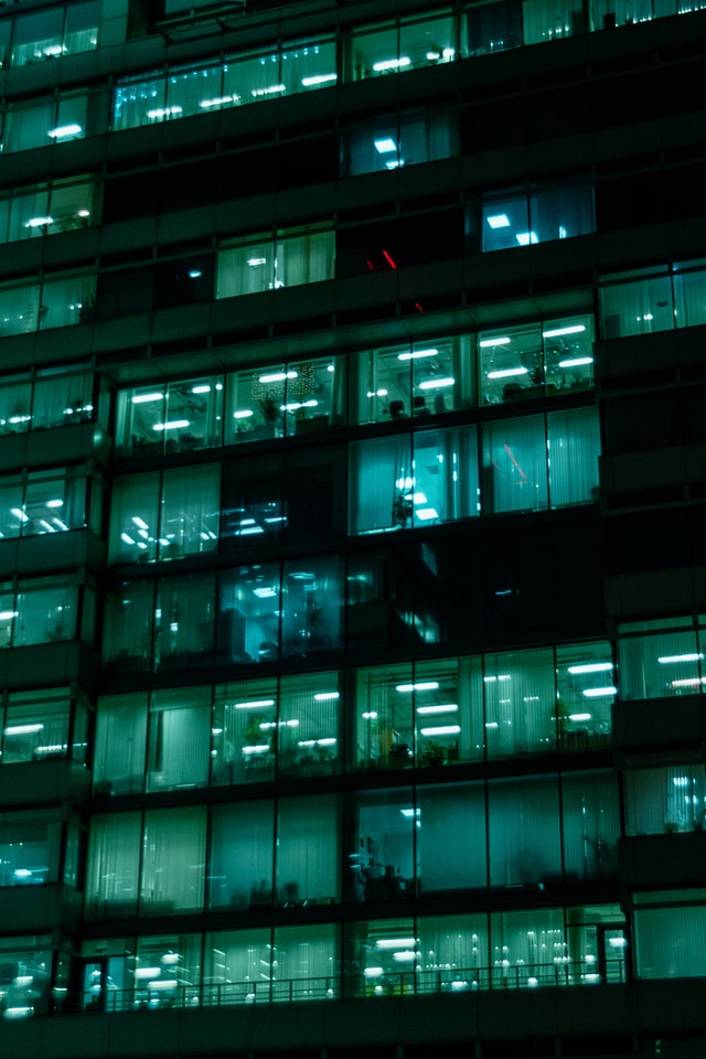
Computer screens started in dark mode, but due to more and more non-tech users, they migrated to white backgrounds to mimic paper.  However, over the last few years, dark themes have become more popular for several reasons, namely battery power, reducing visual stress and allowing information gathering at a glance – which is easier on a dark theme.


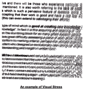
Reducing visual stress is extremely important, and more and more of us are learning about visual hygiene when using a digital display screen.

But here’s the kicker. If the colour contrast on your digital screen is not adjusted/optimised for you individually, it won’t matter how many 20 -20 -20 breaks you take because you’ll be re-exposing yourself to visual stress each time you sit down/look at the screen.

If the colour contrast on your screen means your visual system must work harder, it means you work harder, and it leaves you wide open to not only fatigue and low productivity but also repetitive stress injuries. Many are aware of WRULD’s (work related upper limb disorder), and MSD’s, musculoskeletal disorders, but our eyes can also suffer from repetitive strain injuries.


For example, how often are you experiencing the following?

Tired, dry eyes. Double vision, headaches, blurred vision, poor focus.

Visual stress


If you spend the now average of 8-9 hours a day, looking at a display screen, then chances are you are familiar with at least a few of these, and you will be experiencing them repetitively.

(You are entitled to beaks – take them! ISO 45001 explains work exposure limits. Nigel Dupree explains briefly on LinkedIn how employers are not adhering to this).


We believe your computer screen should come with a warning, and your company should be ensuring that your computer screen is reasonably adjusted to suit your needs, in compliance with UK accessibility regulations, 1995 DDA and the 2010 equality act.


But how do we know all this?

Because of the development of the workplace and how the pc has become the tool we all use.

If we also look at and understand vision therapy and accommodation therapy alongside this, we get more of an idea of how the digital display screen affects our eyesight.


Accommodative dysfunction is an eye-focusing problem resulting in blurred vision to either the up close and/or far away and is frequently found in children or adults who have extended near-work demand – such as the computer/laptop or mobile phone


Optometrists define “vision therapy as an attempt to develop or improve visual skills and abilities; improve visual comfort, ease, and efficiency; and change visual processing or interpretation of visual information.”


The regulations that have come into place have attempted to mitigate the visual stress placed on the user, but to date, they haven’t done anything to improve it apart from a nod at the distance your screen should be from your eyes.

It’s taken decades of work to join the dots as to why colour contrast is essential when it comes to your digital display screen, but it starts way back when flared trousers were making their debut!


  • Late 1970 and researchers noticed “Visual display units (VDUs) have been reported to cause such eye difficulties as eyestrain, visual discomfort, and visual fatigue.”


  • 1984, Helen Irlen set up her institute to help those with reading difficulties. She had discovered that colour could help improve reading rates by reducing visual distortions and coined the term Irlen Syndrome. “Irlen Syndrome is is a perceptual processing disorder. It is not an optical problem. It is a problem with the brain’s ability to process visual information.”

Remember –as a Danish gentleman has said – the eyes look, but the brain sees.


  • 1992 not everyone had a laptop or mobile phone, but there is a growing awareness that digital display screens need regulations –HSE 1992 DSE regulations are announced. These are more ergonomics based but are a start.


  • During the 1990s, Peter Irons brought out his TintaVision methodology for selecting coloured plastic overlays for reading, as did Professor Arnold Wilkins with his intuitive “Colorimeter” for prescribing tinted glasses for reading. They, like Irlen, had seen an improvement in reading and reading speed among those with visual stress once they used the best colour for themselves. (Note – there is still controversy over coloured backgrounds – but this is based on an argument regarding reading speed v comprehension.)


  • May 5, 1999: WCAG 1.0 is born. WCAG was created as it was evident that the internet and websites were not accessible for all. Those with disabilities, reading challenges, or even simply not raised with technology didn’t have access to which they were/are entitled.


  • 2004 Dupree Screen Optimiser (DSO) was created to help reduce visual stress, and Patent was applied for in 126 countries.


  • 2006/7 Researchers dive deeper.  1327 Display Screen Equipment users are studied.  50% of symptoms recorded affected the eyes. Eye discomfort was 9.5%. In addition, 60% suffered from eye fatigue with symptoms including pain, blurred vision and difficulty seeing.


  • HSE put together a paper looking at the injuries sustained by DSE operatives. Page 28 lists some research done from 1987 through to 2005, all showing the strain digital display screens place on the eyes. It states – (1) eye issues reported any discomfort – 70%; (2) smarting, gritty feeling, redness – 56% (3) sensitivity to light – 40%; (4) itching – 34% (5) moderate discomfort – 29% (6) teariness – 24% (7) dryness – 20%.”


  • 2008 – WCAG 2  is published, expanding on the 14 guidelines but placing them into four principles – perceivable, operable, understandable, robust and making the world wide web even more accessible.


  • With more technology now in schools, questions are arising about the efficacy of the 1992 DSE regs. Workplace Law’s Health and Safety Consultants – Kate Gardner and Renier Barnard are brave enough to debate this on YouTube, suggesting “Now that VDU equipment is used widely in schools, the workplace and for leisure, there needs to be a change in attitude and culture so that DSE is used effectively, healthily and sustainably, without causing long-term ill effects.”


  • 2014. Research regarding computer vision syndrome/screen fatigue is coming to the fore, most noticeable amongst students. “Among engineering students, the prevalence of CVS was found to be 81.9% (176/215), while among medical students, it was found to be 78.6% (158/201). In addition, a significantly higher proportion of engineering students, 40.9% (88/215), used computers for 4-6 h/day as compared to medical students 10% (20/201) (P < 0.001).”


  • 2014. Professor Wilkins, the inventor of the Colorimeter, gives a TED talk aptly titled Disturbing Vision. In his talk, he explains how our visual systems that developed in the natural world face problems and discomfort processing some patterns and images found in the modern world, especially black text on white backgrounds and flickering images.


  • 2014 The DSO  is upgraded to include online iteration.


Researchers now begin to look at the cumulative effects of poor lighting, glare, and computer vision syndrome/screen fatigue in the workplace, which now (2022), due to the pandemic, includes working from home on a device that’s not been adjusted since it came out of the box!


Both Screen Fatigue and Computer Vision Syndrome describe the same symptoms – those of: “eye strain, dry eyes, headaches, overall tiredness with reduced productivity, blurred vision, and often includes other musculoskeletal disorders, e.g. a sore, stiff neck, from being unable to sustain an ergonomically comfortable posture while struggling to see clearly“.


These symptoms are becoming more and more prevalent, though HSE states that they are short term only and resolve once you stop looking at a screen. 


  • 2015 We begin to understand more the effect that light has on the body – more specifically in the work environment. Eyes are designed to use light, not look at the light. Glare causes a physiological response in the body, and it’s not a good one.


  • 2016 The DSO is granted a patent in the UK


  • 2017 A safety alert is issued by the Health and Safety Executive due to: “evidence of non-compliance in the area of Display Screen Equipment (DSE) assessment as required by current legislation. The purpose of this Safety Alert is to highlight the importance of ensuring all workstations are assessed. B BACKGROUND: A variety of ill-health symptoms have been associated with work at DSE, including musculoskeletal disorders, mental stress, and visual fatigue.


  • We see the public health messaging of how damaging our addiction to our mobile phones can be, especially for the young.


  • 2018 – WCAG 2.1 – building on the guidelines published in 2008, and now includes mobile devices.


  • 2018 also sees a Chartered Institute of Building Services Engineers presentation discussing the history and changing opinions of daylight and myopia in school children. The presentation charts the ‘fashionable’ views of the time and how they have swung to and fro like a pendulum.


  • 2018 – UK Gov Accessibility Regs for Public Sector Bodies are published, though they appear to exclude secondary and Further Education, they do however include University Compliance.  These regulations were due for implementation in Sept 2020 but were missed due to covid. However, the website has been updated this year, and more guidelines have been published for mobile apps.


  • 2019 Jonathan Hassell from Hassell Inclusion plays an important role contributing to ISO 30071.1 following up on the work of  WCAG 2.1 to help designers and organisations build more inclusive software/systems.


  • Colour contrast is coming more and more to the fore, with excellent presentations describing the importance of colour contrast for branding and accessibility – they are not mutually exclusive.


  • ISO 45003 is the first global standard giving practical guidance on managing psychological health in the workplace. It guides psychosocial risk management as part of an occupational health and safety management system.


Bringing this all together.

We have a timeline showing us the harm that digital display screens can do to our visual systems and bodies. We have a timeline of the guidelines and regulations put into place to try and mitigate those harms.

We don’t have too many solutions that are implemented and enforced,  hence the alert put out in 2017.

Digital display screens damage our eyes – they tire us out and reduce our productivity. This is a given.

This is why the Display Screen Optimiser was created.

With vision therapy in mind, its inventor joined the dots before the rest of us and realised that by changing the background colour on your screen, you could mitigate some of these harms, reduce fatigue, calm the visual systems and maintain productivity levels.

In 2021/2022, life is spent online, through a screen, and it’s up to each one of us to protect our visual systems that interpret that life for us.


In his own words: The DSO produces an immediate response in terms of colour sensitivity providing stimulus enabling the visual system to converge on the subject synchronously, widening the field of vision, whole word recognition, and improving or reducing the stressors linked to fixation and saccades when reading.


Essentially it helps the reader/user to focus and reduces visual stress.


Is your office lighting losing you money?

Poor lighting, flickering lights, too bright, too dim, these all impact our well-being and the company bottom line.

But it’s a surprisingly easy thing to fix.

What is poor lighting?

When we think of poor lighting, we think of dimly lit rooms, even semi-darkness, but a space that’s too bright also qualifies as being poorly lit.

Throw unevenly distributed and or flickering lights into the mix, combine that with the flickering of digital display screens, and together they create a ‘doppler effect’, a well-known hazard in the workplace.

In 2012, Health and Safety International produced an in-depth article related to eye health in the workplace.

The report highlighted a list of factors, and the ability to see well at work depends not only on lighting but also on:

      • The time to focus on an object; fast-moving objects are hard to see
      • The size of an object; very small objects are hard to see
      • Brightness: too high or too low. Reflected light makes objects hard to see
      • Contrast between an object and its immediate background; too little contrast makes it hard to distinguish an object from the background
      • Insufficient light – not enough light for the need
      • Glare – too much light for the need
      • Suboptimal contrast
      • Unequal and poorly distributed light
      • Flicker Poor lighting can cause several problems, such as misjudging the position, shape or speed of an object can lead to accidents and injury
      • Poor lighting can affect the quality of work, particularly in a situation where precision is required, and overall productivity
      • Poor lighting can be a health hazard – too much or too little light strains eyes and may cause eye irritation and headaches

Optimizing the amount of natural light in an office significantly improves health and wellness among workers, leading to gains in productivity.”

Most papers refer to commercial productivity when looking into office lighting, which is understandable as we work to be productive.

But as we are a company concerned with eye health, we want to look a little closer at the effects lighting has on the eyes.

The studies that looked at ocular health found that poor lighting affects the degree of fatigue on the eyes and overall health.

Workers in office environments with optimized natural light reported an 84 per cent drop in symptoms of eyestrain, headaches, and blurred vision symptoms, which often result from prolonged computer and device use at work and can detract from productivity.


The impact of lighting has been documented for hundreds of years in educational establishments, but aren’t offices similar to classrooms? Shouldn’t the lighting be treated in the same way?

There you are in class, sitting in rows, at a desk. There you are in an office, sitting in cubicles, at a desk.  Each situation involves concentration and reading/writing; both probably have sub-optimal lighting.

But let’s first indulge in some lighting talk.

Fluorescent lighting and compact fluorescent light bulbs (an energy-saving version of the former) are familiar to many of us from school and work.

Both are known to cause vision stress, eye strain, dry eyes, double vision, headaches, poor concentration, and increased error rates.

This is due to their production of an artificial source of ultraviolet (not Blue) light known to cause cataracts and macular degeneration, which is why there is now a push towards LED lighting in addition to their energy-saving qualities.

Fluorescent lights may be an old and well-known technology, yet they contain mercury, age significantly when turned on and off (probably why offices leave them running all night – environmental impact anyone?), and are omnidirectional, so the light goes everywhere. Not always the best solution for your eyes.

On the other hand, LEDs have a long life span, are energy efficient, provide high light quality, can easily be directed, and have low maintenance. Plus, you can turn them off without worry if this will kill the bulbs.

The ‘temperature’ of the light is another factor. Warmer light with more of a yellow/orange hue is better for the evening, allowing us to relax and wind down. Office lights are generally ‘cooler’ to help keep us more focused.

Indeed, anglepoise lamp manufacturers are now jumping on the working from the home bandwagon, suggesting ‘warmer’ lighting alongside the daylight from a window, and why not? Lighting in the home office is just as important as the work office.

The window company Velux is now heavily involved in research. As they state on their website, they “are committed to taking a leading role within the building industry to create better environments for working, living and learning”.

Whether an office’s light source is natural, artificial, bright and blue, or dim and yellow, the type of light that employees are exposed to not only impacts mood, circadian rhythms, and physical health but also affects productivity and creativity

The political football

When looking at the lighting in schools, the focus tends to be on mood and concentration, academic performance, and alertness.

Eye strain is barely mentioned, with one website stating that reading in dim light merely tires the eyes but doesn’t cause lasting damage. However, Dr Richard Hobday, PhD, Engineer, and author of The Light Solution, is convinced that poor lighting in schools is triggering myopia, short-sightedness.

A hundred years ago, school designers knew poor lighting caused myopia. Still, in the 1960s, myopia was dismissed as a genetic or inherited condition and had nothing to do with illumination or close-up work.

Currently, myopia is attributed to too much indoor near or close up work, the school environment and lack of outdoor time. Also, in the digital age,  exacerbated by too many hours scrolling on the smartphone.

Hobday writes, “At the beginning of the last century, high levels of daylight in classrooms were one of several measures thought to prevent myopia, and some eye specialists campaigned for what they referred to as ‘ocular hygiene’ in schools. They stated that children had to learn how to see properly, without straining their eyes, if they were to preserve their eyesight.”

Indeed, a recent pilot study from China found that schoolchildren and teachers prefer brightly lit classrooms that reflect more natural daylight. Why mention China? Asia is currently experiencing a myopia rate of 80% in their children.

The solution

Humans have known for hundreds of years that levels of lighting are essential. We know poor lighting is not only responsible for deteriorating eyesight (yes, Granny was right!), but it’s also responsible for fatigue, low productivity, and a decline in wellness.

We receive 85% of our information through our sense of sight.

Therefore, we need optimal lighting in the office and at home. In addition, we need to mitigate the effects of poor lighting and staring at a screen all day.

Optimal lighting is 300-500 lumens.

Lumens (denoted by lm) measure the total amount of visible light (to the human eye) from a lamp or light source. The higher the lumen rating, the “brighter” the lamp will appear.

Whether working from home or in the office, we need lighting adjusted and moved to suit our needs.

Adjusting office lighting and installing systems and features to protect our eyesight will achieve two things.

  • Reduce the levels of visual stress and binocular eye strain.
  • Reduce levels of fatigue and improve levels of productivity.

To conclude: Reduce flickering lights, reduce flickering computer screens,  and invest in a reasonably adjustable LED lighting system. Follow the HSE guidelines and regulations for office workstations and invest in a DSO to prevent screen fatigue.

Much the same way you’d adjust to driving a new car.   The first ergonomic thing you do in a strange vehicle is to change your seat so you can reach the controls safely and make yourself comfortable to reduce stress.  Then you adjust mirrors and find out where the indicator and windshield wiper controls are.

Adjusting the lighting in the home/work office is just as important.

Do you have screen envy?

(And no, we are not talking artfully crafted zoom backgrounds or the latest, coolest green screen design, we are talking about something else, entirely.)

Years ago, I spent many hours training our outreach “Colour Therapy Practitioners” to administrate Digital Literacy Sessions.


This consisted of first popping the trainees on the binocular eye-trace kit, and using them(selves) as guinea pigs, they pretty quickly realised how much effort is required from their eyes / visual system to sustain, complete, or repeat the sequential, serial, fixations and saccades – essentially focussing and refocusing  –  necessary to read fluently.


It was experiential learning at its best.


Then, not only did I have converts in terms of the learned experience of what it feels like to have easier relatively stress-free access to text but, engaged learners for the remainder of the course who were far from indifferent to the outcomes and impact they potentially had on their clients.


That was in the early days, long before developing the technology and knowing how and/or who was competent and experienced enough to create an AI driven, online version, mirroring our practitioner lead administered Dupree ‘Display Screen Optimiser’ (DSO).


When I was contracted to work with a company, I was always surprised by the number of individuals participating who were convinced that they didn’t suffer vision stress or eye strain. They were adamant they were fine and were only taking part because well – take your pick, the boss said they had to, they wanted a cream bun and time away from the desk, safe from discovering anything new, or, they were open-minded, while still firmly believing they didn’t have a problem, and this really didn’t apply to them.


And it never failed to astonish me how many physically and emotionally reacted to finding their ‘optimal colour values’ as a more accessible and less stressful contrast to the text.

These were people that believed they had no issues working on a display screen, they believed any discomfort they were experiencing was part and parcel of work, and so had never taken steps to rectify them.  As far as they were concerned, any discomfort was normal for display screen equipment operators. They were unaware that they were self-harming.


This fact didn’t amaze me, it saddened me then, and still does to this day. This discomfort is often being dismissed as a temporary visual anomaly, and all will be well after a good night’s sleep.


So, you can imagine their surprise, as they took the test and went from not knowing how much stress they were actually under, to feeling their shoulders dropping and relaxing, their respiration and heart rates slowing, all coinciding with improved, measurable gains in accessibility or reading rate of the subject text on-screen, as we came closer and closer to their optimal colour.


This occurred so often, it soon became normal that post-session, over a cup of tea or as they were walking out the door, those involved would admit to not knowing how stressed they must have been and had experienced feeling butterflies in their stomach when we reached the optimal most visually comfortable colour value for them.


Their body knew before they did.


Even more surprising for them was that their optimal colour was often nowhere near their favourite colour. (Another reason why our DSO is objective.)


Then, of course, there were some adults who, at first presented as poor readers. Having discovered they could read fluently with the right colour contrast, they would then understandably become very angry and want to know why no one found this out when they were at school, convinced their life chances would have been significantly different had that been the case.


In this digital age,  which is now considered the ‘new normal’, we are so used to the conventions of dark text on a bright white background, flashing images and stark colour contrasts on websites that we naturally assume there must be something wrong with us.  If we find it visually uncomfortable, sustaining convergence and accommodation (focusing) while reading text on screen, why are we not asking is there something wrong with the screen?

This should be one of our first thoughts.


2021 is going to see an increase in digital use, in education and the workplace ( interesting that this Forbes article cites a safe workplace as the number 1 priority, and perhaps working from home should be included there?) But whatever the latest trends, online is very much here to stay, and this means you need to take care of your eyes.


Would you consider driving a new car or operating unfamiliar equipment without adapting it to your needs? Be those comfort, safety, or both. Yet nobody does this with out of the box display screen equipment, so they carry on regardless of any discomfort and then wonder why they are fatigued, depressed and have sore eyes at the end of the day.


Our eyes have not evolved to stare at unnatural screens all day.  They evolved for our survival in nature. For muted colours, soft lines, not harsh vertical or horizontal stripes but distant horizons and watching our hands work.


Out of the box digital devices need reasonable adjustments from the generic settings, and they need to be adjusted to you – you that is the unique individual reading this post.


You will have an optimally synchronous colour contrast that minimises vision stress for your eyes, that also reduces the associated risk of physical stress, related to the ergonomics of your working environment.


If you are curious about your optimal colour contrast, you can find it using the DSO – (we only charge £1 to help cover admin costs – and one doubts you could find a decent cuppa or java for that price.)


Due to the emotional and physical reactions I’ve observed, for our next stage of research and development, as a therapeutic tool, we are working toward including remote Biometrics Screening in combination with Binocular Eye-Tracking. At present, we are having to depend on body-worn sensors for biometrics but, we hope to achieve remote status in due course.

But here’s the ask from us and why we are only charging the price of a cheap coffee for a product that will change your life.

Your assistance with the collection of interactive anonymised data, will be highly appreciated as this data will not only be used in Proof of Concept, but will go toward getting a head start with “machine-learning”.

We won’t be selling your data to the highest bidder; we will be using it to help people read better on screen.

Would you agree to be the subject of screen envy?

 Would like to boast that your colour contrast background is unique to you, that it’s helping you mitigate the risks of screen fatigue/ computer eye strain/ computer vision syndrome (one wonders what they will call it next), and it’s helping your reading rate and giving you a wee boost in productivity – (around the 20% mark, which is not to be scoffed at).


Will you help us to help you, to help others?

 If it’s a yes –   Please try the DSO, then rate and share your personal experience of the DSO, that also cunningly complies with ISO 30071.1, DSE Colour Contrast Calibration –  optimising your screen ergonomics for accessibility and, mitigating the degree of risk linked to vision stress, eye-strain and visual repetitive stress injuries presenting in vision suppression, myopic or asthenopic adaptations.

We look forward to reading your reviews!