minus font size Text reset font size Size plus font size


Background
 
 
HIDE BARS

Presenteeism and Quiet Quitting. What’s the connection?

Presenteeism describes being at work but being unproductive due to stress, overwhelm and/or illness.

Harvard Business Review has estimated presenteeism costs the U.S. economy upwards of $150 billion a year

Quiet quitting is the ‘latest’ phrase to describe what many have done for decades – which is doing the bare minimum to get by.

And this too is costing the economy. opb.org in their article discussing quiet quitting write:

Gallup recently did a survey about quiet quitting, counting workers who report being neither engaged nor “actively disengaged” at work. They found that these quiet quitters make up at least half of the U.S. workforce.

 Presenteeism and quiet quitting are similar when you boil them down – someone is at work but doing the bare minimum. And that phrase, doing the bare minimum needs to be qualified for presenteeism:

This could be due to a fatigue-related impairment, or a downward spiral of functionality from mild to more serious levels of depression, hence the performance anxiety associated with presenteeism

Quiet quitting has taken off on social media, especially Tick Tok and there are many discussing what it is:

“We’re acting our wage”

“We have no hope of ever buying our own home – so why work hard for nothing?”

“We are working jobs that do not care about us as people”

 This Tik Tok is a great explanation of the quiet part – on both parts – the employee and employer, and suggests, as we will all know deep down, that it is up to the managers, including HR, to not only understand this trend but address it.

@managermethod #quietquitting #worktok #hrtiktok #pov #worklife #workstress #corporate #hrtok #whattosay ♬ original sound – Manager Method

Once the bean counters start to analyse quiet quitting, it will probably cause similar levels of costs as presenteeism.

Add to the above, there is also disagreement when it comes to working from home – where managers don’t believe their employees are productive:

What’s going on, and what do they both have in common?

 Unmet needs, unrealistic expectations, and the idea that the worker must go above and beyond, be more than, and not have any work-life balance to be, what?

A good cog in the wheel

To not be discarded.

In one instance the worker fears are being weaponised due to illness. No, you can’t take time out to be a human being as you must be a cog, and we will fire you if you do not fulfil the role of a cog.

On the other, they are there because they need the salary, they know they are replaceable and will find something else if needed.

Indifference and fear – two emotions that will harm not only the people experiencing them but also the business they’re employed in.

Living a life of fear and living an unfulfilled life at work.

Unmet needs and unrealistic expectations are the bottom lines here.

Unmet needs in the workplace, well, let’s face it, they are legion.

The office worker, employed from 9-5 (depending upon where you live), yet expected to routinely stay late, answer emails in the evening and to a degree, be on call over the weekend.

It’s as if the employee needs to behave like a business owner.

This is entirely unfair, yet it plays into the busy paradigm, of being a martyr for your work when you know your work will replace you within an unfeeling heartbeat.

So why should you care? Why should you go the extra mile just because Napoleon Hill says you should when it gains you nothing but pain? You miss out on the things that truly bring you joy.

So, business needs to start walking the talk and seeing their employees as just as valuable as the customer.

It needs to look after them.

Bonuses only work to a degree, as noted in peoplevalue.net

Businesses if they want to keep an employee, one that will go the extra mile, then it’s a quid pro quo that’s required.

And that starts with recognition for sure, but also ergonomics, wellbeing, and an environment where it’s conducive to be yourself so you can produce your best work, where you feel valued, seen and cared for.

This means investing in diversity, equality, and inclusion. Investing in accessibility, and wellbeing, and yes we are going to mention DSE regulations ( linked to our essential guide)  because there you have it business owners, a handbook that shows you the way.

Display screen regulations, all the way up to and including ISO 30071.1 give you the foundation for looking after your people that spend their days in an office and/or in front of a screen all day.

And it’s so simple.

It’s all about reasonable adjustment for the individual, the same way as when you get in a car and check the seat and mirrors are set in a way that’s perfect for you.

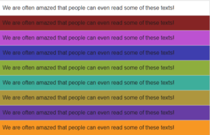
Display Screen Optimisation is a perfect example of this.  By ensuring safety and wellbeing when working with a display screen, making the reasonable adjustments as laid out in the regulations, including individualising the adjustments, so helping their performance and productivity.

To explain in more depth how our  Display Screen Optimiser (DSO)  aids wellbeing, we suggest you understand colour therapy that underpins the science behind the DSO tech and then dive further into how the Display Screen Optimiser software works.

The Display Screen Equipment regulations ask you to look at your employee as human, not a cog, so they stay your people, they want to stay your people, they give their best work and presenteeism and quiet quitting are totally absent and alien to them.

And our DSO can help you do just that.

Presenteeism and quiet quitting, are different, but the same.

What are you going to do about it?

Colour Contrast, reasonable adjustments and ISO 30071.1 (2019)

Working in perfect harmony to ensure your visual wellbeing. 

Reading about regulations is not everyone’s cup of tea

but they have been created for our benefit, and often expand and build on each other.

Display Screen Equipment (DSE) regulations do just that.

So why do we mention ISO 30071.1 when it doesn’t specifically mention colour contrast for screens?

Because this ISO brings accessibility to the regulations by looking at interface accessibility.

It can be seen as being the DSE companion to WCAG 2.1 Colour Contrast Validation for material designed to be presented on-screen

ISO standards are internationally agreed standards, created by experts in their field, and the ISO organisation suggests that you “think of them as a formula that describes the best way of doing something”.

In other words, they describe and encourage best practices.

ISO 30071.1 aims to prevent exclusion and is all about guiding and developing organizational accessibility policies within information and communication technology (ICT) systems and user interface accessibility.

But…

Let’s just take a quick detour and look at the word accessibility.  Does the word accessibility put you off?

Are you thinking – I don’t have any accessibility issues, so this doesn’t apply to me?

Well, it probably does, and here’s why.

Accessibility is the practice of making a website usable by as many people as possible. That could mean making something smartphone-friendly so you can access/read it on any device –iPhone or Android.

It could be making a web-based app accessible on all browsers with no glitches, usable on a Mac and pc, plus it also means helping those who do have accessibility issues – such as low vision.

ISO 300071.1 is there as a guide

and gives process-related guidance, in the form of activities and outcomes.  It is not technical guidance, and basically asks those involved to consider the needs of the user.

This ties in beautifully with the general theme of Display Screen Regulations (DSE), that of making personal and custom “reasonable adjustments”, to prevent or mitigate the risk of direct, and/or longer latency, and repetitive stress injuries.

DSE Regulations make life easier, more efficient and productive when using workplace equipment operated by an employee, including using a digital display screen.

With this ISO, we are going to focus from page 14 onwards – which is all about the personalized/individualised strategy.

“A user-personalized/individualised strategy adapts what is provided by the system to the identified accessibility needs of the individual user in respect of using that system in that context. A system might enable users to specify their accessibility preferences and then adapt its interactions or content automatically to suit those preferences. Alternatively, a similar level of adaptation to individual needs might be provided manually or with the provision of services or content generated for that user”

Throughout this post, we are going to relate this to an office worker, who sits at a desk, and inputs data to Excel spreadsheets.

Let’s call him Dave.

The system (company) has provided Dave with an out-of-the-box pc/laptop, that runs on Windows and uses Office 360.

The IT team have done nothing but unbox his PC, plug it in, ensure the company intranet is on there, Office 360 installed, plus the company cyber security log-ins.

What they don’t know is how well Dave and his visual system cope with a screen that’s way too bright for him, competing with the antiquated overhead fluorescent lighting and the glare from the office window.

No individualisation or personalisation at all.

Dave doesn’t have any accessibility issues that he’s aware of – but straight away his company have put him at a disadvantage, as they have not met his individual needs for his screen.

They haven’t set it up for his preferences.

e.g., does he prefer dark mode when working? Does that help his visual system?

Is the screen too bright and causing him eye strain?

Where are the reasonable adjustments, for him?

This leads us to the next part we would like to highlight

A.3 Support for individualization
The goal: A system supports individualization if its components, functions or operations can be tailored to meet the needs of individual users.

Implementing the goal: [according to ISO/IEC Guide 71:2014, 6.2.3.2] This goal recognizes that a single system design is seldom optimal in meeting the needs of every user and context of use and it can be important to provide users with choices in how to interact with a system. Individualization focuses on providing each user with means of obtaining the best possible solution for that user.

NOTE Individualization includes both the customization of a system for groups of users and the personalization of a system by/for an individual system.

So, Dave’s IT team have implemented a system (set up the PC with required software) but has failed to meet his needs as an employee who stares at a screen for up to 8 hours a day.

What choices have they given him to personalise his screen?

Have they told him how to adjust it?

Have they given him the options of blinds for the window, or a screen filter to reduce glare?

Are they aware of the choices of changing the font, and of colour contrast that affects his visual system?

We keep going

A.8 Usability
The goal: A system is usable if it supports diverse users in their diverse contexts to accomplish their tasks with effectiveness, efficiency and satisfaction.

Our interpretation of this is that we are all different, with different needs and requirements in order to accomplish tasks.

Makes sense.

And they need to apply this to Dave and ask the question – what will help him?

As

Daniel Burrus, Best Selling Author, Keynote Speaker and Strategic Business Consultant at Burrus Research, Inc wrote recently,

“Learning to adapt software with your human workforce is more vital in customer service and customer experience than nearly anywhere else in the workforce, all solely because customers are human beings with wants, needs, and issues needing resolution”.

Burrus writes about customer service, but we would argue this is true for all employees. Adapt the software for them.

And this is where we really come to the fore because the Display Screen Optimiser (DSO) ticks all the boxes we have discussed so far.

Personalisation, support and usability.

 The DSO helps you and your visual system to accomplish the goal of being able to use a digital display screen, using your Microsoft applications, in Windows, by finding the individualised, personal to you, colour contrast background, that helps prevent the screen from over fatiguing your eyesight.

It helps you to achieve your tasks with effectiveness, efficiency and satisfaction.

Basically, it mitigates the harms of computer eye strain/screen fatigue.

As we’ve said, it works presently with the Windows operating system (Mac IOS currently in development), which leads us beautifully to the next section we are highlighting, which is:

A.11 Compatibility with other systems
The goal: A system provides compatibility if it allows diverse users to use other systems as a means to interact with it to accomplish the task.

As we reach the end of ISO 30071.1, we come to some real-life examples

They mention the following:

It is important to take particular note of any platform or technology expectations, constraints and preferences of users with impairments in the system’s target audiences, and the impact on these in the various contexts of use in which the ICT system will be used.

EXAMPLE 1 Some office workers or school or university students could be constrained by using a “standard desktop” or organization-issued mobile device, which could dictate the operating system, browser, the preferences they can set in their browser, or the assistive technologies they can install.

EXAMPLE 2 Some people could be constrained in their choice of assistive technology by cost. For example, a blind person could have a costly screen reader provided for them at work, but only be able to afford a free screen reader at home.

And we have been using our data guy Dave to highlight how the DSO complies beautifully with all the DSE regulations, including ISO 30071.1

The DSO is the only colour contrast/ colour validation software that can say this. The others let you choose a preference, but they are not individualised to your visual system.

One size does not fit all.

Inclusive design strategies often need to be enhanced by user-personalized/individualized strategies. This is especially important when it becomes obvious that the difference between the needs of individuals or groups of users will prevent a “one size fits all” approach from giving an experience which works for all. It is often the case that the needs of one user conflict at a technical level with the needs of a different user and make it impossible for one system to meet such conflicting access needs without taking a personalisation/individualization approach.

Individualized user-personalized approaches allow users to be treated as individuals. When implementing user-personalized/individualized functionality, it is important not to inadvertently exclude users with combined disabilities.

As we have said many times, we regard users as individuals, though they may work for a group.

And finally…the ISO states

C.5 Personalization guidelines for individualized ICT system adaptability

Where an individualized approach to ICT accessibility is being used, it is important for the organization to ensure that:

  1. a)  individualization serves the needs of the users;
    NOTE 1 ISO 9241-129 provides guidance on the use of individualization to serve the needs of users.
  2. b)  at least one personalized version of the ICT system is accessible to each of the diverse users of the system.
  3. c)  the means of individualizing the ICT system are accessible.

So, there you have it – the DSO ticks all the boxes required, and one of the first things Dave did once the IT team had set up his PC was to adjust the brightness, sort out any glare issues and download his DSO theme colour, as Dave cares about his visual system and his health.

You too can be like Dave, (who wouldn’t want to be?) and look after your health and wellness, by finding your optimal colour contrast background colour by going to our registration page.

RISK THROUGH A NEW LENS – why do smart people do dumb things?

They (smart people) are no more or less likely to suffer the debilitating effects of carrying on regardless of the work/life balance, suffering presenteeism, effectively self-harming, and, at risk of self-medicating their way through the 21st Century with an addiction to display screen devices.

Too often they spend longer on-screen than asleep, and then wonder why they constantly feel fatigued………. Nigel Dupree 2022

Smart people are damaging their well-being via their screens.

Your digital display screen should be classified as a hazard, as long-term use causes dry eyes, blurred or double vision, headaches and fatigue, and many other symptoms and knock-on effects.

But you know this.

Yet…If you know this and are carrying on regardless, the question is, why?

Why are you, as a smart person behaving in a dumb way?

Risk assessment is a term used to describe the overall process or method where you:

  • Identify hazards and risk factors that have the potential to cause harm (hazard identification).
  • Analyse and evaluate the risk associated with that hazard (risk analysis and risk evaluation).
  • Determine appropriate ways to eliminate the hazard, or control the risk when the hazard cannot be eliminated (risk control).

Have you seriously risk assessed your screen? If not, why not?

You know in the back of your mind that doom scrolling is not good for you, you know when you need to step away from the screen as you start to feel tired, your eyes are sore etc, but do you?

We can risk a guess here and state probably not.

And one possible reason for not doing so is bias.

You could be suffering from bias regarding this issue, and it’s probably not your fault, and you’re not even aware of it.

Plus, you’ll be fighting the team of behavioural experts employed by social media giants to keep you on screen and scrolling, and they know all about bias – it’s their job.

A group or troupe of bias?

We all have a degree of confirmation bias – wanting others to approve of our choices.

Then we’ll have a smidgen of Groupthink – aligning with others.  Maybe a dash of anchoring bias where we are informed by things we see (advertising and everyone is always on their phone).

Status quo? Sure, keeping things as they are and not wanting to rock the boat, especially at work.

Then finally, Hindsight – we all can attest to that and realise things could have been different.

We want to prevent you from looking back thinking, well, I knew it was not good for me, I did know better, but I didn’t do anything.  

Going the wrong way
Don’t go the wrong way

Can we rely upon others to assess risk for us?

Yes, up to a point. We all depend upon HSE to ensure our work areas are safe, and we hope they are aware of their biases when assessing.

Yet still…

Occupational Health and well-being hazards and “predictable risks” are expediently omitted or worse, ignored. 

Why?

Is it Stress? Maybe. Lack of money, time, resources? Maybe. Or simply they don’t know? (Spoiler – they do but they are not implementing what they know.)

This leads us to the minefield of self-assessment.

Because if those paid and responsible for assessing risk are not implementing the regulations that will mitigate harm, we must do it ourselves to reduce our risk.

But this is where our bias is even worse, as we all love to think things are either way better or way worse than we imagined.

We need to self-assess our risks, and so it’s wiser to use an objective tool or tools as we can.

Let’s talk about assessing the risks regarding your digital display screen.

You need to assess them, and you also need to evaluate them for accessibility, whoever you are. Accessibility is not just for those we perceive as disabled; it’s for everyone.

Reading/working on a digital display screen is not optimal for humans. Recent research shows that it impairs your comprehension and alters your breathing – as reading on screen is more energy-intensive than reading on paper.

“The convenience of smartphones and other electronic devices is immeasurable, and I believe that much of what we do cannot be replaced by paper,” Honma said. “However, if both smartphones and paper can serve the same purpose, I would recommend paper.”

 So, you need to assess your screen to ensure it’s as optimal for you as possible – and we have an entire page of advice to help you do just that.

Our guide will help you find the correct settings for your pc; most of it is intuitive, e.g., brightness, font, text size, adjusting for glare etc.

But as we said, you need to account for your bias, and this is when you need to become objective and use tools to help you.

https://www.screenrisk.com/ss/scorescreen.php  will help with objectively assessing the accessibility of your screen.

From here, you can take the results your receive to HR/HSE ( or both)  – along with our reference guide of the rules and regulations that should be implemented.

Or you take matters into your own hands and look at what you can do to improve your experience of working on your screens.

This post describes some wonderful inventions that we can all use to ease the intensity of working with a screen all day, and this post will advise whether your screen could be damaging your eyesight or you simply need to get an eye test!

But there is still more you can do.  

 And this is where colour contrast enters the frame.

Our visual system can become overwhelmed by colour contrasts (think black/white, purple/yellow). Legislators are doing their best to encourage best practices for websites to reduce harm and increase accessibility.

Southampton University has created a short video explaining how to ensure the use of colour is both on brand and accessible.

Why look at colours?

The wrong colour contrast (black text on a bright white background is poor colour contrast) causes fatigue of the visual system, which causes fatigue of the body, which leads to mistakes, which leads to presenteeism. Still, we carry on and on, essentially and unknowingly, self-harming.

Think about all the images you see on screen during the day – social media scrolling, work-related graphs, charts, whatever. It’s a lot – and your visual system, created for scanning the horizon and looking at your hands, must decipher and translate all that it sees on-screen to your brain.

It’s a lot of work and something we all take for granted – until you get tired, have sore eyes, headaches, and no longer sleep well and you, a smart person, are on a dumb hamster wheel.

Colour contrast is an issue – and now we are seeing the likes of Widows creating options to change the colour contrast in your browser, but it’s not perfect, still needs work, which is why people in the industry are discussing it and creating improvements where they can.

There are apps out there where you can choose a background-coloured theme for your pc, and they help – but here’s where you need to risk assess and be aware of your bias because you might not like the colour orange in any hue,  but what if an orange tone is an optimal colour for you?

The objectivity of testing is vital.

Colour contrast therapy works when it’s individualised. Objectivity means you don’t choose a colour you like – it means the software selects a colour that works for you. One that will soothe your eyes, and aid in reading and working on a screen – basically one that helps your visual system do all the heavy lifting.

Here are a few tools regarding colour contrast:

One will objectively choose the optimal coloured background for your visual system, the second to assist with accessibility issues.

  • Patented Display Screen Optimiser, providing a personal, objective assessment of the best background colour contrast values for you. It’s a self-administered, interactive, online test and takes 15 minutes to complete.
  • The Bureau of Internet Accessibility is more web design-related. They state: “The tool is offered free of charge and is intended for website owners and developers to test their web pages for colour contrast issues that can impede usability for people with visual disabilities.”

Risk assessing our environment, especially our work environment is something that HSE ad HR should be doing, but when you realise that only 10% of businesses are implementing Display Screen Equipment regulations, hot desking is a real thing, and many are now working from home – it is down to us to risk assess for ourselves.

 If you don’t want to join the ranks of the 58% (pre-Covid) DSE operators that already suffer from screen fatigue, then you must act and do something about it.

You need to get on your own white horse because currently, there’s no cavalry from HSE insight.

Scanning versus reading. Is there a difference?

(Yes, and why we prefer scanning over reading may surprise you.)

Scanning; we all do it, especially when scrolling through social media or skimming through a post. We visually bounce from word to word to understand the ‘gist’ of what’s being conveyed.

Scanning involves the internal recognition of letters and words, and it identifies patterns of text. So, it is not necessarily about comprehension (though that does happen).

It closely mimics a user’s natural reading speed for personal consumption, which is important to note. However, reading speed is reduced when the user is asked to read the entire text and then reduced further when reading aloud.

Reading aloud is a less fluid process, as vocalising words lags behind the brain predicting what’s next and modifying what’s being spoken as a result.

Looking ahead can cause incorrect predictions, leading to some stumbling over words, especially for slow readers.

Interestingly, “If you watch a person’s eyes scanning text at a normal rate, the eyes seem to be ahead of the voice when we read aloud.”

Diving deeper into the science of scanning:

Rayner and Pollatsek, two researchers from the Massachusetts Institute of Technology, spent 20 years studying how the eye moves when reading. They discovered that it fixates on what they call content words, e.g., nouns and verbs in a quick succession of stops and jumps called fixation and saccades

A saccade “is a rapid, conjugate eye movement that shifts the center of gaze from one part of the visual field to another. Saccades are used for orienting gaze towards an object of interest. Saccades may be horizontal, vertical, or oblique.”

Imotions.com describe the fixation as “Between saccades, our eyes remain still for around 200-300 ms – this known as a fixation (“still” is a bit of a relative term here – our eyes often continue to move around as a result of optokinetic nystagmus, which aids visual processing in the brain).”

image of text showing eye movement of scanning
Showing the eye focus when scanning

(Image from readingrockets.org )

Why do our eyes jump around like this?

Up-close we have a very narrow field of vision.

Try looking at both of someone’s eyes at the same time without flicking from one to the other. This narrow field makes us very sensitive to misalignment and being uncomfortable when wondering which of their eyes is looking at us.

Even when reading, our eyes move around to take in a larger view.

If you can scan quickly and easily, your eyes are not only seeing the text easily, but you are interpreting the text efficiently and with a degree of visual comfort. 

Reading, on the other hand, is comprehending the words.

If it’s silent reading, it can include creating visual images to help understand the words, and we can often ‘hear’ the word in our heads. So, for example, when you read a novel, you’ll imagine the characters in your mind; you might even imagine how their voices sound.

Reading, primarily when out loud, engages the brain and the vocal system and, to a degree, comprehension.

However, with reading out loud before reading silently, there is a difference in understanding, with a greater degree of comprehension gained from silent reading first.

Ok, so why are we telling you all this?  

When our software is choosing the individualised contrast colour background to text for your digital display screen, we are looking at set data to find the “one” most visually comfortable or accessible colour contrast for you.

One that aids in your scanning and reading.  

The correct colour contrast does this by helping sustain the synchronicity of both eyes, mitigating binocular discomfort and loss of stereoscopic vision due to eye muscle fatigue.

It’s a fatigue that presents as early-onset blurred or double vision.

Different coloured backgounds for the same texts
black text with different coloured backgrounds

Here’s (very simply) how it works:

There are two primary types of photoreceptors in the human retina – rods and cones.

Rods are responsible for vision at low light levels (scotopic vision). They do not mediate colour vision and have a low spatial acuity.

Rods don’t help with colour vision, which is why at night, we see everything in grayscale. The human eye has over 100 million rod cells. Cones require a lot more light and they are used to see colour.”

Cones are active at higher light levels (photopic vision), are capable of colour vision and are responsible for high spatial acuity.

The correct colour contrast background aids in your scanning and reading by engaging the colour “cones” in the eyes, as opposed to the monochrome rods.

It’s about your individual photopic sensitivity.  

Photopic sensitivity refers to visual sensitivity under conditions of bright light, where radiant energy stimulates the cones  – the retinal photoreceptors responsible for colour perception.

The cones, with their high acuity, are better placed to deal with text but are not invoked by black on white text.

Black text on a bright white computer screen only turns up the volume of any discomfort or fatigue.

Bringing in the colour contrast background brings the cones to the party and help you read and scan much more easily.

Now to your screens:

 The visual system (eyesight) is effectively disabled by “Glare”. Think of how you screw up your eyes and want to look away at bright headlights in the dark.

If there is also photophobic flickering light, or very high contrast and/or very low contrast that causes discomfort, prompting visual stress with avoidance strategies such as looking away, natural “adaptations” due to eyestrain will appear.

They must, as your body is trying to defend itself.

The warning signals of this will be loud and clear – pain, headaches, blurry or worse double vision, dizziness, migraine, even nausea and vomiting.

These signals should not be ignored.  

 Every individual and display screen for that matter is different, so it is simply a question of matching the screen colour contrast settings/calibration to the user operators most comfortable, expressed by RGB background screen colour values or HEX number.

By analysing the eye systems responses, we look for any evidence of eye muscle fatigue. We measure screen to brain sets of functions and timescales – namely the focus and refocus of the eye muscles and look at any deficits in speed when scanning.

We’ve found the simplest way to do this is to use a block of no-sense text. This prevents the individual’s natural capacity “for predicting what comes next”, to allow repeat scanning of the same subject matter without becoming familiar with its content.

“With the DSO scanning challenge, we are looking at specific data points, and we are looking at the speed of scanning, as this simply points towards gains in accessibility, comfort and ease”.

 The gains in accessibility to text on-screen, increase comprehensibility, increase the comfort within your visual system for longer and reduces the risk of early-onset eyestrain, mitigating vision system deterioration.

Until our brains are chipped to interface with our computers directly to the screen, users will still need to use their eyes to read.

Until that day, users contend with screen brightness, glare, colour contrasts, and moving images, all of which can overexcite the visual system and cause fatigue, which leads to all the symptoms of screen fatigue/computer vision syndrome.

We aim to calm the visual system more than aid in dyslexia/comprehension by bringing on board the cones to help the eyes to focus and refocus, not leaving the poor rods to do all the heavy lifting.

That it helps in these areas too is a bonus.

In optometry terms, we aim to increase binocular stability, as we all know looking at a screen for too long causes binocular instability, essentially visual fatigue.

(Anecdotally, we notice an average 20% gain in accessibility/reduction in eyestrain and risk of screen fatigue / CVS by using the DSO, which is being investigated further in our clinical trials.)

What about biometrics?

We currently use AI to drive the DSO, and soon we will be adding biometrics screening and voice recognition to next-generation packages of Score My Screen.

Colour contrast for visual stress and why it’s important to optimise it.

Poor colour contrast has a cascade effect that few people are aware of.

This is what happens:

  • The colour contrast affects your eyes.
  • Which affects the stamina of your visual systems and brain.
  • Which negatively affects your capacity to sustain concentration levels.
  • Which in turn, affects your levels of cognitive fatigue, efficiency and productivity.


Processing (understanding) visual information uses energy. For example, if you work harder to process visual information because certain colour combinations cause you pain or discomfort, you use up more energy, become fatigued and therefore less efficient and productive.

You are also prone to increased error rates and making simple mistakes.

Poor Colour contrast is also visually uncomfortable. It affects the eye-muscle stamina in sustaining binocular/stereoscopic vision close up, and can contribute to early-onset eye strain.


 What is colour contrast?

The term refers to the tone, contrast colours, brightness of the background and amount of text and images on a webpage or website, (now regulated by WCAG).

The most basic colour contrast (out of the box setting), is black text on a bright white background. This is considered very high contrast and should be avoided.

But more and more, people are noticing that colours and colour contrast can either enhance or detract from our well-being due to the amount of visual stress it causes.

Bright colours can grab our attention, but they can also cause pain.

Finding the correct colour contrast can enhance access to text.


We all have individual preferences for colour contrast, which is why some find dark mode soothing; others can’t stand it.

Computer screens started in dark mode, but due to more and more non-tech users, they migrated to white backgrounds to mimic paper.  However, over the last few years, dark themes have become more popular for several reasons, namely battery power, reducing visual stress and allowing information gathering at a glance – which is easier on a dark theme.


Reducing visual stress is extremely important, and more and more of us are learning about visual hygiene when using a digital display screen.

But here’s the kicker. If the colour contrast on your digital screen is not adjusted/optimised for you individually, it won’t matter how many 20 -20 -20 breaks you take because you’ll be re-exposing yourself to visual stress each time you sit down/look at the screen.

If the colour contrast on your screen means your visual system must work harder, it means you work harder, and it leaves you wide open to not only fatigue and low productivity but also repetitive stress injuries. Many are aware of WRULD’s (work related upper limb disorder), and MSD’s, musculoskeletal disorders, but our eyes can also suffer from repetitive strain injuries.


For example, how often are you experiencing the following?

Tired, dry eyes. Double vision, headaches, blurred vision, poor focus.

Visual stress


If you spend the now average of 8-9 hours a day, looking at a display screen, then chances are you are familiar with at least a few of these, and you will be experiencing them repetitively.

(You are entitled to beaks – take them! ISO 45001 explains work exposure limits. Nigel Dupree explains briefly on LinkedIn how employers are not adhering to this).


We believe your computer screen should come with a warning, and your company should be ensuring that your computer screen is reasonably adjusted to suit your needs, in compliance with UK accessibility regulations, 1995 DDA and the 2010 equality act.


But how do we know all this?

Because of the development of the workplace and how the pc has become the tool we all use.

If we also look at and understand vision therapy and accommodation therapy alongside this, we get more of an idea of how the digital display screen affects our eyesight.


Accommodative dysfunction is an eye-focusing problem resulting in blurred vision to either the up close and/or far away and is frequently found in children or adults who have extended near-work demand – such as the computer/laptop or mobile phone


Optometrists define “vision therapy as an attempt to develop or improve visual skills and abilities; improve visual comfort, ease, and efficiency; and change visual processing or interpretation of visual information.”


The regulations that have come into place have attempted to mitigate the visual stress placed on the user, but to date, they haven’t done anything to improve it apart from a nod at the distance your screen should be from your eyes.

It’s taken decades of work to join the dots as to why colour contrast is essential when it comes to your digital display screen, but it starts way back when flared trousers were making their debut!


  • Late 1970 and researchers noticed “Visual display units (VDUs) have been reported to cause such eye difficulties as eyestrain, visual discomfort, and visual fatigue.”


  • 1984, Helen Irlen set up her institute to help those with reading difficulties. She had discovered that colour could help improve reading rates by reducing visual distortions and coined the term Irlen Syndrome. “Irlen Syndrome is is a perceptual processing disorder. It is not an optical problem. It is a problem with the brain’s ability to process visual information.”

Remember –as a Danish gentleman has said – the eyes look, but the brain sees.


  • 1992 not everyone had a laptop or mobile phone, but there is a growing awareness that digital display screens need regulations –HSE 1992 DSE regulations are announced. These are more ergonomics based but are a start.


  • During the 1990s, Peter Irons brought out his TintaVision methodology for selecting coloured plastic overlays for reading, as did Professor Arnold Wilkins with his intuitive “Colorimeter” for prescribing tinted glasses for reading. They, like Irlen, had seen an improvement in reading and reading speed among those with visual stress once they used the best colour for themselves. (Note – there is still controversy over coloured backgrounds – but this is based on an argument regarding reading speed v comprehension.)


  • May 5, 1999: WCAG 1.0 is born. WCAG was created as it was evident that the internet and websites were not accessible for all. Those with disabilities, reading challenges, or even simply not raised with technology didn’t have access to which they were/are entitled.


  • 2004 Dupree Screen Optimiser (DSO) was created to help reduce visual stress, and Patent was applied for in 126 countries.


  • 2006/7 Researchers dive deeper.  1327 Display Screen Equipment users are studied.  50% of symptoms recorded affected the eyes. Eye discomfort was 9.5%. In addition, 60% suffered from eye fatigue with symptoms including pain, blurred vision and difficulty seeing.


  • HSE put together a paper looking at the injuries sustained by DSE operatives. Page 28 lists some research done from 1987 through to 2005, all showing the strain digital display screens place on the eyes. It states – (1) eye issues reported any discomfort – 70%; (2) smarting, gritty feeling, redness – 56% (3) sensitivity to light – 40%; (4) itching – 34% (5) moderate discomfort – 29% (6) teariness – 24% (7) dryness – 20%.”


  • 2008 – WCAG 2  is published, expanding on the 14 guidelines but placing them into four principles – perceivable, operable, understandable, robust and making the world wide web even more accessible.


  • With more technology now in schools, questions are arising about the efficacy of the 1992 DSE regs. Workplace Law’s Health and Safety Consultants – Kate Gardner and Renier Barnard are brave enough to debate this on YouTube, suggesting “Now that VDU equipment is used widely in schools, the workplace and for leisure, there needs to be a change in attitude and culture so that DSE is used effectively, healthily and sustainably, without causing long-term ill effects.”


  • 2014. Research regarding computer vision syndrome/screen fatigue is coming to the fore, most noticeable amongst students. “Among engineering students, the prevalence of CVS was found to be 81.9% (176/215), while among medical students, it was found to be 78.6% (158/201). In addition, a significantly higher proportion of engineering students, 40.9% (88/215), used computers for 4-6 h/day as compared to medical students 10% (20/201) (P < 0.001).”


  • 2014. Professor Wilkins, the inventor of the Colorimeter, gives a TED talk aptly titled Disturbing Vision. In his talk, he explains how our visual systems that developed in the natural world face problems and discomfort processing some patterns and images found in the modern world, especially black text on white backgrounds and flickering images.


  • 2014 The DSO  is upgraded to include online iteration.


Researchers now begin to look at the cumulative effects of poor lighting, glare, and computer vision syndrome/screen fatigue in the workplace, which now (2022), due to the pandemic, includes working from home on a device that’s not been adjusted since it came out of the box!


Both Screen Fatigue and Computer Vision Syndrome describe the same symptoms – those of: “eye strain, dry eyes, headaches, overall tiredness with reduced productivity, blurred vision, and often includes other musculoskeletal disorders, e.g. a sore, stiff neck, from being unable to sustain an ergonomically comfortable posture while struggling to see clearly“.


These symptoms are becoming more and more prevalent, though HSE states that they are short term only and resolve once you stop looking at a screen. 


  • 2015 We begin to understand more the effect that light has on the body – more specifically in the work environment. Eyes are designed to use light, not look at the light. Glare causes a physiological response in the body, and it’s not a good one.


  • 2016 The DSO is granted a patent in the UK


  • 2017 A safety alert is issued by the Health and Safety Executive due to: “evidence of non-compliance in the area of Display Screen Equipment (DSE) assessment as required by current legislation. The purpose of this Safety Alert is to highlight the importance of ensuring all workstations are assessed. B BACKGROUND: A variety of ill-health symptoms have been associated with work at DSE, including musculoskeletal disorders, mental stress, and visual fatigue.


  • We see the public health messaging of how damaging our addiction to our mobile phones can be, especially for the young.


  • 2018 – WCAG 2.1 – building on the guidelines published in 2008, and now includes mobile devices.


  • 2018 also sees a Chartered Institute of Building Services Engineers presentation discussing the history and changing opinions of daylight and myopia in school children. The presentation charts the ‘fashionable’ views of the time and how they have swung to and fro like a pendulum.


  • 2018 – UK Gov Accessibility Regs for Public Sector Bodies are published, though they appear to exclude secondary and Further Education, they do however include University Compliance.  These regulations were due for implementation in Sept 2020 but were missed due to covid. However, the website has been updated this year, and more guidelines have been published for mobile apps.


  • 2019 Jonathan Hassell from Hassell Inclusion plays an important role contributing to ISO 30071.1 following up on the work of  WCAG 2.1 to help designers and organisations build more inclusive software/systems.


  • Colour contrast is coming more and more to the fore, with excellent presentations describing the importance of colour contrast for branding and accessibility – they are not mutually exclusive.


  • ISO 45003 is the first global standard giving practical guidance on managing psychological health in the workplace. It guides psychosocial risk management as part of an occupational health and safety management system.


Bringing this all together.

We have a timeline showing us the harm that digital display screens can do to our visual systems and bodies. We have a timeline of the guidelines and regulations put into place to try and mitigate those harms.

We don’t have too many solutions that are implemented and enforced,  hence the alert put out in 2017.

Digital display screens damage our eyes – they tire us out and reduce our productivity. This is a given.

This is why the Display Screen Optimiser was created.

With vision therapy in mind, its inventor joined the dots before the rest of us and realised that by changing the background colour on your screen, you could mitigate some of these harms, reduce fatigue, calm the visual systems and maintain productivity levels.

In 2021/2022, life is spent online, through a screen, and it’s up to each one of us to protect our visual systems that interpret that life for us.


In his own words: The DSO produces an immediate response in terms of colour sensitivity providing stimulus enabling the visual system to converge on the subject synchronously, widening the field of vision, whole word recognition, and improving or reducing the stressors linked to fixation and saccades when reading.


Essentially it helps the reader/user to focus and reduces visual stress.