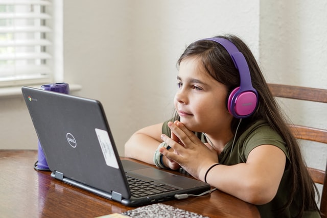
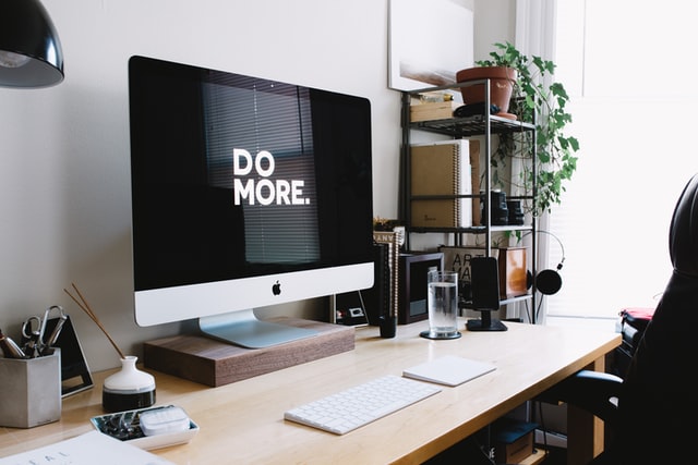
Presenteeism describes being at work but being unproductive due to stress, overwhelm and/or illness.
Harvard Business Review has estimated presenteeism costs the U.S. economy upwards of $150 billion a year
Quiet quitting is the ‘latest’ phrase to describe what many have done for decades – which is doing the bare minimum to get by.
And this too is costing the economy. opb.org in their article discussing quiet quitting write:
Gallup recently did a survey about quiet quitting, counting workers who report being neither engaged nor “actively disengaged” at work. They found that these quiet quitters make up at least half of the U.S. workforce.
Presenteeism and quiet quitting are similar when you boil them down – someone is at work but doing the bare minimum. And that phrase, doing the bare minimum needs to be qualified for presenteeism:
This could be due to a fatigue-related impairment, or a downward spiral of functionality from mild to more serious levels of depression, hence the performance anxiety associated with presenteeism
Quiet quitting has taken off on social media, especially Tick Tok and there are many discussing what it is:
“We’re acting our wage”
“We have no hope of ever buying our own home – so why work hard for nothing?”
“We are working jobs that do not care about us as people”
This Tik Tok is a great explanation of the quiet part – on both parts – the employee and employer, and suggests, as we will all know deep down, that it is up to the managers, including HR, to not only understand this trend but address it.
Once the bean counters start to analyse quiet quitting, it will probably cause similar levels of costs as presenteeism.
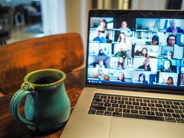
Add to the above, there is also disagreement when it comes to working from home – where managers don’t believe their employees are productive:
What’s going on, and what do they both have in common?
Unmet needs, unrealistic expectations, and the idea that the worker must go above and beyond, be more than, and not have any work-life balance to be, what?
A good cog in the wheel
To not be discarded.
In one instance the worker fears are being weaponised due to illness. No, you can’t take time out to be a human being as you must be a cog, and we will fire you if you do not fulfil the role of a cog.
On the other, they are there because they need the salary, they know they are replaceable and will find something else if needed.
Indifference and fear – two emotions that will harm not only the people experiencing them but also the business they’re employed in.
Living a life of fear and living an unfulfilled life at work.
Unmet needs and unrealistic expectations are the bottom lines here.
Unmet needs in the workplace, well, let’s face it, they are legion.
The office worker, employed from 9-5 (depending upon where you live), yet expected to routinely stay late, answer emails in the evening and to a degree, be on call over the weekend.
It’s as if the employee needs to behave like a business owner.
This is entirely unfair, yet it plays into the busy paradigm, of being a martyr for your work when you know your work will replace you within an unfeeling heartbeat.
So why should you care? Why should you go the extra mile just because Napoleon Hill says you should when it gains you nothing but pain? You miss out on the things that truly bring you joy.
So, business needs to start walking the talk and seeing their employees as just as valuable as the customer.
Businesses if they want to keep an employee, one that will go the extra mile, then it’s a quid pro quo that’s required.
And that starts with recognition for sure, but also ergonomics, wellbeing, and an environment where it’s conducive to be yourself so you can produce your best work, where you feel valued, seen and cared for.
This means investing in diversity, equality, and inclusion. Investing in accessibility, and wellbeing, and yes we are going to mention DSE regulations ( linked to our essential guide) because there you have it business owners, a handbook that shows you the way.
Display screen regulations, all the way up to and including ISO 30071.1 give you the foundation for looking after your people that spend their days in an office and/or in front of a screen all day.
And it’s so simple.
It’s all about reasonable adjustment for the individual, the same way as when you get in a car and check the seat and mirrors are set in a way that’s perfect for you.
Display Screen Optimisation is a perfect example of this. By ensuring safety and wellbeing when working with a display screen, making the reasonable adjustments as laid out in the regulations, including individualising the adjustments, so helping their performance and productivity.
To explain in more depth how our Display Screen Optimiser (DSO) aids wellbeing, we suggest you understand colour therapy that underpins the science behind the DSO tech and then dive further into how the Display Screen Optimiser software works.
The Display Screen Equipment regulations ask you to look at your employee as human, not a cog, so they stay your people, they want to stay your people, they give their best work and presenteeism and quiet quitting are totally absent and alien to them.
And our DSO can help you do just that.
Presenteeism and quiet quitting, are different, but the same.
In a world where ever-increasing hours are spent on display screens of all shapes and sizes, it seemed odd that they all deliver text in black on a white background.
This is why we need to look at colour therapy.
Is it bottles of two-toned colours lined up on shelves in a holistic clinic?
Perhaps it’s interior design for institutions to modify behaviour?
It’s actually related to your health, and more specifically your eyesight.
The ancient Egyptians were using colour therapy back in 3100BC. The Greeks built solariums for it, and practitioners of the Ayurveda medical system will be well versed in it.
Yet it is a relative newcomer to the west, (some say around 1916) and is still treated with a degree of scepticism.
However, by 1941 colour therapy was becoming more popular, and today, there is an active College of Syntonic Optometry that’s been operating since 1933, with researchers discovering over the last 100 years just how colour impacts your health.
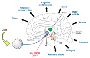
Alongside this, doctors have been gaining more insight into the Autonomic Nervous System (ANS) and how an imbalance within it could be the cause of most diseases.
Together, they’ve discovered that colour can correct the imbalance. (That was where we started when we thought up the idea of display screen optimisation).
So, what is colour therapy, and what relevance does it have to your health?
Firstly, colour therapy is yet another methodology and proven science that underpins our work and the mechanisms behind the Display Screen Optimiser (DSO).
This post aims to explain why we urge you, via the DSO to use a background colour, that is unique to you when using Microsoft applications.
“Syntonics or optometric phototherapy is the branch of ocular science dealing with the application of selected light frequencies through the eyes.
It has been used clinically for over 70 years in the field of optometry with continued success in the treatment of visual dysfunctions, including strabismus (eye turns), amblyopia (lazy eye), focusing and convergence problems, learning disorders, and the after-effects of stress and trauma”.
By studying how the human body reacts and interacts with colour, we now know certain colours calm what can be an overexcited, or exhausted visual system.
Examples: green is considered restful, while blue is considered peaceful, and we can even detect these colours through our skin.
Note: (A fair part of the information shared in this post is taken from this article written by Raymond Gottlieb, O.D PhD.)
Gottlieb describes light as a healing agent.
“Noncoherent, nonpolarized, non-narrowband light, is delivered into the eyes to treat visual dysfunctions, brain injury, headache, strabismus, eye pathology, learning disabilities and mood”.
“Coloured filter goggles are placed on the eyes for the duration of the light therapy treatment— usually up to 10 minutes (our note: some say it can be up to 20 minutes).The filter colour applied to the goggles is determined based on the presenting visual problem.”
Why use the eyes if we can ‘see’ colour through our skin?
The eye is one area of the body where blood is directly exposed to daylight.
The light/colour therapy utilises this area to irradiate (as in to illuminate – shine a light), which in turn relaxes the blood vessel walls, increasing blood flow and reducing hypoxia (low oxygen).
“Haemoglobin is similar to chlorophyll in structure, and both are reversibly altered by light”.
What appears to be happening is that the light, by reducing hypoxia, influences oxygen-carbon dioxide exchange, vasodilation, neurotransmission, oxidation, inflammation and other basic physiological functions.
Syntonics, Gottlieb believes, may work through the eye by optimising the above and our internal bodily rhythms.
He writes, “Multiple physiological rhythms are vital to the health and functioning of the organism.” By rebalancing these, we restore health.
This post gives a very simplistic explanation of how colour therapy works.
Light and the brain and body
Image from: pointsdevue.com
In a nutshell: a specific-coloured light, shone in the eyes for a prescribed amount of time, calms the autonomic nervous system.
This rebalances bodily rhythms that are out of kilter, and therefore restores harmony to the body, which then positively affects health.
(Can you see now what we are doing with the DSO?)
Some of the benefits noted from syntonic phototherapy are:
Improved visual attention
Increased energy
better sleep and reduced eye strain.
Syntonic phototherapy is especially helpful with visual problems.
Myopia, treated in Russia, used low-intensity red and infrared light, for 6 minutes per eye on 10 consecutive days.
In a more recent study, involving 264 children aged 8 to 13 years, where the researchers concluded:
“Repeated low-level red-light therapy is a promising alternative treatment for myopia control in children with good user acceptability and no documented functional or structural damage”.
This leads us to Physics and vibrational frequencies, and the ‘how’ of colour therapy.
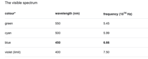
Colour is simply light of different wavelengths and frequencies.
It’s made from photons, and we see the visible spectrum made up of 7 colours.
Light through a prism
Image from byjus.com
Each colour has its own frequency and wavelength, measured in waves per second. Counting the number of waves determines the frequency.
Chart showing the vibrational frequency of colours
Image from: Britannica.com
You have probably heard the phrase everything is energy, and indeed we are energetic beings, that also emit vibrational frequencies.
“If you want to find the secrets of the universe, think in terms of energy, frequency and vibration”.
Nikola Tesla (1942)
A body out of balance affects the autonomic nervous system, so affecting your “frequency “.
As the Scientific American magazine writes, “The Hippies Were Right: It’s All About Vibrations, Man!”
Therapists believe that colour frequencies and vibrations can harmonise and rebalance the frequencies and vibrations of the body.
Knowing and understanding the theory behind colour therapy, we developed our unique software (DSO) that chooses, objectively, the optimal colour for your visual system when working on screen to balance it, ensure it doesn’t become overexcited, exhausted and throw you off balance and into computer vision syndrome/screen fatigue.
To find out your optimal and unique colour, take our reading challenge and then download your tailor-made theme.
Every individual has their own optimal screen background colour which calms the visual system and helps to restore convergence, visual stability, and stereoscopic vision.
Resulting in greater comfort reading text on the screen.
ISO standards are internationally agreed standards, created by experts in their field, and the ISO organisation suggests that you “think of them as a formula that describes the best way of doing something”.
In other words, they describe and encourage best practices.
ISO 30071.1 aims to prevent exclusion and is all about guiding and developing organizational accessibility policies within information and communication technology (ICT) systems and user interface accessibility.
But…
Let’s just take a quick detour and look at the word accessibility. Does the word accessibility put you off?
Are you thinking – I don’t have any accessibility issues, so this doesn’t apply to me?
Well, it probably does, and here’s why.
Accessibility is the practice of making a website usable by as many people as possible. That could mean making something smartphone-friendly so you can access/read it on any device –iPhone or Android.
It could be making a web-based app accessible on all browsers with no glitches, usable on a Mac and pc, plus it also means helping those who do have accessibility issues – such as low vision.
ISO 300071.1 is there as a guide
and gives process-related guidance, in the form of activities and outcomes. It is not technical guidance, and basically asks those involved to consider the needs of the user.
This ties in beautifully with the general theme of Display Screen Regulations (DSE), that of making personal and custom “reasonable adjustments”, to prevent or mitigate the risk of direct, and/or longer latency, and repetitive stress injuries.
DSE Regulations make life easier, more efficient and productive when using workplace equipment operated by an employee, including using a digital display screen.
With this ISO, we are going to focus from page 14 onwards – which is all about the personalized/individualised strategy.
“A user-personalized/individualised strategy adapts what is provided by the system to the identified accessibility needs of the individual user in respect of using that system in that context. A system might enable users to specify their accessibility preferences and then adapt its interactions or content automatically to suit those preferences. Alternatively, a similar level of adaptation to individual needs might be provided manually or with the provision of services or content generated for that user”
Throughout this post, we are going to relate this to an office worker, who sits at a desk, and inputs data to Excel spreadsheets.
Let’s call him Dave.
The system (company) has provided Dave with an out-of-the-box pc/laptop, that runs on Windows and uses Office 360.
The IT team have done nothing but unbox his PC, plug it in, ensure the company intranet is on there, Office 360 installed, plus the company cyber security log-ins.
What they don’t know is how well Dave and his visual system cope with a screen that’s way too bright for him, competing with the antiquated overhead fluorescent lighting and the glare from the office window.
No individualisation or personalisation at all.
Dave doesn’t have any accessibility issues that he’s aware of – but straight away his company have put him at a disadvantage, as they have not met his individual needs for his screen.
They haven’t set it up for his preferences.
e.g., does he prefer dark mode when working? Does that help his visual system?
Is the screen too bright and causing him eye strain?
Where are the reasonable adjustments, for him?
This leads us to the next part we would like to highlight
A.3 Support for individualization The goal: A system supports individualization if its components, functions or operations can be tailored to meet the needs of individual users.
Implementing the goal: [according to ISO/IEC Guide 71:2014, 6.2.3.2] This goal recognizes that a single system design is seldom optimal in meeting the needs of every user and context of use and it can be important to provide users with choices in how to interact with a system. Individualization focuses on providing each user with means of obtaining the best possible solution for that user.
NOTE Individualization includes both the customization of a system for groups of users and the personalization of a system by/for an individual system.
So, Dave’s IT team have implemented a system (set up the PC with required software) but has failed to meet his needs as an employee who stares at a screen for up to 8 hours a day.
What choices have they given him to personalise his screen?
Have they given him the options of blinds for the window, or a screen filter to reduce glare?
Are they aware of the choices of changing the font, and of colour contrast that affects his visual system?
We keep going
A.8 Usability The goal: A system is usable if it supports diverse users in their diverse contexts to accomplish their tasks with effectiveness, efficiency and satisfaction.
Our interpretation of this is that we are all different, with different needs and requirements in order to accomplish tasks.
Makes sense.
And they need to apply this to Dave and ask the question – what will help him?
As
Daniel Burrus, Best Selling Author, Keynote Speaker and Strategic Business Consultant at Burrus Research, Inc wrote recently,
“Learning to adapt software with your human workforce is more vital in customer service and customer experience than nearly anywhere else in the workforce, all solely because customers are human beings with wants, needs, and issues needing resolution”.
Burrus writes about customer service, but we would argue this is true for all employees. Adapt the software for them.
And this is where we really come to the fore because the Display Screen Optimiser (DSO) ticks all the boxes we have discussed so far.
Personalisation, support and usability.
The DSO helps you and your visual system to accomplish the goal of being able to use a digital display screen, using your Microsoft applications, in Windows, by finding the individualised, personal to you, colour contrast background, that helps prevent the screen from over fatiguing your eyesight.
It helps you to achieve your tasks with effectiveness, efficiency and satisfaction.
Basically, it mitigates the harms of computer eye strain/screen fatigue.
As we’ve said, it works presently with the Windows operating system (Mac IOS currently in development), which leads us beautifully to the next section we are highlighting, which is:
A.11 Compatibility with other systems The goal: A system provides compatibility if it allows diverse users to use other systems as a means to interact with it to accomplish the task.
As we reach the end of ISO 30071.1, we come to some real-life examples
They mention the following:
It is important to take particular note of any platform or technology expectations, constraints and preferences of users with impairments in the system’s target audiences, and the impact on these in the various contexts of use in which the ICT system will be used.
EXAMPLE 1 Some office workers or school or university students could be constrained by using a “standard desktop” or organization-issued mobile device, which could dictate the operating system, browser, the preferences they can set in their browser, or the assistive technologies they can install.
EXAMPLE 2 Some people could be constrained in their choice of assistive technology by cost. For example, a blind person could have a costly screen reader provided for them at work, but only be able to afford a free screen reader at home.
And we have been using our data guy Dave to highlight how the DSO complies beautifully with all the DSE regulations, including ISO 30071.1
The DSO is the only colour contrast/ colour validation software that can say this. The others let you choose a preference, but they are not individualised to your visual system.
One size does not fit all.
Inclusive design strategies often need to be enhanced by user-personalized/individualized strategies. This is especially important when it becomes obvious that the difference between the needs of individuals or groups of users will prevent a “one size fits all” approach from giving an experience which works for all. It is often the case that the needs of one user conflict at a technical level with the needs of a different user and make it impossible for one system to meet such conflicting access needs without taking a personalisation/individualization approach.
Individualized user-personalized approaches allow users to be treated as individuals. When implementing user-personalized/individualized functionality, it is important not to inadvertently exclude users with combined disabilities.
As we have said many times, we regard users as individuals, though they may work for a group.
And finally…the ISO states
C.5 Personalization guidelines for individualized ICT system adaptability
Where an individualized approach to ICT accessibility is being used, it is important for the organization to ensure that:
a) individualization serves the needs of the users; NOTE 1 ISO 9241-129 provides guidance on the use of individualization to serve the needs of users.
b) at least one personalized version of the ICT system is accessible to each of the diverse users of the system.
c) the means of individualizing the ICT system are accessible.
So, there you have it – the DSO ticks all the boxes required, and one of the first things Dave did once the IT team had set up his PC was to adjust the brightness, sort out any glare issues and download his DSO theme colour, as Dave cares about his visual system and his health.
You too can be like Dave, (who wouldn’t want to be?) and look after your health and wellness, by finding your optimal colour contrast background colour by going to our registration page.
To understand why this happens, we need to look at Binocular vision.
Binocular vision occurs when using two eyes with overlapping fields of view, allowing for good depth perception.
It allows us to see in 3D which is vital for coordination and hand-eye skills.
Depth perception is incredibly important (you wouldn’t be able to catch a ball without it), plus the fusing of two images gives us a wider view. One eye can give us roughly a 130-degree field of vision. With two eyes, we can see 180 degrees.
However, digital display screens make the eyes work hard.
It’s like a gym session that lasts the entire time you are on screen. This tires out the eye muscles that are involved with binocular vision, to the degree that the binocular vision stops working as well, hence the tired eyes and double vision.
Tired eyes after scrolling?
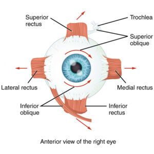
Let’s look a little more at those poor muscles we mentioned when describing binocular vision.
The eye muscles involved in reading and writing are called the extra-ocular muscles.
There are six extraocular muscles.
” The contributions of the six extraocular muscles are to vertical and horizontal eye movements. Horizontal movements are mediated by the medial and lateral rectus muscles, while vertical movements are mediated by the superior and inferior rectus and the superior and inferior oblique muscle groups”.
Every movement that your eye makes, be that looking up from keyboard to screen, looking from one side of the screen to the other, these muscles are responsible.
And, as we’ve already mentioned, looking at a screen for longer than you should, tires out these muscles, leading to screen fatigue – dry eyes, blurred vision, double vision ( as mentioned above), and headaches.
It means eye strain. It’s the medical name used in Ophthalmology to describe the fatigue or tiring of the eyes, usually characterized by discomfort, dimness of vision, and headache, caused by overuse of the visual organs, dysfunction of the ocular muscles, and incorrect refraction.
You will see it referred to a lot in articles about computer eye strain, and it involves those muscles we’ve just mentioned.
If there is also a flickering light which can trigger photophobic reactions, or very high contrast and/or very low contrast that causes discomfort, this prompts visual stress with avoidance strategies such as looking away, and natural “adaptations” due to eyestrain will appear.
They must, as your body is trying to defend itself. The warning signals of this will be loud and clear – pain, headaches, blurry or worse double vision, dizziness, migraine, even nausea and vomiting”.
We know more now since the pandemic started, but this quote is from TIME magazine in 2014.
Dunaief says. “There’s evidence that bright light can damage your retinas irreversibly. That might mean staring at a computer screen that is very bright could damage your eyes.” He says there’s also some experimental evidence indicating regular exposure to computer-strength light could be damaging in similar ways.
The human eye evolved in nature and is perfectly suited to looking at it and its natural colours. That we can apparently see over 4 million colours ( some sites say over 7 million), is another interesting fact. But there are colours that will make some of us look away in discomfort,
This post from social media is a case in point:
“I don’t like bright or flashy colours. I just despise these colours with a strange passion. These colours hurt my eyes every time I look at them”.
Pure lemon yellow is said to be the most fatiguing colour.
Why?
It’s all down to physics and the wavelengths of different colours and how your visual system interprets them.
Again, this is well known, as these two websites show.
Eye pain pallet Please do NOT look at it if you know that bright, neon colours cause you visual pain/stress.
Can colours cause visual stress?
Yes, as we have seen in the snippet above. And we have an entire post about it and why it’s important to calibrate your screen, not only for brightness, glare and font size, ( all things that can cause visual fatigue/stress if not optimised for you), but glaring colours tire you out.
Best background colour to reduce eye strain?
For this, we need to look at colour contrast.
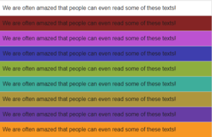
Colour contrast refers to the tone, brightness and amount of text, images and background on a webpage or website.
The simplest explanation of colour contrast is black text on a white background. If you have black text on a pale purple background, you still have colour contrast, but it is to a different ratio than black on white, and your visual system will react differently to it. Some will find it easier to read, others won’t.
And when it comes to colour contrast, you need to let your visual system decide this.
As we are all unique, your visual system is unique, and what works for you will not work for anyone else. Plus, a colour you may love, your visual system may not love it as much if it’s a background colour – for hours.
So, we suggest you find out using our Display Screen Optimiser and find the optimal coloured background for your Microsoft/Windows applications.
It takes just over 15 minutes, has a downloadable theme for Windows, and within the hour you can start to prevent your eyesight from being badly affected by your screen.
Exercises/hacks to prevent screen fatigue?
Most of us work with PCs, laptops etc, and despite the advice to not spend more than an hour or two per day looking at one, that’s not feasible in 2022.
But there are things you can do to mitigate the harm.
The most well know is the 20-20-20 – and we advise this strongly.
The 20-20-20 involves looking away from your screen, at something 20 feet away, for 20 seconds.
There are also apps to remind you to take a break from your screen and we have a list of things you can do now, to help your eyes and prevent screen fatigue/computer vision syndrome/computer eye strain.
How far away should my screen be?
This is interesting, as we have regulations about setting up your office space, the ergonomics of it and how to do it – refer to DSE Regulations 1992. But what about your eyesight? Well according to one post we found, it doesn’t matter how close you are to your screen visually, it matters more about how you feel, and how easily you can read/see the screen. And when you think about how close we are to our phone screens, they can sometimes almost be in our faces.
This means it’s going back to the symptoms we have described so far and taking a break from your screen to let your eyesight recover.
(And why it’s essential to understand what it is).
When you enter the world of vision, accessibility and colour, you often come across the word ‘overlay’, and indeed there are products called overlays.
Initially, you find they are coloured pieces of plastic or coloured glasses that people, generally with Dyslexia, use to help them read.
But then you start to enter the minefield of research, anecdotes, and ‘serious science’ (whatever that qualification means). You become acquainted with software companies that market accessibility overlays as a ‘quick fix’ for your website yet are often anything but.
And this makes our job just that bit tougher because the Display Screen Optimiser (DSO) is not an accessibility overlay, nor is it a sheet of plastic that you put over your PC screen, yet it is a piece of software.
So, to prevent any further confusion and uncertainty – let’s explore what the others are and how the DSO differs.
First up are the digital accessibility overlays.
They appear to have this name because they use a short bit of code like a plugin or a widget that is supposed to correct specific accessibility issues business or government websites may have.
It is supposed to ‘overlay’ the problem.
One definition of overlay is:
e.g. cover the surface of (something) with a coating.
“Their fingernails were overlaid with silver or gold.”
And it sounds great, doesn’t it? Add a plugin, and boom – your website passes all the accessibility guidelines and regulations.
Only as many have found, they can make the matter worse for some users.
When widgets make things worse
The most recent and high-profile case involved a company called Eyebobs.
“Eyebobs, an online glasses company, was slapped with a lawsuit for failing to meet web accessibility requirements in January 2021.
In September 2021, ADP was sued by LightHouse for the Blind and Visually Impaired over persistent accessibility issues with ADP’s HR and payroll platform.
Both companies were using overlay products provided by one of the largest accessibility overlay companies on the market. Despite this, their websites were not still accessible for blind users.”
The companies in question provide a line of code that, according to nbcnews.com, interferes with many accessibility products.
They write:
“When they visit those sites, it can prevent screen readers — which read out loud what’s on websites, including image descriptions, menus and buttons — from reading the pages correctly and has rendered some websites they used to use unnavigable.”
Some accessibility overlays don’t allow for accessibility products already in use by some users, disabling them and doing the opposite of what has been advertised.
It’s a shame they’ve coined, taken, or have the term accessibility overlay.
As one of our colleagues stated, “Overlays aren’t functional unless they can be attributed to the user’s actual/matched needs. If they don’t, they are just fluffy attempts at pacifying the accessibility regulations”.
To truly make your website accessible, you need to get into its nuts and bolts, down to the coding and ideally work with a professional who understands what needs amending.
A plugin /widget super duper bit of blah won’t work, and they certainly won’t help with the WCAG compliance.
For example:
When we turn our gaze to the USA, where suing is as much a part of life as breathing – ADA claims regarding section 508 have gone up by 23% in 2020 alone
“Section 508 is part of the US Rehabilitation Act, which requires US federal agencies to make their information and communications technology accessible to people with disabilities. Access must be in a “comparable manner to the access experienced by employees and members of the public without disabilities.”
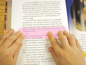
Next, we look at the plastic overlays used by some people with Dyslexia.
Please note the word some – Dyslexia is a broad diagnosis, and as we are all individual human beings, a one size peg does not fit all.
And it’s here we need to look at visual stress.
Eyesite.co.uk describes visual stress as:
“Visual Stress is a perceptual processing condition that causes reading difficulties, headaches and visual problems from exposure to patterns in text, such as lines of text. Visual Stress is linked to Dyslexia and similar visual learning difficulties. Sufferers experience print distortion and fatigue when reading”.
Visual stress occurs when the visual cortex (an area at the back of the brain that is part of interpreting what the eyes see) is oversensitive to specific coloured wavelengths.
Using a plastic coloured overlay can help filter the problem wavelengths, making text clearer for the reader, and often reducing headaches at the same time.
The coloured overlays help the brain interpret what the eyes are seeing without the problem wavelengths interfering.
Some heavily invested in the Dyslexia world are suggesting that visual impairment may not be the cause of Dyslexia, and it may well not be, and as such coloured overlays do not help everyone, yet there is no denying that coloured overlays have helped many people with visual stress and that are Dyslexic to improve their reading.
Pink plastic overlay for assisting with reading image from Dyslexic.com
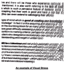
Below is a link to an excellent video showing what a person suffering from visual stress experiences.
Editor’s note: Watching this video will give you a much better understanding of the profound role vision plays in our quality of life.
Messing with your binocular vision/brain’s perceptions of how things should be naturally, versus learned experience can produce some very uncomfortable symptoms.
SoWARNING – watching this may cause nausea, you may need to look away, you may need to spend time away from the pc after you watch this, and if you have epilepsy – DO NOT WATCH:
For those that have chosen not to, or cannot watch the video – the following image gives a glimpse of what it is like to experience visual stress.
Example of visual stress
Dyslexia appears to be a multi-faceted condition, there is much ongoing research, and as we learn more and more about it, then understandings and therapies ( including colour therapy) will, we hope, inevitably improve.
So, we have two mentions of the word overlay, meaning two very different things.
About 30% of the population are uncomfortable with black text on white backgrounds because their visual cortex is oversensitive to certain wavelengths
The WHO state that 2.2 billion people are visually impaired, but it has yet to recognise visual stress as a medical condition.
However, we would argue that doesn’t stop visual stress from being experienced by many people (ref: the video above) and documented.
Why talk about visual stress?
Because too much time on screen can cause, although in the main temporarily, visual stress.
This manifests as Screen Fatigue when the visual stress becomes a habitual act of self-harm.
And by self-harm, we are referring to the everyday habit/routine/work-related needs you have to keep looking at your digital display screen for over 8 hours a day.
It’s affecting your vision, but you keep rinsing and repeating.
The Display Screen Optimiser.
By understanding the increased visual stress that’s been placed on display screen equipment users, The DSO took the idea of the plastic coloured overlays used for reading on paper and brought it into the 21st Century to assist those with mild to more serious photophobia (eye discomfort in bright light).
The DSO colour contrast calibration is of the background contrast to text, it is not an ‘overlay’ tinting everything on-screen, or like an overlay for placing over the screen, or even tinted glasses the user may have.
Example of how the Display Screen Optimiser looks when installed
Reading text against a very high, or low contrast background can be challenging and stressful.
By developing a simple and quick risk assessment to determine the degree of deficit or impairment experienced by the user, the Display Screen Optimiser is an interactive, objective screen calibration application that not only improves accessibility to text, at the same time it mitigates the risk of early-onset eye strain, screen fatigue, computer vision syndrome, myopia (short-sightedness) and asthenopia (eye strain).
Reading and working online means a bright white lit background; screen glare (that may surprise you to know can cause discomfort and produces a natural avoidance strategy directly linked to the body’s survival response of fight, flight or freeze),
moving images, colour contrast that hurts the eyes and much more ‘visual noise’ that overexcites the poor visual cortex, all ultimately leading to fatigue.
(The fatigue occurs due to the natural visual adaptations as the body attempts to reduce the eyes strain by suppressing the vision in one eye or the other.)
The DSO is designed to provide visual comfort and accessibility for the individual screen user. Created with the Display Screen Equipment regulations in mind, it is a “personal custom reasonable adjustment” to the “ergonomics of the screen interface” for anyone on-screen for longer than an hour a day, which is the recommended maximum time spent on standard DSE settings found on public access machines.
It’s designed to mitigate the harms of repetitive visual stress that, in 2017, 58% of DSE users reported experiencing.
And that 58% will include 10 to 15 or even 20% classified as Dyslexic and functionally illiterate with a reading rate below 180wpm.
And here’s a not so fun fact: Anyone with preexisting visual impairments is at a ‘4’ to ‘7’ fold increased risk of early-onset 3D vision stress when compared to those without, after only 20 minutes looking/working on screen.
What Screen Risk has discovered (and is being thoroughly tested in clinical trials) is that by finding the objective colour contrast validation for you, as a living, breathing individual, the DSO reduces your visual stress.
The DSO is not a one size fits all, hence needing to complete a reading exercise, and it’s not a website band-aid plugin.
By focusing on the colour contrast validation, (that is finally coming more and more into website design awareness), the DSO can help users to decipher the foreground from the background, make visual sense of the on-screen environment and help the visual system to interpret what it’s seeing, be that lines of text or images. And it does this by finding the unique colour that helps calm and soothe your visual cortex.
This leads us to Screen Fatigue.
Screen Fatigue, also known as computer eye strain and computer vision syndrome, are manifestations of visual stress.
Whatever label you give it, by staring at a screen all day, you will inevitably experience it.
Screen Fatigue tires you out, which reduces your productivity and increases the risks of mistakes, and who wants to spend their lives with sore eyes, blurred vision and headaches?
In conclusion
Carrying on regardless of a repetitive stressor that causes discomfort or pain will simply result in the body adapting to cope and/or tolerate said stressor until it reaches the point of “adaptation exhaustion”.
This is when the body presents more serious incapacities/symptoms of one kind or another enforcing an escape from the stressor.
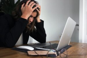
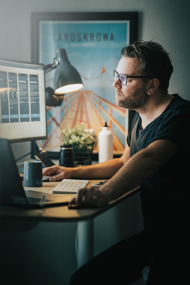
With Screen Fatigue and visual stress, you can no longer look at or work on a digital display screen. You become too fatigued, your vision is blurry, you have headaches, productivity drops, mistakes are made, and there you are, the embodiment of presenteeism.
The Display Screen Optimiser is software that’s designed for the individual’s screen. To mitigate the harms of what spending your life on screen can do to your visual system. And for one more added benefit for the coders and designers out there – it allows for images to be displayed naturally and design work to happen uninhibited
Imagine, if you will, feeling as if an invisible force is slowly squeezing your head.
And it’s applying just enough pressure to be annoying but not painful. It’s probably making you feel a bit irritable.
Your head feels tight, your eyebrows are scrunched up, your facial muscles are becoming more rigid, and you have that inner tiredness.
Chances are you also feel uncomfortable in your chair, your body is heavy, and you simply need a break away from the PC as you struggle to focus.
But you can’t leave, as you still have the afternoon to get through with at least one more zoom meeting.
Walking to the door and back gives minimal relief, as the symptoms start again as soon as you sit down.
You’ve tried coffee to keep you going. You have a bottle of water by your side, and maybe you are one of the lucky ones that get to go outside for their lunch and away from the office glare – that glare that no matter how many times you try and readjust your pc, always seems to be bouncing off your over bright screen.
As the afternoon wears on, the tightness in your head begins to build up into a headache, and you know that soon your eyes will start to feel tired and dry. Some of you will feel as if they are burning around the edges.
You start to rub your eyes often; you’re yawning and feel uncomfortable.
You manage to get through the zoom meeting, but you notice that the screen is getting a bit blurry, and by the end of the call, you see two of each attendant.
You sit back and try and look at something 20 feet away for 20 seconds, but it only brings minimal relief.
And by the end of the day, you are physically drained, mentally tired and want to get home.
Where you might chill with a glass of wine, spend the evening looking at more screens, and then doom scrolling lying in bed until the small hours, feeling drained but too wired to sleep.
And then you get up the following day and repeat.
You spend your time willing the weekend to arrive so that you don’t have to sit in front of your digital display screen feeling frazzled and sore because your screen hasn’t been individualised for you.
It is, in fact, harming your wellbeing.
This is what screen fatigue – or computer vision syndrome feels like.
Your eye muscles are fatigued from the screen. A screen that’s comprised of a bright white background with high colour contrasts and probably a decent amount of glare.
This tires the entire visual system that then starts to deplete the body, mistakes are made, and productivity decreases. Still, sleep procrastination goes up, and there you are, on the hamster wheel of screen fatigue, not knowing what’s wrong but knowing things are not right.
These are a few steps to improving your wellbeing, productivity, and maybe even your sleep. And all in, it won’t take longer than 30 minutes, but they’ll be the best 30 minutes you’ve spent on your screen for a long time.
And don’t just take our word for it.
Read a couple of case studies from people that have found a world of difference when they started using the correct, individualised colour contrast background, for them.
“They (smart people) are no more or less likely to suffer the debilitating effects of carrying on regardless of the work/life balance, sufferingpresenteeism, effectively self-harming, and, at risk of self-medicating their way through the 21st Century with an addiction to display screen devices.
Too often they spend longer on-screen than asleep, and then wonder why they constantly feel fatigued……….“ Nigel Dupree 2022
Smart people are damaging their well-being via their screens.
Your digital display screen should be classified as a hazard, as long-term use causes dry eyes, blurred or double vision, headaches and fatigue, and many other symptoms and knock-on effects.
But you know this.
Yet…If you know this and are carrying on regardless, the question is, why?
Why are you, as a smart person behaving in a dumb way?
Risk assessment is a term used to describe the overall process or method where you:
Identify hazards and risk factors that have the potential to cause harm (hazard identification).
Analyse and evaluate the risk associated with that hazard (risk analysis and risk evaluation).
Determine appropriate ways to eliminate the hazard, or control the risk when the hazard cannot be eliminated (risk control).
Have you seriously risk assessed your screen? If not, why not?
You know in the back of your mind that doom scrolling is not good for you, you know when you need to step away from the screen as you start to feel tired, your eyes are sore etc, but do you?
We can risk a guess here and state probably not.
And one possible reason for not doing so is bias.
You could be suffering from bias regarding this issue, and it’s probably not your fault, and you’re not even aware of it.
Plus, you’ll be fighting the team of behavioural experts employed by social media giants to keep you on screen and scrolling, and they know all about bias – it’s their job.
A group or troupe of bias?
We all have a degree of confirmation bias – wanting others to approve of our choices.
Then we’ll have a smidgen of Groupthink – aligning with others. Maybe a dash of anchoring bias where we are informed by things we see (advertising and everyone is always on their phone).
Status quo? Sure, keeping things as they are and not wanting to rock the boat, especially at work.
Then finally, Hindsight – we all can attest to that and realise things could have been different.
We want to prevent you from looking back thinking, well, I knew it was not good for me, I did know better, but I didn’t do anything.
Don’t go the wrong way
Can we rely upon others to assess risk for us?
Yes, up to a point. We all depend upon HSE to ensure our work areas are safe, and we hope they are aware of their biases when assessing.
Yet still…
Occupational Health and well-being hazards and “predictable risks” are expediently omitted orworse, ignored.
Why?
Is it Stress? Maybe. Lack of money, time, resources? Maybe. Or simply they don’t know? (Spoiler – they do but they are not implementing what they know.)
This leads us to the minefield of self-assessment.
Because if those paid and responsible for assessing risk are not implementing the regulations that will mitigate harm, we must do it ourselves to reduce our risk.
But this is where our bias is even worse, as we all love to think things are either way better or way worse than we imagined.
We need to self-assess our risks, and so it’s wiser to use an objective tool or tools as we can.
Let’s talk about assessing the risks regarding your digital display screen.
You need to assess them, and you also need to evaluate them for accessibility, whoever you are. Accessibility is not just for those we perceive as disabled; it’s for everyone.
Reading/working on a digital display screen is not optimal for humans. Recent research shows that it impairs your comprehension and alters your breathing – as reading on screen is more energy-intensive than reading on paper.
“The convenience of smartphones and other electronic devices is immeasurable, and I believe that much of what we do cannot be replaced by paper,” Honma said. “However, if both smartphones and paper can serve the same purpose, I would recommend paper.”
So, you need to assess your screen to ensure it’s as optimal for you as possible – and we have an entire page of advice to help you do just that.
Our guide will help you find the correct settings for your pc; most of it is intuitive, e.g., brightness, font, text size, adjusting for glare etc.
But as we said, you need to account for your bias, and this is when you need to become objective and use tools to help you.
From here, you can take the results your receive to HR/HSE ( or both) – along with our reference guide of the rules and regulations that should be implemented.
Or you take matters into your own hands and look at what you can do to improve your experience of working on your screens.
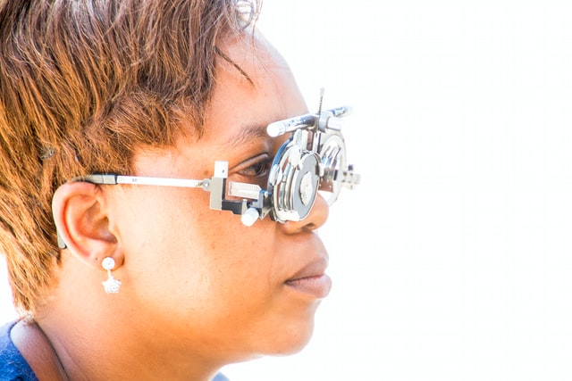
This post describes some wonderful inventions that we can all use to ease the intensity of working with a screen all day, and this post will advise whether your screen could be damaging your eyesight or you simply need to get an eye test!
Our visual system can become overwhelmed by colour contrasts (think black/white, purple/yellow). Legislators are doing their best to encourage best practices for websites to reduce harm and increase accessibility.
Southampton University has created a short video explaining how to ensure the use of colour is both on brand and accessible.
Why look at colours?
The wrong colour contrast (black text on a bright white background is poor colour contrast) causes fatigue of the visual system, which causes fatigue of the body, which leads to mistakes, which leads to presenteeism. Still, we carry on and on, essentially and unknowingly, self-harming.
Think about all the images you see on screen during the day – social media scrolling, work-related graphs, charts, whatever. It’s a lot – and your visual system, created for scanning the horizon and looking at your hands, must decipher and translate all that it sees on-screen to your brain.
It’s a lot of work and something we all take for granted – until you get tired, have sore eyes, headaches, and no longer sleep well and you, a smart person, are on a dumb hamster wheel.
Colour contrast is an issue – and now we are seeing the likes of Widows creating options to change the colour contrast in your browser, but it’s not perfect, still needs work, which is why people in the industry are discussing it and creating improvements where they can.
There are apps out there where you can choose a background-coloured theme for your pc, and they help – but here’s where you need to risk assess and be aware of your bias because you might not like the colour orange in any hue, but what if an orange tone is an optimal colour for you?
Colour contrast therapy works when it’s individualised. Objectivity means you don’t choose a colour you like – it means the software selects a colour that works for you. One that will soothe your eyes, and aid in reading and working on a screen – basically one that helps your visual system do all the heavy lifting.
Here are a few tools regarding colour contrast:
One will objectively choose the optimal coloured background for your visual system, the second to assist with accessibility issues.
Patented Display Screen Optimiser, providing a personal, objective assessment of the best background colour contrast values for you. It’s a self-administered, interactive, online test and takes 15 minutes to complete.
The Bureau of Internet Accessibility is more web design-related. They state: “The tool is offered free of charge and is intended for website owners and developers to test their web pages for colour contrast issues that can impede usability for people with visual disabilities.”
Risk assessing our environment, especially our work environment is something that HSE ad HR should be doing, but when you realise that only 10% of businesses are implementing Display Screen Equipment regulations, hot desking is a real thing, and many are now working from home – it is down to us to risk assess for ourselves.
If you don’t want to join the ranks of the 58% (pre-Covid) DSE operators that already suffer from screen fatigue, then you must act and do something about it.
You need to get on your own white horse because currently, there’s no cavalry from HSE insight.
(Yes, and why we prefer scanning over reading may surprise you.)
Scanning; we all do it, especially when scrolling through social media or skimming through a post. We visually bounce from word to word to understand the ‘gist’ of what’s being conveyed.
Scanning involves the internal recognition of letters and words, and it identifies patterns of text. So, it is not necessarily about comprehension (though that does happen).
It closely mimics a user’s natural reading speed for personal consumption, which is important to note. However, reading speed is reduced when the user is asked to read the entire text and then reduced further when reading aloud.
Reading aloud is a less fluid process, as vocalising words lags behind the brain predicting what’s next and modifying what’s being spoken as a result.
Looking ahead can cause incorrect predictions, leading to some stumbling over words, especially for slow readers.
Interestingly, “If you watch a person’s eyes scanning text at a normal rate, the eyes seem to be ahead of the voice when we read aloud.”
Diving deeper into the science of scanning:
Rayner and Pollatsek, two researchers from the Massachusetts Institute of Technology, spent 20 years studying how the eye moves when reading. They discovered that it fixates on what they call content words, e.g., nouns and verbs in a quick succession of stops and jumps called fixation and saccades
A saccade “is a rapid, conjugate eye movement that shifts the center of gaze from one part of the visual field to another. Saccades are used for orienting gaze towards an object of interest. Saccades may be horizontal, vertical, or oblique.”
Imotions.com describe the fixation as “Between saccades, our eyes remain still for around 200-300 ms – this known as a fixation (“still” is a bit of a relative term here – our eyes often continue to move around as a result of optokinetic nystagmus, which aids visual processing in the brain).”
Showing the eye focus when scanning
(Image from readingrockets.org )
Why do our eyes jump around like this?
Up-close we have a very narrow field of vision.
Try looking at both of someone’s eyes at the same time without flicking from one to the other. This narrow field makes us very sensitive to misalignment and being uncomfortable when wondering which of their eyes is looking at us.
Even when reading, our eyes move around to take in a larger view.
If you can scan quickly and easily, your eyes are not only seeing the text easily, but you are interpreting the text efficiently and with a degree of visual comfort.
Reading, on the other hand, is comprehending the words.
If it’s silent reading, it can include creating visual images to help understand the words, and we can often ‘hear’ the word in our heads. So, for example, when you read a novel, you’ll imagine the characters in your mind; you might even imagine how their voices sound.
Reading, primarily when out loud, engages the brain and the vocal system and, to a degree, comprehension.
However, with reading out loud before reading silently, there is a difference in understanding, with a greater degree of comprehension gained from silent reading first.
Ok, so why are we telling you all this?
When our software is choosing the individualised contrast colour background to text for your digital display screen, we are looking at set data to find the “one” most visually comfortable or accessible colour contrast for you.
One that aids in your scanning and reading.
The correct colour contrast does this by helping sustain the synchronicity of both eyes, mitigating binocular discomfort and loss of stereoscopic vision due to eye muscle fatigue.
It’s a fatigue that presents as early-onset blurred or double vision.
black text with different coloured backgrounds
Here’s (very simply) how it works:
There are two primary types of photoreceptors in the human retina – rods and cones.
Rods are responsible for vision at low light levels (scotopic vision). They do not mediate colour vision and have a low spatial acuity.
“Rods don’t help with colour vision, which is why at night, we see everything in grayscale. The human eye has over 100 million rod cells. Cones require a lot more light and they are used to see colour.”
Cones are active at higher light levels (photopic vision), are capable of colour vision and are responsible for high spatial acuity.
The correct colour contrast background aids in your scanning and reading by engaging the colour “cones” in the eyes, as opposed to the monochrome rods.
It’s about your individual photopic sensitivity.
Photopic sensitivity refers to visual sensitivity under conditions of bright light, where radiant energy stimulates the cones – the retinal photoreceptors responsible for colour perception.
The cones, with their high acuity, are better placed to deal with text but are not invoked by black on white text.
Black text on a bright white computer screen only turns up the volume of any discomfort or fatigue.
Bringing in the colour contrast background brings the cones to the party and help you read and scan much more easily.
Now to your screens:
The visual system (eyesight) is effectively disabled by “Glare”. Think of how you screw up your eyes and want to look away at bright headlights in the dark.
If there is also photophobic flickering light, or very high contrast and/or very low contrast that causes discomfort, prompting visual stress with avoidance strategies such as looking away, natural “adaptations” due to eyestrain will appear.
They must, as your body is trying to defend itself.
The warning signals of this will be loud and clear – pain, headaches, blurry or worse double vision, dizziness, migraine, even nausea and vomiting.
Every individual and display screen for that matter is different, so it is simply a question of matching the screen colour contrast settings/calibration to the user operators most comfortable, expressed by RGB background screen colour values or HEX number.
By analysing the eye systems responses, we look for any evidence of eye muscle fatigue. We measure screen to brain sets of functions and timescales – namely the focus and refocus of the eye muscles and look at any deficits in speed when scanning.
We’ve found the simplest way to do this is to use a block of no-sense text. This prevents the individual’s natural capacity “for predicting what comes next”, to allow repeat scanning of the same subject matter without becoming familiar with its content.
“With the DSO scanning challenge, we are looking at specific data points, and we are looking at the speed of scanning, as this simply points towards gains in accessibility, comfort and ease”.
The gains in accessibility to text on-screen, increase comprehensibility, increase the comfort within your visual system for longer and reduces the risk of early-onset eyestrain, mitigating vision system deterioration.
Until our brains are chipped to interface with our computers directly to the screen, users will still need to use their eyes to read.
Until that day, users contend with screen brightness, glare, colour contrasts, and moving images, all of which can overexcite the visual system and cause fatigue, which leads to all the symptoms of screen fatigue/computer vision syndrome.
We aim to calm the visual system more than aid in dyslexia/comprehension by bringing on board the cones to help the eyes to focus and refocus, not leaving the poor rods to do all the heavy lifting.
That it helps in these areas too is a bonus.
In optometry terms, we aim to increase binocular stability, as we all know looking at a screen for too long causes binocular instability, essentially visual fatigue.
(Anecdotally, we notice an average 20% gain in accessibility/reduction in eyestrain and risk of screen fatigue / CVS by using the DSO, which is being investigated further in our clinical trials.)
What about biometrics?
We currently use AI to drive the DSO, and soon we will be adding biometrics screening and voice recognition to next-generation packages of Score My Screen.
If you take anything away from this quick reference guide – let it be these words:
“So far as reasonably practicable.”
Have them etched in your mind because this is what is being asked of you.
DSE regulations have a “reasonably practicable” regulatory solution for most visual repetitive stress injuries.
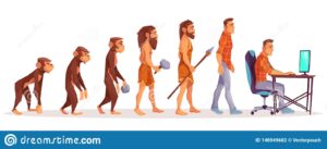
The evolution
evolution from ape to pc ( image from dreamstime.com)
The regulations for Display Screen Equipment have been evolving for decades.
As you read through this document, you’ll see how they’ve evolved to encompass all aspects of working with DSE, from the chair to the mental health of the operative.
1974
Digital Devices in 1974
They began back in 1974 with the Health & Safety at Work Act legislation still current to this day.
The aim of the Health and Safety at Work Act is so that we all know and understand what health and safety measures are needed in our workplaces, where we can find the information for them, and that they have been implemented so far as is reasonably practicable.’
This phrase is not a get out of free jail card – this is a – you need to look and see what needs implementing, and do it as far as is reasonably practicable.
Please note we have provided examples of checklists for each regulation where possible.
This regulation is the benchmark for evaluating the workplace for any health and safety risks for display screen users – BUT – as this was the start of the digital age, they didn’t focus too much on the screen – it was more about the office environment and the ergonomics.
The emphasis was on assessing and evaluating the workplace.
The main points are:
Analysis and requirement of workstation
· Daily work routine – a bit Shakespearian in writing, but here’s a sample – 4. “Every employer shall so plan the activities of users at work in his undertaking that their daily work on display screen equipment is periodically interrupted by such breaks or changes of activity as reduce their workload at that equipment“.
· If you work with DSE, you are entitled to regular eye tests and equipment needed to ensure your vision is cared for.
Six years later and new realisations are emerging. Tech is becoming better; digital is more and more in our daily lives, the office chair and desk are regulated – so now we have the
1998 PUWER Act ( created initially in 1992, updated in 1998, with minor updates in 2021 to reflect that the UK is no longer part of the EU)
These regs move from the workplace environment – office desk and chair etc. to the equipment – asking the questions:
>>>>>>>>> is it suitable, how is it used, andhave they been trained? <<<<<<<<<<
From the regulations themselves:
“The use of work equipment is also very widely interpreted and ‘…means any activity involving work equipment and includes starting, stopping, programming, setting, transporting, repairing, modifying, maintaining, servicing and cleaning”.
The 1998 PUWER requires risks to people’s health and safety from equipment they use at work to be prevented or controlled. … safe for use, maintained in a safe condition; “used only by people who have received adequate information, instruction, and training”.
This act is trying to prevent injuries and mishaps.
Nine years later, we are into the new millennium, and being faithful tech people, we are looking at DATA, and the impacts that working with DSE have on our bodies.
HSE RR561 2007 landmark Study – Think: Presenteeism, carrying-on regardless of visual stress, MSD’s and repetitive physical stress injuries MSK’s/
The opening paragraph tells us most of what we need to know about this study:
A variety of ill health symptoms have been associated with work with Display Screen Equipment (DSE), including musculoskeletal disorders, mental stress, and visual fatigue.
The survey found high prevalences in DSE users of self reported symptoms, eg.
headaches (52%),
eye discomfort (58%), and
neck pain (47%);
other symptoms such as back (37%)
and shoulder (39%) pain were also frequently reported.
>>>>>>. Most of those reporting symptoms did not take any time off work. <<<<<<<<<<
All symptoms were more common among respondents who had indications of stress, anxiety and/or depression.
It’s important to note that this is 15 years after the introduction of DSE regs in 1992, and they quite rightly point out:
“However, there are substantial uncertainties, not least over the extent to which the provisions of the legislation have been fully implemented, and it cannot be safely concluded that the legislation has had no effect.”
Has there been an update to this?
Not that we have been able to find, but then we have just been living through 2020/2021, so we are sure there will be an update due to screen fatigue and zoom fatigue now being endemic.
Why would we include a list of eye problems in a regulatory quick reference guide?
Especially when this particular ICD-10 list of eye diseases is the basis for identifying the severity of illness in the USA and used by eye hospitals for billing purposes (depending on specific conditions covered by insurance or not).
We’ve included it as a pause, a time to reflect, and ask the question:
How long before this list is used in the UK? Particularly if a DSE operator recognises that their eyesight has deteriorated because their employer has not been implementing the DSE regs?
2017
Digital devices 2017
This year saw the release of a DSE Safety Alert as it was noted “ There is evidence of non-compliance in the area of Display Screen Equipment (DSE) assessment as required by current legislation. The purpose of this Safety Alert is to highlight the importance of ensuring all workstations are assessed.”
2018
Digital Life 2018
So, by now, we realise that sitting in a chair all day, staring at a screen, is not great for the body, mind or soul, there is a vast list of injuries used by the USA insurance companies, a safety alert has been raised by Health and Safety England, so we need to start looking at limits.
Not easy with working from home becoming more popular, but we become tired, and when fatigued, we make mistakes, which can be costly.
“Following these guidelines ensures content is more accessible to a wider range of people with disabilities, including accommodations for blindness and low vision, deafness and hearing loss, limited movement, speech disabilities, photosensitivity, and combinations of these, and some accommodation for learning disabilities and cognitive limitations.”
They also clearly state:
Following these guidelines will also often make Web content more usable to users in general.
Welcomes ISO 30071.1, which takes WCAG a step further, is the evolution of British Standard 8878 and focuses more on user experience and the more personalised approach, emphasising accessibility.
This ISO applies to all types of organisations. It applies to the breadth of ICT systems (Information and Communications Technology) within an organisation, including, but not limited to: information systems; intranet systems; websites; mobile and wearable applications; social media; and Internet of Things (IoT) systems.
Giving requirements and recommendations for organisations such as:
Ensuring accessibility is considered in their policies or strategy by creating an organisational ICT accessibility policy.
Embedding the consideration of accessibility decisions through the entire process of developing, procuring, installing, operating and maintaining ICT systems, and documenting these choices.
Communicating the ICT system’s accessibility decisions to its users at launch through creating and publishing its “Accessibility Statement”.
2021
Digital devices in charging dock ( image Esquire.com)
ISO 45003 – Finally, we arrive at the mental health aspects of DSE regulations.
Remember how the 2007 Data showed people carrying on regardless of illness, injury and poor mental health? Well, this set of regulations attempts to redress this.
Occupational health and safety management “Psychological health and safety at work – Guidelines for managing psychosocial risks guide psychological health and safety risks within an occupational health and safety management system.
This ISO addresses the many areas that can impact a worker’s psychological health, including ineffective communication, excessive pressure ( our note: not taking a lunch break, poor lighting, working late – staring at a screen that has not been calibrated for the user – i.e. straight out of the box – for over 9 hours a day), poor leadership and organisational culture.
And here is where we want to take another pause and think more about Exposure Control.
We usually consider exposure control is required for chemicals or toxic substances. Still, here we are referring to exposure to visual health stressors – and yes – high on the list is the display screen, including the hours and hours we all spend looking at one – be that pc – phone or TV.
Overexposure to DSE presents as dry-eye syndrome and binocular visual disturbances (WHO ICD-10), debilitating myopic and asthenopic (eye stress) disease. This often presents as deficits in spatial awareness and blurred, or worse double vision, impairing learning and educational/work performance.
Tying this all together.
You should now see the evolution from thinking about the desk and the chair to the actual human experience working with DSE in the chair.
We know that the office environment needs to be optimal, and risks mitigated.
We know that frequent breaks are required, overexposure leads to physical and mental harm, and we know we need to take care of our most valuable asset – the employee.
And you can do that by personalising their DSE.
The DSO creates the optimal, personal coloured background for the DSE user, mitigating the harms of overexposure and the disease associated with that, reducing stress, and having them shows compliance with the DSE regulations in that reasonably practical way.
Looking after your employees’ wellbeing isn’t a chore; it’s a privilege, and if you do it well, everybody and the company flourishes.
Congratulations if you made it this far!
You probably now know more than most regarding DSE regulations
A brief note about colour contrast validation.
Poor colour contrast has a cascade effect that few people are aware of.
This is what happens:
The colour contrast affects your eyes.
Which affects the stamina of your visual systems and brain.
Which negatively affects your capacity to sustain concentration levels.
Which in turn, affects your levels of cognitive fatigue, efficiency and productivity.
Processing (understanding) visual information uses energy. For example, if you work harder to process visual information because certain colour combinations cause you pain or discomfort, you use up more energy, become fatigued and therefore less efficient and productive.
You are also prone to increased error rates and making simple mistakes.
Poor Colour contrast is also visually uncomfortable. It affects the eye-muscle stamina in sustaining binocular/stereoscopic vision close up, and can contribute to early-onset eye strain.
What is colour contrast?
The term refers to the tone, contrast colours, brightness of the background and amount of text and images on a webpage or website, (now regulated by WCAG).
The most basic colour contrast (out of the box setting), is black text on a bright white background. This is considered very high contrast and should be avoided.
But more and more, people are noticing that colours and colour contrast can either enhance or detract from our well-being due to the amount of visual stress it causes.
Bright colours can grab our attention, but they can also cause pain.
Finding the correct colour contrast can enhance access to text.
And if you are a DSE operator, you want your eyes to work well, you want to be alert, you want to avoid pain, and you want to be as productive as you can be.
If you are in HR, you want these for your staff.
This is why the DSO should be on your DSE
regulation and wellbeing checklist:
Does everyone know where the health and safety manuals are? ✅
Chair, pc and table and office lighting assessed? ✅
Necessary training has been given/undertaken? ✅
Have work exposure limits been set? ✅
PC has had personalised adjustments for the individual user? ✅
DSO installed on company computers? ✅
Employee is aware of psychological and wellbeing services? ✅
Most of us will know about increasing the font size if needed.
A few might know about reducing the brightness on a standard, very high contrast white screen.
But how many of us are aware of addressing the user operator’s (as in you) “personal, custom and reasonable adjustments for accessibility”?
For example, the WCAG Website guidelines offer us and suggest Colour Contrast Validation.
But what does this mean in real life and in relation to your screen?
How does it affect you?
The WCAG describe it as reducing the discomfort of e-learning material or any material presented on-screen using colour contrast as a tool.
Colour contrast is essential, as poorly contrasting colours can cause us physical pain. This is why some people will screw up their eyes and even look away if they find a colour causes discomfort.
Plus, those with preexisting visual impairments, Neurodiverse and Dyslexic suffer a 4-to-7-fold increased risk of eyestrain and early onset binocular vision stress when using a screen, or “the near or close-up”, before they even get to thinking about colours.
So, add some colour contrast that’s painful for them, and there’s no way they will engage on screen.
This stark comparison has been found in as little as an average 20-minute task on any standard, unmitigated for best or optimal Colour Contrast Calibrated screen.
But it’s not just the WCAG that is mentioning this.
“Brightness and contrast” are mentioned in Working From Home Guidance along with fostering user operators to adjust “My Computer My Way”, but, interestingly, carefully avoiding the “why”.
It appears they are simply suggesting this small action is “Removing Visual Barriers” to digital exclusion in the workplace.
They are not looking at the possible long-term harms that an unadjusted computer screen can cause.
Screen fatigue is simply one consequence.
There are more.
Looking at the “chain of causation” (joining the dots), 30% of teenagers are still leaving education pre or post ’16’ to enter the UK adult population with reading rates of an 11-year-old. There is evidence that this is partly due to difficulty reading, and often when traced back, is due to early-onset binocular vision stress, caused by too much time on the near and close up and not being diagnosed early enough.
Take that to the next level: The economic cost of functional illiteracy is estimated to be not far short of a £1 bn.
The cost of presenteeism (20% lost productivity) is also in the billions, with 58% of DSE Operators experiencing CVS or Screen Fatigue.
Myopic and asthenopic (eye strain) disease is predicted/projected to affect 50% of the population by 2050.
Effectively we will all be one-eyed with the loss of 3D vision.
This all sounds more doom and gloom, yet the solutions are simple and easy.
What’s missing from your screen are the adjustments and additions that can mitigate visual stress and screen fatigue/computer vision syndrome.
Reduce visual stress by reducing the brightness, adjusting the screen, and correcting the colour contrast.
Poor colour contrast has a cascade effect that few people are aware of.
This is what happens:
The colour contrast affects your eyes.
Which affects the stamina of your visual systems and brain.
Which negatively affects your capacity to sustain concentration levels.
Which in turn, affects your levels of cognitive fatigue, efficiency and productivity.
Processing (understanding) visual information uses energy. For example, if you work harder to process visual information because certain colour combinations cause you pain or discomfort, you use up more energy, become fatigued and therefore less efficient and productive.
You are also prone to increased error rates and making simple mistakes.
Poor Colour contrast is also visually uncomfortable. It affects the eye-muscle stamina in sustaining binocular/stereoscopic vision close up, and can contribute to early-onset eye strain.
What is colour contrast?
The term refers to the tone, contrast colours, brightness of the background and amount of text and images on a webpage or website, (now regulated by WCAG).
The most basic colour contrast (out of the box setting), is black text on a bright white background. This is considered very high contrast and should be avoided.
But more and more, people are noticing that colours and colour contrast can either enhance or detract from our well-being due to the amount of visual stress it causes.
Bright colours can grab our attention, but they can also cause pain.
Finding the correct colour contrast can enhance access to text.
We all have individual preferences for colour contrast, which is why some find dark mode soothing; others can’t stand it.
Computer screens started in dark mode, but due to more and more non-tech users, they migrated to white backgrounds to mimic paper. However, over the last few years, dark themes have become more popular for several reasons, namely battery power, reducing visual stress and allowing information gathering at a glance – which is easier on a dark theme.
Reducing visual stress is extremely important, and more and more of us are learning about visual hygiene when using a digital display screen.
But here’s the kicker. If the colour contrast on your digital screen is not adjusted/optimised for you individually, it won’t matter how many 20 -20 -20 breaks you take because you’ll be re-exposing yourself to visual stress each time you sit down/look at the screen.
If the colour contrast on your screen means your visual system must work harder, it means you work harder, and it leaves you wide open to not only fatigue and low productivity but also repetitive stress injuries. Many are aware of WRULD’s (work related upper limb disorder), and MSD’s, musculoskeletal disorders, but our eyes can also suffer from repetitive strain injuries.
For example, how often are you experiencing the following?
If you spend the now average of 8-9 hours a day, looking at a display screen, then chances are you are familiar with at least a few of these, and you will be experiencing them repetitively.
(You are entitled to beaks – take them! ISO 45001 explains work exposure limits. Nigel Dupree explains briefly on LinkedIn how employers are not adhering to this).
We believe your computer screen should come with a warning, and your company should be ensuring that your computer screen is reasonably adjusted to suit your needs, in compliance with UK accessibility regulations, 1995 DDA and the 2010 equality act.
But how do we know all this?
Because of the development of the workplace and how the pc has become the tool we all use.
If we also look at and understand vision therapy and accommodation therapy alongside this, we get more of an idea of how the digital display screen affects our eyesight.
Accommodative dysfunction is an eye-focusing problem resulting in blurred vision to either the up close and/or far away and is frequently found in children or adults who have extended near-work demand – such as the computer/laptop or mobile phone
Optometrists define “vision therapy as an attempt to develop or improve visual skills and abilities; improve visual comfort, ease, and efficiency; and change visual processing or interpretation of visual information.”
The regulations that have come into place have attempted to mitigate the visual stress placed on the user, but to date, they haven’t done anything to improve it apart from a nod at the distance your screen should be from your eyes.
It’s taken decades of work to join the dots as to why colour contrast is essential when it comes to your digital display screen, but it starts way back when flared trousers were making their debut!
Late 1970 and researchers noticed “Visual display units (VDUs) have been reported to cause such eye difficulties as eyestrain, visual discomfort, and visual fatigue.”
1984, Helen Irlen set up her institute to help those with reading difficulties. She had discovered that colour could help improve reading rates by reducing visual distortions and coined the term Irlen Syndrome. “Irlen Syndrome is is a perceptual processing disorder. It is not an optical problem. It is a problem with the brain’s ability to process visual information.”
1992 not everyone had a laptop or mobile phone, but there is a growing awareness that digital display screens need regulations –HSE 1992 DSE regulations are announced. These are more ergonomics based but are a start.
During the 1990s, Peter Irons brought out his TintaVision methodology for selecting coloured plastic overlays for reading, as did Professor Arnold Wilkins with his intuitive “Colorimeter” for prescribing tinted glasses for reading. They, like Irlen, had seen an improvement in reading and reading speed among those with visual stress once they used the best colour for themselves. (Note – there is still controversy over coloured backgrounds – but this is based on an argument regarding reading speed v comprehension.)
May 5, 1999: WCAG 1.0 is born. WCAG was created as it was evident that the internet and websites were not accessible for all. Those with disabilities, reading challenges, or even simply not raised with technology didn’t have access to which they were/are entitled.
2004 Dupree Screen Optimiser (DSO) was created to help reduce visual stress, and Patent was applied for in 126 countries.
2006/7 Researchers dive deeper. 1327 Display Screen Equipment users are studied. 50% of symptoms recorded affected the eyes. Eye discomfort was 9.5%. In addition, 60% suffered from eye fatigue with symptoms including pain, blurred vision and difficulty seeing.
HSE put together a paper looking at the injuries sustained by DSE operatives. Page 28 lists some research done from 1987 through to 2005, all showing the strain digital display screens place on the eyes. It states – (1) eye issues reported any discomfort – 70%; (2) smarting, gritty feeling, redness – 56% (3) sensitivity to light – 40%; (4) itching – 34% (5) moderate discomfort – 29% (6) teariness – 24% (7) dryness – 20%.”
2008 – WCAG 2 is published, expanding on the 14 guidelines but placing them into four principles – perceivable, operable, understandable, robust and making the world wide web even more accessible.
With more technology now in schools, questions are arising about the efficacy of the 1992 DSE regs. Workplace Law’s Health and Safety Consultants – Kate Gardner and Renier Barnard are brave enough to debate this on YouTube, suggesting “Now that VDU equipment is used widely in schools, the workplace and for leisure, there needs to be a change in attitude and culture so that DSE is used effectively, healthily and sustainably, without causing long-term ill effects.”
2014. Research regarding computer vision syndrome/screen fatigue is coming to the fore, most noticeable amongst students. “Among engineering students, the prevalence of CVS was found to be 81.9% (176/215), while among medical students, it was found to be 78.6% (158/201). In addition, a significantly higher proportion of engineering students, 40.9% (88/215), used computers for 4-6 h/day as compared to medical students 10% (20/201) (P < 0.001).”
2014. Professor Wilkins, the inventor of the Colorimeter, gives a TED talk aptly titled Disturbing Vision. In his talk, he explains how our visual systems that developed in the natural world face problems and discomfort processing some patterns and images found in the modern world, especially black text on white backgrounds and flickering images.
2014 The DSO is upgraded to include online iteration.
Researchers now begin to look at the cumulative effects of poor lighting, glare, and computer vision syndrome/screen fatigue in the workplace, which now (2022), due to the pandemic, includes working from home on a device that’s not been adjusted since it came out of the box!
Both Screen Fatigue and Computer Vision Syndrome describe the same symptoms – those of: “eye strain, dry eyes, headaches, overall tiredness with reduced productivity, blurred vision, and often includes other musculoskeletal disorders, e.g. a sore, stiff neck, from being unable to sustain an ergonomically comfortable posture while struggling to see clearly“.
These symptoms are becoming more and more prevalent, though HSE states that they are short term only and resolve once you stop looking at a screen.
2015 We begin to understand more the effect that light has on the body – more specifically in the work environment. Eyes are designed to use light, not look at the light. Glare causes a physiological response in the body, and it’s not a good one.
2016 – International Statistical Classification of Diseases and Related Health Problems 10th Revision (ICD-10)-WHO Version for Visual Disturbances and Blindness is published.
2017 A safety alert is issued by the Health and Safety Executive due to: “evidence of non-compliance in the area of Display Screen Equipment (DSE) assessment as required by current legislation. The purpose of this Safety Alert is to highlight the importance of ensuring all workstations are assessed. B BACKGROUND: A variety of ill-health symptoms have been associated with work at DSE, including musculoskeletal disorders, mental stress, and visual fatigue.
We see the public health messaging of how damaging our addiction to our mobile phones can be, especially for the young.
2018 – WCAG 2.1 – building on the guidelines published in 2008, and now includes mobile devices.
2018 also sees a Chartered Institute of Building Services Engineers presentation discussing the history and changing opinions of daylight and myopia in school children. The presentation charts the ‘fashionable’ views of the time and how they have swung to and fro like a pendulum.
2018 – UK Gov Accessibility Regs for Public Sector Bodies are published, though they appear to exclude secondary and Further Education, they do however include University Compliance. These regulations were due for implementation in Sept 2020 but were missed due to covid. However, the website has been updated this year, and more guidelines have been published for mobile apps.
2019 Jonathan Hassell from Hassell Inclusion plays an important role contributing to ISO 30071.1 following up on the work of WCAG 2.1 to help designers and organisations build more inclusive software/systems.
Colour contrast is coming more and more to the fore, with excellent presentations describing the importance of colour contrast for branding and accessibility – they are not mutually exclusive.
ISO 45003 is the first global standard giving practical guidance on managing psychological health in the workplace. It guides psychosocial risk management as part of an occupational health and safety management system.
Bringing this all together.
We have a timeline showing us the harm that digital display screens can do to our visual systems and bodies. We have a timeline of the guidelines and regulations put into place to try and mitigate those harms.
We don’t have too many solutions that are implemented and enforced, hence the alert put out in 2017.
Digital display screens damage our eyes – they tire us out and reduce our productivity. This is a given.
This is why the Display Screen Optimiser was created.
With vision therapy in mind, its inventor joined the dots before the rest of us and realised that by changing the background colour on your screen, you could mitigate some of these harms, reduce fatigue, calm the visual systems and maintain productivity levels.
In 2021/2022, life is spent online, through a screen, and it’s up to each one of us to protect our visual systems that interpret that life for us.
In his own words: The DSO produces an immediate response in terms of colour sensitivity providing stimulus enabling the visual system to converge on the subject synchronously, widening the field of vision, whole word recognition, and improving or reducing the stressors linked to fixation and saccades when reading.
Essentially it helps the reader/user to focus and reduces visual stress.
You can call it what you like; you can diagnose it as whatever you want – but it’s a vast, unacknowledged problem that’s only getting worse.
Call it blurred or double vision – or call it by its medical name, AMBLYOPIA in children, and PRESBYOPIA in adults.
But it refers to the gradual loss of eye-muscle stamina to sustain “convergence and accommodation”, when focusing on the near indoors or close up on the screen. This could be in any indoor space, less than 20ft in size, with little natural daylight.
It could be at the office, or at home.
Reading and working in these conditions leave you with tired eyes, and generally fatigued as your eyes do their best to adapt.
The eye muscles become tired and then stop working as efficiently.
Some of us will experience stress-related vision suppression over time. Others will wake up one morning effectively monocular, living in a 2D world without depth. This is because the image from one eye has been ‘re-directed’ somewhere else, leaving the other eye dominant.
The visual system and brain process that dominant “single image”, ignoring the other fainter double image.
Then there’s Astigmatism, the suppression of the vision from one eye, with or without visible lazy eye.
Strabismus; misalignment of the eyes or unstable alignment of one eye
Asthenopia; weakness, or debility, of the eyes or vision
The list goes on and on, and you can find out more @ WHO ICD-10
Call them by their generic or medical names, but all are mirrored in Computer Vision Syndrome, more commonly known as Screen Fatigue, tired eyes and/or eyestrain.
Screen Fatigue/Computer Vision Syndrome is the name given to a cluster of symptoms that arise from looking at a digital screen for prolonged periods.
The symptoms can include eye strain, dry eyes, headaches, overall tiredness with reduced productivity, blurred vision, and often includes other musculoskeletal disorders, e.g. a sore, stiff neck, from being unable to sustain an ergonomically comfortable posture while struggling to see clearly
Screen fatigue is also cognitive fatigue.
The visual system has to work harder processing uncomfortable, distorted, blurred or double images, demanding more blood-oxygen as fuel to the brain to support the additional processing demand.
The more ‘close up’ work you perform, the more oxygen is required, the more fatigued you become, and round and round it goes.
It’s a thoroughly unpleasant merry go round.
28% of the population are immune from eyestrain or vision stress. Still, the rest of us, the 72% are not, and so easily succumb to visual repetitive stress fatigue and/or stress-related adaptations.
We are at a four to seven-fold increased risk of earlier onset of associated adaptations when over-exposed in early life or later to the near indoors and/or close-up at our school desks and on-screen.
China and now Instagram are seeking to introduce Exposure Control Measures, either by cutting off access to the internet after a period or having pop-ups advising “Take a Break”.
Instagram is bringing this in due to political pressure. China, for the simple fact that they are noticing 80% of students are graduating with severe myopia.
Linked to the ‘take a break’ concept is the well-known occupational health advice of the 20-20-20 rule for DSE operators (look away from your screen every 20 minutes, at something 20 feet away and for 20 seconds) when working with standard, unmitigated, inaccessible display screens that have not had their contrast optimised for the user in education or the workplace.
Computer Vision Syndrome is serious.
For example, in 2007, 58% of Display Screen Equipment users suffered from vision issues related to their screens.
What’s the number now, as 2021 draws to a close?
But more importantly, what can be done about it?
Sure, we put the smartphone down, look away, and take a coffee break. We all know about not being ‘online an hour before bed’, and many of us know about getting out and moving about in natural daylight – but how many of us actually do this?
But unless we adjust the screens we are looking at, we go straight back to the problem.
It then becomes a repetitive stress injury.
We need to adjust our screens because colour and light play a massive role in screen fatigue and cannot be left out of the conversation.
Researchers became aware of colours and sensitivity to light in the 1960s. As more and more has come become evident, we realise that every one of us experiences colour and light differently.
We use light; we don’t necessarily ‘see’ it. Instead, we interpret the waves of colours that surround us individually, as we interpret the speed at which they uniquely arrive in our visual system.
One person will see glare; another will not.
One person will find dark purple hurtful for their eyes; another will not.
Photosensitivity is an immune system reaction triggered by sunlight, which unsurprisingly
manifests in a high degree of visual discomfort and, for some, may trigger migraine, fits or convulsions, especially when presented with flickering lights/screens or strobe lights, or even sunlight flickering through trees beside the road, depending on the speed of travel.
Irlen Syndrome, first described by Helen Irlen, is a sensory disorder of how the brain interprets bright white light, whether reflected off white paper or from an illuminated background to text on-screen.
Visual Illusions are often created by playing with light and dark or shadows to challenge our visual perceptions and constructs of the brain’s typical or expected responses. Experience of typical images can also leave impressions on the retina interpreted as changing colours.
We all experience these differently, to one degree or another.
But Helen Irlen spotted a connection between visual stress and visual stress relief.
Through trial and error, she found that existing or early-onset eyestrain when reading could be relieved by selecting the best effective contrast other than a “high contrast white” background to text. The ‘normal’ white background with black text is painful for many.
Clashing contrasts of often unnatural (as in not found in nature) colours are uncomfortable and painful for many.
Hence her coloured overlays and coloured glasses for reading, aimed at reducing glare, and thereby reducing the discomfort experienced by the brain and visual system.
Other pioneers in colour therapy, including Arnold Wilkins, have sought similar methodologies for subjectively selecting the best contrast, thereby improving reading skills and abilities.
No one should experience vision stress, discomfort or painful headaches when reading.
But this is where ScreenRisk has joined the dots but flipped the script.
We don’t do the things we are supposed to do for our health, and in 2021 our lives are run through our screens, and those screens are damaging our eyes and causing us stress.
Understanding that many visual issues are replicated in screen fatigue and understanding that we are all unique in interpreting light and colour means we need an individualised response.
Knowing that stress affects the eyesight and all parts of our body and that digital screens that we are now addicted to cause cognitive fatigue – we created the DSO.
A tool that considers all of the above and chooses the best-coloured background objectively for your eyesight and visual system, providing you with that coloured theme for your screen.
Objectively choosing means your body, not your personal colour preference, selects the optimal colour that soothes your visual system. Reducing all of the above stresses also means that you are not repeatedly self-harming when working/studying online.
The induced near or close-up indoor eyestrain and 3D vision stress, created and exacerbated by hours on-screen, where no reasonable adjustments have been made, can be mitigated.
It’s simply a question of joining the dots as to what’s going on and then creating an app to make the eyes and visual system as comfortable as possible.
In 2021, our stress levels are off the charts; we are exhausted living with unknown unknowns, high levels of anxiety, mistrust, and uncertainty in many areas.
We strongly believe that if there is an app that can help alleviate stress, we should use it.
Stress causes illness (here’s a handy list of just a few of them), and it lowers the immune system. So, making life less stressful and more manageable is something we believe we should all be embracing.
As such, we’ve put together a list of 9 accessibility apps that we know can make life easier and less stressful for all of us.
Not everyone has a disability, and not everyone wants to admit or disclose having a disability, so why would an accessibility app help if you don’t ‘need’ one?
Because our lives are lived through our screens, and to make them more accessible makes them more inclusive. Yet, just because we are online 24/7, it doesn’t mean the interface to that life is harmless.
It isn’t.
We are all aware that post lockdowns screen fatigue and zoom fatigue are endemic.
Plus, those with pre-existing visual impairments, dyslexia and diagnosed as neurodiverse are at a ‘4’ to ‘7’ fold increased risk of induced visual repetitive stress injuries, namely myopia (short-sightedness) and asthenopia (eye strain) that are exacerbated by prolonged periods on-screen.
The longer we spend on screen, the worse the repetitive visual stress injuries, the longer the recovery time, the worse the eyesight, that’s worsened by being on-screen all the time.
And around we go.
We also need to nod to the fact that accessibility is a regulatory requirement, though sadly not well adhered to or enforced.
Below is a list of current UK regulations regarding digital display screens, and we do often wonder how many HR departments are aware of them and implement them?
ISO 45001 ‘Work Exposure Limits’ regardless of not having a “Right to Disconnect.”
ISO 45003 Employee Wellbeing, Psychosocial Hazards and Risks to Mental Health
WCAG 2.1 Colour Contrast Validation for websites and e-learning (inc Education)
ISO 30415 Diversity and Inclusion Standard (Accessibility and Inclusion)
But enough of the problems and regulations, to the apps for the solutions!
(And a massive shout out to the folk that created them).
1) Screen readers.
Screen readers convert what’s on the screen to sound or braille, be those images, text, buttons, and so on and are most often used by vision-impaired people.
What many don’t realise is that screen readers can read faster than most humans.
According to Axess Lab, a Finish developer called Tuukka Ojala
set his reading speed to 450 words per minute. The average person reads at a rate of around 150 words per minute.
That’s quite the speed!
You’ve probably already noticed that you can speed up some podcasts and YouTube videos; well, now you can speed up reading your screen.
Why would you use one if you are not vision impaired?
If you want to read articles and don’t have the time, then a screen reader can increase the speed of ‘reading’ by reading it aloud to you at say twice the average rate – you get the information and you save time, and you could be doing other things simultaneously.
Axess Lab has created a fantastic resource explaining what a screen reader is, and they have a video showing one in action.
If you are considering a screen reader – this is the most recent review that we’ve found. From 2019, it compares 5 of the top screen readers.
2) Google Translate
You might consider this a bit of an odd one, as google translate is for languages other than our own, but is it?
On the app is an icon for sound. So, if you are unsure of how to pronounce a word, simply type it into google translate, press the sound icon, and the app will ‘speak’ the word correctly pronounced.
Why do we need to hear how a word is pronounced? Because we learn language through vision and sound.
Here’s an example.
A friend’s daughter can pronounce the name of THAT village in Wales.
How? Because she heard it repeated over and over again.
https://youtu.be/_3b2F-bkAdM ( and I bet you didn’t know the entire name was made up to be a tourist attraction?)
However – put medical terminology in front of the same girl and ask her to say it out loud? Not so easy!
According to an article in Scientific American, “we hear written words in our head.
Sound may have been the original vehicle for language, but writing allows us to create and understand words without it. Yet new research shows that sound remains a critical element of reading”.
Give it a try the next time you’re unsure of how a word is pronounced.
3) Dictation apps – voice to text
Dictation apps mean you speak while the computer/phone does the typing.
Using ASR – advanced speech recognition, they can be faster, easier, no clumsy fingers, no one finger typing, and you can concentrate on what you are trying to say, rather than figuring out where the letters are on the keyboard.
Great for people with dyslexia, reading and learning difficulties.
Great for replying to messages and emails when you are washing up – yes, looking at you, J!
Also great for people who wish they had a typist who could do it all for them.
These apps are also invaluable for people with RSI, arthritis, and physical disabilities, where typing can be uncomfortable or challenging.
Softwaretestinghelp.com have put together a comprehensive guide to the best dictation software out there, entirely up to date as of the 18th of October 2021. And yes, both Google docs and Apple have free software for this (in the top 3 according to the review).
4) Windows 11 accessibility
Windows 11 is gradually being rolled out, and according to their blog, it “is the most inclusively designed version of Windows.”
What will remain from Windows 10 are: Narrator, Magnifier, Closed Captions and Windows Speech Recognition.
What’s new? Microsoft boasts new sound schemes, including different sounds for Light and Dark Themes, combining vision and sound.
They’ve upgraded their colour contrast settings, so those with light sensitivity and people working for extended periods can enjoy different colour themes, including new Dark themes and what they call reimagined High Contrast Themes.
Closed Captions have been re-designed and are now easier to read and customise. In addition, windows Voice Typing uses state-of-the-art artificial intelligence to recognise speech, transcribe, and automatically punctuate the text.
As Windows 11 rollout is ongoing – we will await feedback from users, but what is fantastic is that accessibility is improving.
5) Display Screen Optimiser (DSO).
Compatible with Windows 10 and using innovations and discoveries from the world of dyslexia – the Display Screen Optimiser is there to help prevent screen fatigue (also known as computer eye strain or computer vision syndrome).
Spending hours online causes the following symptoms: Tired, dry eyes: double vision, headaches, blurred vision, and poor focus.
But you can mitigate these symptoms and the long-term harm they cause by changing the background colour of your screen.
What’s unique about the DSO is that it doesn’t rely upon you to choose a colour; instead, you need to take a 15 minute – admittedly challenging – reading test, and it finds the best-coloured background for you.
A few people have been surprised at the colour they needed – (deep purple or bright orange, anyone?) But they’ve also been pleasantly surprised at how less stressed they felt once they started using it.
See Jason’s testimony as a case in point. He spends hours staring at Excel spreadsheets every day, and the DSO has undoubtedly improved his energy and concentration.
There are two types of captions – closed captions and subtitles.
Closed captions were created to allow deaf and hard-of-hearing people to experience the video/movie/TV show, including background sounds and speaker changes.
Subtitles assume the viewer hears the audio and, as a result, do not highlight background sounds or speaker changes.
Most of us will see subtitles as we scroll through our various streaming subscriptions and on some social media, as it’s a clever way to see a snippet of the video without having to have the sound on. They’re also great to use if the person speaking has a voice that grates on your nerves!
Are they easy to enable??
Social media or streaming services have a settings option; usually a simple enable captions on/off button.
But what if you want to add captions to your videos?
Many find it challenging and tiring, and thankfully the days of having to write out that transcript in full have gone, as there are apps everywhere for this, from free to paid, and we’ve added a link to a top 5 review below.
Having captions enabled is a game-changer if you are hard of hearing or if there’s background noise, if the language spoken is not your first language, if you are in a noisy place, or perhaps you are somewhere where you need to be silent?
And putting them on your videos means your videos are more accessible for everyone, which means the reach will probably be further.
Here’s the review of 5 Best Android Apps, because yes – you can even do this now on your phone!
7) Keyboard and mouse.
These should probably come under the assistive technology label, but we have included them to help accessibility.
There are a plethora of keyboards available, and some of the ergonomic ones are intriguing.
Designed so there is barely any wrist movement, almost eliminating the risks of RSI. The linked post is a resource to show if a different type of keyboard would benefit you, even if just as a preventative measure.
Some keyboards are designed for vision issues, so the keys/letters are easier to see.
Then for the mouse, these too have had a radical re-design. Some look like the control of an RAF stealth bomber, designed to fit in with the human body and natural movements.
Unfortunately, the uber-cool and sleek mouse designs that come as standard can be devastating to the body if used long term.
Some more advanced pc users use their PCs with keystroke operations to limit mouse use, and some even write their own code for it!
8) Apple short cuts app: iPhone and iPad.
Creating shortcuts can be worth the time – if, on balance, they save you time, make your phone or iPad easier to use and result in personalisation for your specific needs.
In this video: https://youtu.be/U5MtSH60uEI Mathew Cassinelli walks you through shortcuts he’s made to his iPad, explaining some of the features available, e.g., brightness, white point, dark mode, text size, reducing motion, transparency and contrasts, and more.
There are so many features that can help with our day-to-day life; it’s just that many of us don’t know about them.
9) Apple Watch
Probably not the first accessibility tool to think about, as the screens are small, and one might think not easy to navigate or use, yet Apple watches come with accessibility built-in – here’s a quick rundown of how they can assist you.
• VoiceOver
• Zoom
• Grayscale
• On/Off Labels
• The X-Large watch face
• Text size
• Reduce motion
• Mono audio
• Taptic Engine provides a gentle tap on your wrist every time a notification comes in.
So, nine apps that barely scratch the surface of what’s out there to improve our lives but they are certainly a start.
All it takes is a little investigating, learning how to use them, and then the stress levels should start to fall as your life becomes just that little bit easier.
Twitter is like marmite – you either love it or hate it. But no matter where your personal opinions are, Twitter has over 300 million active users a month, and last year (2020), it generated over $3.7 billion in revenue.
That’s a lot of eyeballs generating a lot of money.
So let’s look at the eyeballs and how twitter’s accessibility policy made the headlines during the summer.
In August 2021, and with much fanfare, Twitter announced accessibility changes to their platform with the idea that it would make Twitter more accessible.
“Accessibility is the capacity for everybody to have access to something, regardless of any conditions they might have.”
They created their own font – cheesily called Chirp.
They also created higher contrast between text and background colours and reduced visual clutter.
These don’t sound much; they were welcomed by many and have provided a cleaner reading experience for some.
But if you have visual issues, these new changes prove challenging and highlight that websites can cause physical harm.
As Sheri Byrne-Haber wrote in her article for UXDesign.
Animation and multimedia flashing can trigger epileptic seizures. Pseudoflashing (black and white optical illusions) that don’t actually move but appear to be moving can do the same. Someone who seizes might fall, which can cause a skull fracture. This is literally the only WCAG guideline where failing to follow it can result in someone’s death.
Font changes and certain contrast can trigger eyestrain and headaches.
Certain types of motion, such as parallax and optical illusions, can make some people motion sick.
So what are the problems?
Twitter’s new font is said by many to be squished up, making it harder to read.
The stark contrast of black against white, instead of blue against white, is causing migraines in some users, and too much white space can be jarring on the eyes, again triggering pain.
Interestingly, this is not the first time Twitter has made attempts at accessibility.
In 2019, Twitter installed a new colour contrast button for high contrast – so only suitable for those with low and poor vision.
You can find it in settings.
Twitter colour contrast control
And it’s the colour contrast issues that we are concerned with and are highlighting because the colour contrast on Twitter has been changed for you – with no option to reduce it.
As the Verge stated: Accessibility isn’t one size fits all.
We describe in one of our blogs how colour contrast refers to the “tone, brightness and amount of text, images and background on a web page or website. So essentially, it’s looking at how easy is it to read regarding the colours, the fonts, and the background colours and images.
It’s important because:
“Colour contrast can help reduce the distortions of the printed word and can increase reading ease and speed.”
But as we know all too well here at ScreenRisk, colour contrast is very personal. What works well for one person will have others running out the door – as Twitter found out.
Looking through the media regarding the Twitter story, Verywell health online website wrote the following:
“While having high contrast between font and text can make it easier for people with low vision to read, some users with photosensitivity (including those who get migraines or tension headaches) have said that Twitter has made the contrast on the site so high that it’s triggering their symptoms.”
“They’ve effectively just transferred the issues with colour contrast to a new group of users, rather than resolving them,” Jessica James, an accessibility consultant at Erudite Agency, tells Verywell.
With revenue in the billions and over 300 million users a month,
Twitter has grown from a relatively small platform in 2010 with around 50 million users a month to where it is now. Their users will be diverse in many ways, which begs the question, how did they get it so wrong?
There are a couple of possibilities.
1) They are unaware of the level of users that have visual stress and disabilities.
In 2020, approximately 2.28 million individuals in the United Kingdom were classified as having moderate-severe vision loss, with around 171 thousand Brits registered blind.
6.3 million people in the UK have Dyslexia, and those stats are from 2017. Research shows that dyslexic people tend to read faster when presented with lower-contrast text.
8.5 million people in the UK have visions issues.
How many are using Twitter? Do Twitter even know?
2) They didn’t engage with or listen to the people that it would affect.
In June 2020, journalist Devin Coldway wrote an article highlighting that Twitter didn’t have a dedicated disability/accessibility team.
In it, he quoted a team member that said, “volunteers behind accessibility at Twitter” were “frustrated and disappointed” at the lack of consideration for people with disabilities, prompting astonishment that there is no dedicated team. He clarified that they are paid employees (not outright volunteers) but that “the work we do is notionally on top of our regular roles.” So the work he and everyone else has done has essentially been in their spare time.”
This article may have shamed the company into doing something because, in September of 2020, Twitter shared a blog post titled Making Twitter more Accessible. They announced the creation of two new teams and highlighted their accessibility account @TwitterA11y.
And they are making changes to the latest tweaking of colour contrast after customer feedback was so vocal.
Twitter reply to users
WCAG or Web Content Accessibility Guidelines are a set of guidelines seen as the benchmark for website accessibility. They look at improving access to websites for those with visual issues, who are deaf or hard of hearing and those with learning disabilities.
WCAG 2.1 regulations were designed to look at contrast ratio, especially the luminance or brightness between colours, and help those suffering from visual, auditory, physical, speech, cognitive, language, learning, and neurological disabilities access web content more readily.
(We have an entire page dedicated to digital accessibility where we explain the guidelines and regulations)
To those campaigning for website accessibility, WCAG covers the basics, and they are merely guidelines.
The only companies that must follow them are governments and healthcare agencies,
“However, for a virtual, private, or high street business, being WCAG compliant is not a necessity.“
Twitter doesn’t have to follow any of them, that they do is testimony to them.
But what this entire situation has highlighted is that accessibility is not one size fits all, that we are all diverse, unique and have our own struggles, and one of the tech giants could, if they so choose, make huge strides with accessibility on their platform.
Poor lighting, flickering lights, too bright, too dim, these all impact our well-being and the company bottom line.
But it’s a surprisingly easy thing to fix.
What is poor lighting?
When we think of poor lighting, we think of dimly lit rooms, even semi-darkness, but a space that’s too bright also qualifies as being poorly lit.
Throw unevenly distributed and or flickering lights into the mix, combine that with the flickering of digital display screens, and together they create a ‘doppler effect’, a well-known hazard in the workplace.
The report highlighted a list of factors, and the ability to see well at work depends not only on lighting but also on:
The time to focus on an object; fast-moving objects are hard to see
The size of an object; very small objects are hard to see
Brightness: too high or too low. Reflected light makes objects hard to see
Contrast between an object and its immediate background; too little contrast makes it hard to distinguish an object from the background
Insufficient light – not enough light for the need
Glare – too much light for the need
Suboptimal contrast
Unequal and poorly distributed light
Flicker Poor lighting can cause several problems, such as misjudging the position, shape or speed of an object can lead to accidents and injury
Poor lighting can affect the quality of work, particularly in a situation where precision is required, and overall productivity
Poor lighting can be a health hazard – too much or too little light strains eyes and may cause eye irritation and headaches
“Optimizing the amount of natural light in an office significantly improves health and wellness among workers, leading to gains in productivity.”
Most papers refer to commercial productivity when looking into office lighting, which is understandable as we work to be productive.
But as we are a company concerned with eye health, we want to look a little closer at the effects lighting has on the eyes.
The studies that looked at ocular health found that poor lighting affects the degree of fatigue on the eyes and overall health.
Workers in office environments with optimized natural light reported an 84 per cent drop in symptoms of eyestrain, headaches, and blurred vision symptoms, which often result from prolonged computer and device use at work and can detract from productivity.
The impact of lighting has been documented for hundreds of years in educational establishments, but aren’t offices similar to classrooms? Shouldn’t the lighting be treated in the same way?
There you are in class, sitting in rows, at a desk. There you are in an office, sitting in cubicles, at a desk. Each situation involves concentration and reading/writing; both probably have sub-optimal lighting.
But let’s first indulge in some lighting talk.
Fluorescent lighting and compact fluorescent light bulbs (an energy-saving version of the former) are familiar to many of us from school and work.
Both are known to cause vision stress, eye strain, dry eyes, double vision, headaches, poor concentration, and increased error rates.
This is due to their production of an artificial source of ultraviolet (not Blue) light known to cause cataracts and macular degeneration, which is why there is now a push towards LED lighting in addition to their energy-saving qualities.
Fluorescent lights may be an old and well-known technology, yet they contain mercury, age significantly when turned on and off (probably why offices leave them running all night – environmental impact anyone?), and are omnidirectional, so the light goes everywhere. Not always the best solution for your eyes.
On the other hand, LEDs have a long life span, are energy efficient, provide high light quality, can easily be directed, and have low maintenance. Plus, you can turn them off without worry if this will kill the bulbs.
The ‘temperature’ of the light is another factor. Warmer light with more of a yellow/orange hue is better for the evening, allowing us to relax and wind down. Office lights are generally ‘cooler’ to help keep us more focused.
Indeed, anglepoise lamp manufacturers are now jumping on the working from the home bandwagon, suggesting ‘warmer’ lighting alongside the daylight from a window, and why not? Lighting in the home office is just as important as the work office.
The window company Velux is now heavily involved in research. As they state on their website, they “are committed to taking a leading role within the building industry to create better environments for working, living and learning”.
Whether an office’s light source is natural, artificial, bright and blue, or dim and yellow, the type of light that employees are exposed to not only impacts mood, circadian rhythms, and physical health but also affects productivity and creativity
The political football
When looking at the lighting in schools, the focus tends to be on mood and concentration, academic performance, and alertness.
Eye strain is barely mentioned, with one website stating that reading in dim light merely tires the eyes but doesn’t cause lasting damage. However, Dr Richard Hobday, PhD, Engineer, and author of The Light Solution, is convinced that poor lighting in schools is triggering myopia, short-sightedness.
A hundred years ago, school designers knew poor lighting caused myopia. Still, in the 1960s, myopia was dismissed as a genetic or inherited condition and had nothing to do with illumination or close-up work.
Currently, myopia is attributed to too much indoor near or close up work, the school environment and lack of outdoor time. Also, in the digital age, exacerbated by too many hours scrolling on the smartphone.
Hobday writes, “At the beginning of the last century, high levels of daylight in classrooms were one of several measures thought to prevent myopia, and some eye specialists campaigned for what they referred to as ‘ocular hygiene’ in schools. They stated that children had to learn how to see properly, without straining their eyes, if they were to preserve their eyesight.”
Indeed, a recent pilot study from China found that schoolchildren and teachers prefer brightly lit classrooms that reflect more natural daylight. Why mention China? Asia is currently experiencing a myopia rate of 80% in their children.
The solution
Humans have known for hundreds of years that levels of lighting are essential. We know poor lighting is not only responsible for deteriorating eyesight (yes, Granny was right!), but it’s also responsible for fatigue, low productivity, and a decline in wellness.
We receive 85% of our information through our sense of sight.
Therefore, we need optimal lighting in the office and at home. In addition, we need to mitigate the effects of poor lighting and staring at a screen all day.
Lumens (denoted by lm) measure the total amount of visible light (to the human eye) from a lamp or light source. The higher the lumen rating, the “brighter” the lamp will appear.
Whether working from home or in the office, we need lighting adjusted and moved to suit our needs.
Adjusting office lighting and installing systems and features to protect our eyesight will achieve two things.
Reduce the levels of visual stress and binocular eye strain.
Reduce levels of fatigue and improve levels of productivity.
To conclude: Reduce flickering lights, reduce flickering computer screens, and invest in a reasonably adjustable LED lighting system. Follow the HSE guidelines and regulations for office workstations and invest in a DSO to prevent screen fatigue.
Much the same way you’d adjust to driving a new car. The first ergonomic thing you do in a strange vehicle is to change your seat so you can reach the controls safely and make yourself comfortable to reduce stress. Then you adjust mirrors and find out where the indicator and windshield wiper controls are.
Adjusting the lighting in the home/work office is just as important.
Years before covid arrived on our shores, the WHO classified a global pandemic of a different kind.
One of Display screen users’ 3D vision loss.
A few years later, in 2018, regulations were released to help mitigate this 3D vision loss, in the guise of WCAG 2.1 Colour Contrast Validation Standard for e-learning & websites. (HSE RR5612007)
It was created to recognise the 2007 statistics of 58% of those using digital display screens in the workplace presenting with a range of visual and physical repetitive stress injuries, often referred to as MSD’S – Musculo-Skeletal Disorders.
In 2020, MSD’s which are conditions affecting muscles, nerves, tendons, joints, cartilage and spinal discs, often caused by repetitive stress injuries and adaptations, often caused by manual handling and Display Screen Equipment use – have persisted as the second highest cause of ill health’.
The number of children now presenting with 3D vision loss has skyrocketed and is linked to overexposure to the near and close up, prolonged periods of display screen use, coupled with lack of time outside in natural daylight.
So, it’s not without reason that wellness and health experts are screaming at you to put your phone down, your laptop away and “disconnect” and want you to do the same for your kids.
No one anticipated the 2020/21 pandemic and how that would increase screentime.
Yet here we are, and still today, no one in ‘power’ mentions the pandemic is increasingly disrupting children’s eyesight, in effect mirroring the visual repetitive stress injuries seen in the workplace.
We know the addiction to social media is endemic (it’s designed to be). Netflix got many of us through lockdowns, and zoom was essential for family contact and work. But what if reducing screentime or exposure control is not an option?
We’ve all read the articles about reducing screen time for your children, but what do you do when life is lived online or through a screen, and you can’t reasonably reduce the amount of time online?
According to a recent study, the incidence of ocular problems has dramatically increased in line with the continuous rise in digital media consumption.
An estimated 49.8% (4.8 billion) and 9.8% (0.9 billion) of the global population will have myopia or high myopia.
Myopia is short-sightedness. But it’s more than simply wearing glasses because distant objects appear blurred. It’s also about distance and depth perception.
Which impacts the way we live our lives.
It’s not able to see loved ones faces at a distance. Driving becomes more challenging, and navigating life becomes more difficult and expensive due to eye checks every year.
But children were learning online before 2020, and with digital literacy programmes sponsored by Apple, computers have been steadily making their way into schools. Then, with the pandemic, online schooling became the norm.
Preschool? Screentime is there, too, with a third of preschool toddlers having their own tablet.
UK children spend an average of 23 hours a week online or looking at a screen.
UK adults spend over 5 hours a day – and we don’t believe this solely refers to the time at work.
Digital display screens are here to stay, so we need to become savvy about mitigating the harms they do because exposure control alone, limiting time online, is challenging.
So, we won’t tell you to get your kids off their screens. Instead, we will give you the information to make informed decisions for yourself and your children.
The Eye Science of fatigue is similar to sleep fatigue in terms of triggering the HPA Axis of hormones directly linked to stimulating our stress responses.
This means it activates the survival fight, flight or freeze reactions to a real or perceived threat.
In adults, this activation can result in cyclical behaviour.
For example, knowing you can’t reduce the stressors/fatigue related irritability in the workplace, you go home in a mood, too often self-medicate, unwind while still over-stimulated by staying on-screen, and then can’t sleep—the cycle repeats.
Translate this behaviour to children, and they come home moody, slump in front of the pc, and stay up watching videos or playing video games, messaging friends, and can’t sleep. The cycle repeats.
So how do you do best for your child, knowing they will be online for most of the working week and that it impacts their physical, mental and emotional health?
With less than a couple of weeks to go before it’s ‘back to school’, the first step is to be aware of the school environment and policies regarding screens.
Talk to the school – do they have a policy regarding phone use?
Is there one for the amount of online time allowed per session, per day?
Do they have enforced vision breaks every 20 minutes?
Are they aware of calibrating digital display screens to reduce vision stress and eye strain?
Do they know how to make reasonable adjustments – e.g. re-calibrate Screen Colour Contrast, increase the font size, avoid glare and/or ask for help to access accessibility features?
Ask too about their school accessibility policy and whether they actually have an Accessibility Statement. For example, do they have a policy of complying with Accessibility Regulations for e-learning and digital display screens? (Spoiler: it’s been over two years since introduced so they should be compliant).
Are they compliant with sufficient ambient lighting policies surrounding day and/or supplemental artificial work-lighting, and are the display screen positioned so free from glare?
The aim is to reduce the eye fatigue that leads to general fatigue and the cycle outlined above.
Kids use their phones in school, and they use PC’s – so teach them how to adjust the screen brightness to reduce glare. The glare from an overhead light or screen makes it much harder for our eyes to focus, which cause the eye muscles to become tired as they overwork – much like doing too many reps at the gym.
Laptops, again if it belongs to your child, adjust the screen performance – the brightness, font and text size to suit them, and of course, get them their own personal DSO themed background colour that reduces the colour contrast.
The DSO reduces fatigue and mitigates against the likes of screen fatigue, which will impact their learning.
We have an entire page dedicated to mitigating the risks of digital display screens, plus a post that outlines 14 quick and easy things you can do today.
Of course, reducing time online is essential; using the 20-20-20 rule of after 20 minutes look away for 20 seconds, at something 20 feet away is a must, perhaps you could pass this onto your kid’s school too?
Schools will have a lot o their plates in 2021, the attainment gap is widening, and some now say children from more deprived areas are a good 22 months behind their more affluent peers. However, further damaging eyesight and increasing stress for children due to poorly calibrated screens don’t need to be part of the issue.
If you’ve reached this far, this video might be worth your time. We are addicted to our smartphones; we miss out on human interaction when we’re online, and perhaps we can all benefit from turning off the devices now and then?
Ultimately, it’s the human interaction, interpersonal relationships in person or on-screen that is essential for children’s inclusion, growth, learning and development, not their smartphones.
In 2010 the presenteeism rate was at 26%. By 2018 it had rocketed up to 86%.
And for an issue that costs the UK economy at least £15.1 billion a year, only 25% of companies are doing anything proactive to reduce it.
It costs companies about £4000.00 per employee, per annum in wages alone.
It’s a big problem.
And not as simple as someone coming in sick, barely working and then infecting the rest of the team.
Presenteeism: Understood by many as people showing up to work when they are sick, but it also applies to work stress and carry on regardless, resulting in fatigue and risk of burnout.
It’s being present in the room but not doing the work to the standard required. Also, not being optimally fit for work, due to deficits in your wellbeing and health – mental or physical.
It leads to poor performance, increased error rates, poor decision making, reduces safety and can and does affect others.
Presenteeism is a severe drag on productivity and overall contribution. It is related to poor health literacy, both by the employee and omissions by the employer to ensure some of the very basics to ensure optimal working conditions.
Most employees will spend an average of 2.5 weeks at work when they should be home, recuperating.
We can be optimistic that post-COVID, this will change, and we’ll have an instinctual aversion to someone coughing and sneezing in the office, but ingrained work and cultural habits are not always easy or fast to change.
We have a current paradigm where employees feel they always need to be available.
In the US, if TV shows like Suits are anything to go by, workers are expected to be in the office upwards of 12 hours a day.
This is crazy when research shows that 3-4 hours a day of sustained, deep work is as much as most of us can cope with if we are to be productive.
With smartphones and laptops, even if we are not physically in the office, we are there in virtual reality.
We don’t switch off.
“Advances in technology are generally seen to have more of a positive than negative impact on employee well-being. However, almost nine in ten respondents call out employees’ inability to switch off out of work hours as the most common negative effect of technology on well-being.”
Perhaps we are all suffering from presenteeism at some point during the day or week?
But ignoring presenteeism won’t make it go away, and it’s not as simple as sending someone home.
There are four types and two measurements of presenteeism, according to The Leader’s Council
Functional: Where the employee is unwell, but the illness doesn’t impact their basic levels of work.
Dysfunctional: No positive impact on the employee or productivity, and can impair the future of both.
Therapeutic: Assists the mental health of the employee, but not the performance or long term recovery.
Overachieving: Great performance by the employee, but at considerable cost to their health.
The above can be measured by:
Absolute presenteeism, where performance is related to possible performance.
Relative presenteeism is where performance is related to other workers in the same role.
So, to that silent, unassuming ally.
It’s your digital display screen.
The following may resonate:
There you are, it’s 1 pm, you’ve had back to back zoom calls, and you noticed on the last one that your eyes were burning, Doris from accounts began to look a bit blurred, and then frighteningly, there were two of her, and you left the meeting feeling exhausted.
You lean back on your chair, rub your eyes and neck, and noticed a mild headache.
This isn’t the first time you’ve felt this way. You’re noticing the longer you spend working on your screen, the more tired you feel, your eyes feel drier, and the feelings of exhaustion are creeping in earlier in the day.
You also know that the rest of the day is shot because your eyesight will prevent you from doing any serious work on your pc, as will the headache, and all you want to do is get out of the office, but you can’t, because it’s only 1 pm.
It’s not just sickness that causes presenteeism; it’s also your work environment and your screen as they contribute to fatigue.
We have a raft of research and legislation that tells us exactly this.
Working on a digital display screen for too long induces the symptoms of screen fatigue, which cause fatigue of your visual system and musculoskeletal system, which means you are unable to work to the level required.
Presenteeism in a nutshell.
Covid has taught us many things: working from home is possible, and many thrive by doing it.
It’s also shown us that presenteeism levels are a problem, whether WFH or not.
“The Covid-19 pandemic has put a huge strain on employers and individuals. Employers should take a strategic and preventative approach to well-being to tackle work-related stress and unhealthy behaviour like presenteeism and leaveism, and this must be role modelled by those in senior positions.”
Presenteeism is a multifaceted issue, but one thing you can do, and very quickly, is reduce your screen fatigue, take that out of the equation, and then hone in on other factors.
The DSO is designed to mitigate screen fatigue, and it’s straightforward to use. It could improve your productivity by up to 20%, preventing those afternoons from being shot to hell because your eyes can’t focus and you feel physically exhausted.
Did you know that 13.4 million eye tests took place in 2019?
‘74% of people in the UK either wear corrective eyewear or have had laser eye surgery to help them see better.’
But, in a recent study to find out why many were not having eye tests, the reasons given were:
My vision hasn’t changed – 31%
COVID – 19%
Too expensive – 18%
Not having the time – 13%
Survey results eye exam UK
COVID – I think we can all understand that one!
Cost – Another understandable one.
The price can be eyewatering. Without the glass, frames can be £80-£90 if not in the designer range. And that’s before the test, before the lenses and the upsells of scratch proofing, glare resistance etc.!
Probably not much change from £200 once it’s all added up?
Specsavers (we are not affiliated) have a great page with all the pricing and frames available so you can budget before you step instore. (We have some advice regarding the cost later in the post).
Plus, a quick Google of cheap glasses brings up plenty of websites – however, caveat emptor! Buyer beware!
But back to you.
Are you experiencing changes or difficulty with your vision?
Are you noticing you can’t see the food on your plate so well, or your eyes are burning and sore at the end of the day?
If so, now is the time to channel your inner Sherlock and get on the case of:
Do you need an eye test, or do you need to mitigate against screen fatigue, also known as computer vision syndrome and computer eye strain?
And how can you tell the difference?
If you need an eye test, these are the general symptoms – and you will notice them most of the time:
Headaches when reading or looking at your computer screen.
Having trouble reading or seeing the computer screen or television
Getting double vision
Difficulty with colour discrimination
Difficulty when driving
Difficulty with glare
Difficulty with night vision
Mobility problems especially bumping into or tripping over objects, particularly those on one side.
Changes in your vision.
Now, here’s something you probably didn’t know regarding the cost:
“If you must spend some of your working days using a display screen (or are due to start using a screen), then you are entitled to an eye test paid for by your employer”. Unison
Yup – straight away, that’s roughly £25 you won’t have to fork out.
Then, if you do need glasses for your job – you might be eligible to have those paid for you as required PPE– again, Unison have the details:
“If an eye test shows that you need to wear glasses when using a visual display, then your employer is obliged to pay for your glasses.
Even if you need glasses for other work activities, your UNISON rep may be able to help you get financial support towards the cost of glasses.”
Not bad, eh? Certainly, worth investigating.
Is it computer eye strain, computer vision syndrome or screen fatigue?
Sore dry eyes due to computer eye strain
(Remember it’s all the same thing – it’s just so bad they named it three times)
Screen fatigue is the name given to a cluster of symptoms that arise from looking at a digital screen for prolonged periods.
The symptoms are generally:
Eyestrain
Dry eyes
Headaches
Overall tiredness with reduced productivity
Blurred vision
Sore, stiff neck and shoulders
Struggling to see
There is a difference between needing an eye test and suffering from screen fatigue and you will need to decide, but generally, when requiring an eye examination for disease, the visual problems will be progressive and constant.
Bear in mind :
There is a difference is between age-related disease and induced repetitive stress injuries causing dis-ease and stress-related adaptations from visual suppression to asthenopia
With screen fatigue, if you give yourself a break for the screen and follow the tips we have laid out on the website, the risk of visual repetitive stress injuries and symptoms will be mitigated or significantly reduced. Often the symptoms will disappear while you are away from your screen, only to re-appear like an evil genie once you are back on.
And of course, we have some advice for this as well.
Having an individualised Display Screen Optimiser is another option to consider.
The ‘optimiser’ creates the optimal coloured background for your digital display screen. It’s 100% geared towards your needs. It reduces screen fatigue/ computer eye strain/ computer vision syndrome (Why can’t there be one name for it??) andincrease productivity.
Well, it would, because suddenly you’re not hampered with the symptoms mentioned above.
We would strongly suggest that you look after your eyesight, have regular check-ups with an optician, and use the tips and Display Screen Optimiser.
This way, you will reduce the harms of working all day on a screen, and perhaps when you go along for your wellbeing eye test, you won’t need a new prescription?
Only this isn’t really a ‘hack’. it’s probably more a preventative, a screen enhancement that behaves like a hack, because after a 15-minute screen reading/scanning test, a download of some software, the hack is installed and up goes your productivity.
Sometimes by as much as 20%.
58% of display screen equipment operators, on average, recover a day a week of productivity.
This hack doesn’t rely upon shortcuts, self-discipline, motivational speeches – nope, the ‘hack’ does it all for you.
Plus this hack is one way of managing your energy, and not your time.
But first, what is productivity?
Is it a formula?
Certainly, many have been written and trashed.
Is it input/output?
Possibly, but the best description we can find, one that doesn’t make us feel like a cog in a machine comes from James Clear, author of atomic habits. He writes – Productivity is getting important things done consistently.
A goal many of us aspire to.
So, what are we talking about? And isn’t a 20% increase a tad optimistic?
According to the science no, but this is why we have written ‘up to’ and ‘average’, because we are all different and have our own quirks, and that’s important to bear in mind.
Plus, not all screens are the same.
Still curious about the hack?
It’s simply finding the best/ optimal colour contrast, for text, for you.
A unique, individualised coloured background for your laptop/pc/tablet.
We know it doesn’t sound like much – a change in the background colour, and whoop! Up goes your productivity, but colours and sound waves have an impact on our brain, emotions and psychology.
Why else do designers agonise over the colour of branding? Because colour impacts us on many levels.
Having the correct coloured background for you, quietly working away while you pound the keyboard or surf the net, impacts you in ways we are only just starting to understand.
We are humans living in the 21st Century, yet our bodies are still designed to be hunter-gatherers out on the tundra. Our eyes are made for scanning the horizon, often. They are for looking at our hands as they make flint tools – basket weaving, catching fish – whatever it was that stone age people did. That’s where our eyes are still languishing.
Shoving them in front of a screen for hours at a time, day after day was not in the design brief. Staring at a screen means looking at and importantly focusing and refocusing, repeatedly – at sharp colour contrast, black text on white background, garish neon, flashing images, vertical and horizontal stripes.
Nothing like scanning the horizon of the tundra.
Did you know that text is created from a string of stripes?
M N H I W – as an example.
Sir Ken Robinson beautifully explains it in this video. It’s a TED talk, so not long and well worth a watch.
Our eyes are magnificently rising to the challenge when it comes to screen use, but it’s exhausting for them as they constantly have to refocus. You look at the screen and all that’s on there, then back down to the keyboard, then back to the screen – for hours – or you’re scrolling. Just think how hard that is on your eyes? This is why many of us now know the intimate symptoms of screen fatigue, computer vision syndrome, or computer eye strain.
We know what screen fatigue feels like – the burning, dry eyes, the headaches, the blurred vision…
Here’s a quick 4-minute video that explains more about screen fatigue and how it affects your eyes and eyesight.
So, what does the correct coloured background do?
It calms the eyes and the excitation that all the sharp contrast cause in your brain. It’s the excitation and the constant refocusing that tires us out.
There’s a reason they named the tiredness and aching you feel after being on a screen all day screen fatigue – It’s because of the effect the screen has on you!
We wrote another post about why your screen should come with a safety warning – check it out if health and safety and looking after yourself is important to you.
You can also read more about the science in our White Paper.
Essentially having the correct coloured background calms the brain and makes it easier for the eyes to focus and refocus while you are working on screen.
If you really want to have a higher chance of that productivity hack working, then try the Display Screen Optimiser.
Why this one? Because of several things:
It provides more than a generic choice of 10-12 colours.
It’s objective – it doesn’t care if you hate/love orange – what it cares about is making it much easier on your eyes to read and work online – and if that means orange is your colour – then orange is your colour.
It’s a simple theme that can be downloaded and easily uninstalled if you don’t get on with it.
There is customer service and tech support – (you don’t get that with a chrome extension!)
If your eyes don’t get as tired, it means you don’t get as tired, which means you make better decisions, think clearer, and are more productive as a result.
Fatigue is slowly killing us – but thankfully we are waking up to this fact. You don’t have to make your eyes tired; you can mitigate this.
Dare we say this could even be part of your business strategy? By having the individualised colour across all your devices, for all of your staff, (if you have staff) you can continue moving forwards, safe in the knowledge that not only are you reducing the risks of screen fatigue – you’re also increasing your productivity.
The current understanding is that screen fatigue/computer vision syndrome is temporary. You give your eyes a rest, pop in a few drops, they recover, you carry on.
However, we know millions throughout the ages have ruined their eyesight due to what we call ‘working with the near and close up’, which can be interpreted as reading a book, writing, or working on a digital display screen, hour after hour, day after day.
Dante, the Italian poet, writer and philosopher, who lived from 1256 to 1321 suffered from Myopia (short-sightedness), which he put down to working with the near and close up.
Probably in a dark room lit by candlelight.
Well, too much brightness we believe can do the same damage, and we are also of the opinion that screen fatigue will have an accumulative effect, much like the near and close up work, and could result in worsening eyesight.
We firmly believe that digital display screens should come with a product warning for your eyesight.
A quick Google search for safety requirements for digital screens comes back, rather interestingly, with a list of articles about digital signage… with titles such as – How can digital signage improve Health and Safety in the workplace?
Not what we were looking for.
So, another search term and another try, and we hit the Health and Safety blurb, this time about laptops and as they have digital screens, we took a look.
And yes, here we go –Unison, a UK Union have created documentation for safe laptop use:
They found:
89% of those who suffered headaches also suffered eyestrain
81% of those who suffered back pain also suffered eyestrain
80% of those who suffered back pain also suffered headaches
79% of those who suffered back pain also suffered neck pain
69% of those who suffered back pain also suffered pain in arms and hands.
Working with a digital display screen is not too healthy it would seem.
The hazards are discussed, there is advice against theft and violence, plenty about work-related stress, with a checklist. Tucked in there is this:
“Are users provided with eye tests and glasses where needed? This is important because of working directives: The law says employers must arrange an eye test for display screen equipment (DSE) users if they ask for one and provide glasses if an employee needs them only for DSE use.”
A tacit admission that DSE work is hard on the eyes?
DSE work does not cause permanent damage to the eyes. But long spells of DSE work can lead to:
tired eyes
discomfort
temporary short-sightedness
headaches
Yet we know overworking muscles can lead to long term and persistent damage. RSI of the wrists/carpal tunnel syndrome is a case in point.
We can find nothing about adjusting the laptop for the individuals eyes apart from the odd blog post. And this is something that drives us a little bit insane, because it is one of the easiest and efficient things to do when it comes to eye care, and everyone should know that they need to do it.
We suggest this is actually a safety issue.
Product safety “is the ability of a product to be safe for intended use, as determined when evaluated against a set of established rules.
“The legislation sets out clear test and documentary requirements that manufacturers and distributors placing equipment on the European market, must follow to demonstrate that their products meet defined safety criteria and are safe for the intended use. “
How does this relate to the laptop/digital display screen user?
If you use a digital device and you are NOT made aware of the possible harms that could arise from long term use, this will become a problem for you, your employer and the manufacturer. But the onus will probably land on you.
Admittedly this is a grey area. In the USA where suing is the ‘thing,’ there are now thousands of court cases against websites for not being accessible enough. Employees are taking employers to court for lack of care in this area because they are noticing the harms of working long hours with DSE.
Post-COVID digital eye strain is becoming a genuine issue.
Next stop – Microsoft and their product safety warnings online.
And almost at the bottom of a very long page is this:
“Good binocular vision is required to view stereoscopic 3D content. Consider consulting an eye doctor if you are not able to view the 3D effect clearly and comfortably. HoloLens can be worn over most glasses and used with contact lenses. If you have a pre-existing vision disorder, please consult a doctor before using HoloLens. A small percentage of people have a pre-existing vision disorder that may be aggravated when using HoloLens.”
However, HoloLens are mixed reality smartglasses – so not screens then.
Nothing about computer vision syndrome/screen fatigue that we can find in the safety literature.
If you can find it, please do let us know, as we would be delighted to see it.
We have found nothing in the safety requirements about adjusting the brightness of the screen, nothing about taking breaks, nothing about looking after your vision when working/using a digital display screen.
Should this advice be included?
Knowing what we know now, we believe very much that it should.
It should be one of the first things that you do when you get a new phone, tablet, laptop or PC. You go in and adjust the screen and settings to accommodate your eyesight because if you don’t, you could be open to harm.
Regulations set out to try and mitigate the harms of screen fatigue/computer vision syndrome, but how many know about them?
Compliance with WCAG, particularly ISO 30071.1 DSE Accessibility Regulations, Colour Contrast Validation & Calibration respectively, is required as a reasonable adjustment to prevent and/or mitigate to some degree, the highly predictable risk of Computer Vision Syndrome and/or Screen Fatigue, that results in “visual repetitive stress injuries” (WHO ICD-10), as a direct result of DSE operators under pressure to carry on regardless, which can and does result in presenteeism.
Our founder, Nigel Dupree has said, regarding this very issue:
“So, unless I am clearly deluded, this is a predictable and known “DSE Product Safety issue” and, expediently ignoring occupational health regulations and omitting to be compliant with enabling employees to make reasonable adjustments is negligence.”
There is little to nothing about eyesight care in the safety instructions that we can find. Plenty about overheating, locking it away and musculoskeletal issues – but hardly anything about eyesight.
Yet it is our eyes that do the majority of the work when using a digital display screen.
Here’s what you need to do:
Adjust the screen brightness.
Change the size of the font.
Modify the browser setting so that you can read websites with ease.
Use our colour contrast validation tool that optimises your screen and decreases the excitation in your brain, and thereby helps to restore good binocular vision.
We give a very detailed explanation about this in our White Paper – here’s a brief excerpt:
Binocular Vision disorders arise when the eyes target and focus on different places, the brain is then left to process or interpret conflicting images. If it is unable to fuse them together as a single stereoscopic image when faced with these two separate images, the brain compensates by suppressing one image, fully or partially. This is known as suppression or binocular rivalry driving monocular adaptation.
When reading, these issues present as word displacement, reversal of letters and words, shadowing in the spaces between words, or just alphabet soup.
Binocular vision(BV) disorder can be a condition present from birth but can also be caused by injury or trauma to the head, brain damage or stroke and is also well documented as being caused by headaches, anxiety, and other stressors.
Issues related to BV disorder, as with myopia, are amblyopia and strabismus: all are caused by muscle fatigue, an imbalance between eye muscles, or weakness and potential habitual eye-turns designed to reduce the stress of sustaining 3D vision.
Basically, our eyes are not meant to look at screens that are full of stripes, vertical and horizontal lines, harsh colour contrast and flashing images. These excite, possibly too much the areas of the brain to do with vision.
Research has shown that having an individualised colour contrast background soothes the excitation, is easier on the eyes and makes the entire experience of working with a digital screen more pleasant. People find it easier to read and presenteeism is reduced or banished.
Taking the steps outlined above will reduce your risks of computer vision syndrome and will save your eyesight as time marches on.
We believe all digital display screens should arrive, as standard with a manual on how to mitigate the effects of computer vision syndrome and have an individual colour contrast option as standard.
(And no, we are not talking artfully crafted zoom backgrounds or the latest, coolest green screen design, we are talking about something else, entirely.)
Years ago, I spent many hours training our outreach “Colour Therapy Practitioners” to administrate Digital Literacy Sessions.
This consisted of first popping the trainees on the binocular eye-trace kit, and using them(selves) as guinea pigs, they pretty quickly realised how much effort is required from their eyes / visual system to sustain, complete, or repeat the sequential, serial, fixations and saccades – essentially focussing and refocusing – necessary to read fluently.
It was experiential learning at its best.
Then, not only did I have converts in terms of the learned experience of what it feels like to have easier relatively stress-free access to text but, engaged learners for the remainder of the course who were far from indifferent to the outcomes and impact they potentially had on their clients.
That was in the early days, long before developing the technology and knowing how and/or who was competent and experienced enough to create an AI driven, online version, mirroring our practitioner lead administered Dupree ‘Display Screen Optimiser’ (DSO).
When I was contracted to work with a company, I was always surprised by the number of individuals participating who were convinced that they didn’t suffer vision stress or eye strain. They were adamant they were fine and were only taking part because well – take your pick, the boss said they had to, they wanted a cream bun and time away from the desk, safe from discovering anything new, or, they were open-minded, while still firmly believing they didn’t have a problem, and this really didn’t apply to them.
And it never failed to astonish me how many physically and emotionally reacted to finding their ‘optimal colour values’ as a more accessible and less stressful contrast to the text.
These were people that believed they had no issues working on a display screen, they believed any discomfort they were experiencing was part and parcel of work, and so had never taken steps to rectify them. As far as they were concerned, any discomfort was normal for display screen equipment operators. They were unaware that they were self-harming.
This fact didn’t amaze me, it saddened me then, and still does to this day. This discomfort is often being dismissed as a temporary visual anomaly, and all will be well after a good night’s sleep.
So, you can imagine their surprise, as they took the test and went from not knowing how much stress they were actually under, to feeling their shoulders dropping and relaxing, their respiration and heart rates slowing, all coinciding with improved, measurable gains in accessibility or reading rate of the subject text on-screen, as we came closer and closer to their optimal colour.
This occurred so often, it soon became normal that post-session, over a cup of tea or as they were walking out the door, those involved would admit to not knowing how stressed they must have been and had experienced feeling butterflies in their stomach when we reached the optimal most visually comfortable colour value for them.
Their body knew before they did.
Even more surprising for them was that their optimal colour was often nowhere near their favourite colour. (Another reason why our DSO is objective.)
In this digital age, which is now considered the ‘new normal’, we are so used to the conventions of dark text on a bright white background, flashing images and stark colour contrasts on websites that we naturally assume there must be something wrong with us. If we find it visually uncomfortable, sustaining convergence and accommodation (focusing) while reading text on screen, why are we not asking – is there something wrong with the screen?
This should be one of our first thoughts.
2021 is going to see an increase in digital use, in education and the workplace ( interesting that this Forbes article cites a safe workplace as the number 1 priority, and perhaps working from home should be included there?) But whatever the latest trends, online is very much here to stay, and this means you need to take care of your eyes.
Would you consider driving a new car or operating unfamiliar equipment without adapting it to your needs? Be those comfort, safety, or both. Yet nobody does this with out of the box display screen equipment, so they carry on regardless of any discomfort and then wonder why they are fatigued, depressed and have sore eyes at the end of the day.
Our eyes have not evolved to stare at unnatural screens all day. They evolved for our survival in nature. For muted colours, soft lines, not harsh vertical or horizontal stripes but distant horizons and watching our hands work.
Out of the box digital devices need reasonable adjustments from the generic settings, and they need to be adjusted to you – you that is the unique individual reading this post.
You will have an optimally synchronous colour contrast that minimises vision stress for your eyes, that also reduces the associated risk of physical stress, related to the ergonomics of your working environment.
If you are curious about your optimal colour contrast, you can find it using the DSO – (we only charge £1 to help cover admin costs – and one doubts you could find a decent cuppa or java for that price.)
Due to the emotional and physical reactions I’ve observed, for our next stage of research and development, as a therapeutic tool, we are working toward including remote Biometrics Screening in combination with Binocular Eye-Tracking. At present, we are having to depend on body-worn sensors for biometrics but, we hope to achieve remote status in due course.
But here’s the ask from us and why we are only charging the price of a cheap coffee for a product that will change your life.
Your assistance with the collection of interactive anonymised data, will be highly appreciated as this data will not only be used in Proof of Concept, but will go toward getting a head start with “machine-learning”.
We won’t be selling your data to the highest bidder; we will be using it to help people read better on screen.
Would you agree to be the subject of screen envy?
Would like to boast that your colour contrast background is unique to you, that it’s helping you mitigate the risks of screen fatigue/ computer eye strain/ computer vision syndrome (one wonders what they will call it next), and it’s helping your reading rate and giving you a wee boost in productivity – (around the 20% mark, which is not to be scoffed at).
Will you help us to help you, to help others?
If it’s a yes – Please try the DSO, then rate and share your personal experience of the DSO, that also cunningly complies with ISO 30071.1, DSE Colour Contrast Calibration – optimising your screen ergonomics for accessibility and, mitigating the degree of risk linked to vision stress, eye-strain and visual repetitive stress injuries presenting in vision suppression, myopic or asthenopic adaptations.
Yes, you need to consciously think about blinking when you’re working with a digital display screen. Why? Because studies are showing we blink 50% less than we should when online, which means our eyes become drier, and dare we say it – a little grungier than they should? No one is really sure why we blink less, some put it down to intense concentration, but more research is definitely required in this area.
Adjust the light.
You should not have any light (artificial or sunlight) reflecting off your screen, because it will make it harder for your eyes to focus. Plus, if you are in a really bright environment, you may be screwing up your eyes, which increases muscle usage, which tires them out quicker. Overuse of the eye muscles is the main cause of computer eye strain.
Take breaks.
The culture of busy, busy, busy! well and truly needs to go, if only for the sake of your eyes. Give them a break, get away from the screen. (We sound like your Mother, we know – but mother knows best!)
Limit screen time
Still firmly sounding as if in parenting mode, but limit the time. Get off the screen/phone/laptop and give your eyes and your body a break. When looking at a screen, your eyes are constantly having to refocus due to colour contrast, moving images, pop-ups, and so on. Our eyes were not designed for this, so like any workout – you need to include the rest time.
Fresh air and natural surroundings.
Being in nature is an absolute balm for your eyes. They have evolved to be in nature – to scan the horizon for grizzly bears or a yummy buffalo to eat, to look down at the fire, pick up the flint – you get the idea. We have not evolved to look at screens all day – well not yet anyway.
Glasses
Do you need them? When was the last time you had your eyes checked? You may need a visit to the optician, and glasses are sexy.
Check the brightness of your screen
Many of us are unaware that the factory settings on the pc/laptop/phone are not always optimal for you. Yes, this is an individual thing, so have a play – dim the screen and see if it helps – if not, brighten it a tad. You can always do the White Paper trick.
Position your screen
Place it an arm’s length away from you and have it about 10-15 degrees below your eye line – this has been found to be the optimal position ergonomically.
Supplements?
Why not – Omega 3 and Bilberry are said to help and here’s why –The Omega 3 helps to slow down the ageing of the retina, while the Bilberry is said to reduce retinal inflammation. There’s a really lovely story about Bilberry Jam and night flights by the RAF in WW2, but that’s for another time!
Adjust the screen settings
Do you need to increase the font size of the text? Do you need to adjust the browser settings because you are squinting to read? Don’t be shy, increase the font size if you need to.
Wear contacts?
Show your eyes some love and wear glasses a few days a week.
Pimp up your screen
With a customised colour contrast background – yes, this works, it’s not just for those with dyslexia, it’s for all of us. We each have a unique colour palette that our eyes love, and having this as your background colour, to contrast against images and text helps with reading/watching and soothes your eyes. It might even be a colour you don’t instinctively like, but it will be much easier on your eyes than the regular black and white contrast that comes as standard.
Put paper documents alongside the screen.
Don’t have them down in front of you – get one of those cookbook stands, and have the paper alongside the screen. Reducing looking up and down will reduce the effort of refocusing your eyes.
Do the 20-20-20 Cha Cha Cha.
Look away after 20 minutes, at something that’s 20 feet away (6 meters) for at least 20 seconds.
Zoom fatigue is NOT screen fatigue but adjusting for zoom fatigue will help with screen fatigue.
Yes, we are now fighting digital eye strain on several fronts, but zoom fatigue is more to do with how anxiety-inducing watching other’s faces can be.
Stanford University conducted a study and found 4 things that they believe are the causes of zoom fatigue. In the article, they give solutions as to what you can do about it, but essentially it boils down to – turn off your camera.
Zoom meetings cause you to be close up to someone’s face, often many faces in a confined space, which is not natural.
The only time you would do this in ‘real life’ would be in a rugby scrum, a group hug, or hiding in a fort with your friends.
It’s this close up, zoomed-in images of faces they feel triggers the anxiety of public speaking, alongside … wait for it …triggering primal instincts of fighting or mating because the zoom call is that intense for our reptilian brains.
Top tip no 1 then is to reduce the size of the faces, and not be on speaker view. Instead switch to gallery mode if there are more than a couple of participants.
Seeing your own reflection
Seeing yourself on zoom is unsettling, (let’s face it, zoom is not flattering) and this increase our negative self-talk, which increases our anxiety.
How many of you have been unnerved at your appearance on zoom, because that’s not how you looked in the mirror 5 minutes ago?
The solution is to right-click on your image once you are on the call and hide the self-view.
Try it, it’s very relaxing and only takes a few minutes to get used to.
Next point: We move a fair amount when we are chatting face to face, we gesticulate, and we look away a lot more.
When on zoom we continuously look at the faces, we don’t look away, and this is unnatural, plus, it increases cognitive load, which means your brain has to work harder, it burns more calories and you become tired quicker.
The solution is to either have an audio call only or turn the camera off every now and then.
One writer suggests having the camera further away from you, so you can look at things on your desk and doodle – exactly the same way we do in a face-to-face group meeting.
The cognitive load increases on zoom because the non-verbal’s are not as obvious. Non-verbal’s, according to verywellmind.com include facial expressions, gestures, paralinguistics such as loudness or tone of voice, body language, personal space, eye gaze, touch, appearance, and artefacts.
Nonverbal communication amounts to between 70-93% of communication.
When we are online, over zoom or another video conferencing app, we have to exaggerate our nonverbal communication, which makes the brain and body work harder, so the solution here is… you guessed it – have an audio call only.
Turn the camera off.
What about the introverts? Are they loving this?
Nope. They are screaming internally and are becoming well and truly frazzled, but that’s another conversation that will involve exercise, mindfulness and yes, you guessed it – turning off the camera. (There is a link to an article for introverts at the end of this post)
So how does tackling zoom fatigue help with screen fatigue?
Turning the camera off allows you to look away from the screen – it allows your eyes to rest and relax. (Remember, screen fatigue is due to the eye muscles overworking.)
Screening for the risk of screen fatigue is as important as accepting the degree of stress associated with public speaking from your platform at home, as both are problematic when working online.
Being on zoom triggers anxiety. Screen fatigue also triggers anxiety, so this taking back control of your environment will allow you to reduce the anxiety. Turning off the screen lets you move around, reducing the musculoskeletal issues we all get being glued to a screen, and finally, it allows you to stop pretending.
Screen fatigue and zoom fatigue both make you tired – hence the word fatigue. But when we are forced to stare at a screen for hours on end, with no decent break, our productivity drops, and we fall into what is called presenteeism – basically being at the desk pretending to work to avoid punishment, but we are not actually working.
In conclusion:
Zoom fatigue and screen fatigue are in the same ‘family’, as they both cause eyes strain and anxiety, but like siblings, they are not the same.
What is similar, is whether zooming or working on-screen, the display screen is just as close-up, requiring sustained convergence and accommodation ( focusing to you and me), but, with zoom, it’s larger objects to focus on, rather than the small text symbols that require serious visual stamina to continue making serial, sequential searches, fixations and saccads (again, more words that mean to focus and re-focus) when reading.
Turn the screen off. Rest your eyes, and don’t forget our patented software can help reduce screen fatigue.
Having the optimised coloured background for your screen is not only soothing for your eyes, it means you won’t need to fake it as much, and you’ll be far less anxious.
But there are reasons behind this, and it doesn’t have to be yes if you understand how they damage your eyes, and what you can do to avoid that damage.
But first, let’s talk about blue light because it’s very relevant here.
Digital screens emit blue light. According to UPMC, a medical health care agency in the USA, “Digital devices release blue light, which can reach the inner lining of the back of your eye (retina). Studies show that blue light can damage light-sensitive cells in the retina. This can lead to early age-related macular degeneration, which can lead to loss of eyesight.”
Let’s unpack this.
White light/daylight is made up of all the colours of the rainbow, and this includes blue light. According to studies, blue light has shorter wavelengths than the other colours, and as a result more energy. This means the blue light has a higher frequency, so it travels faster and is, according to Science Direct – absorbed better.
How this then translates to your eyes is that it hits the retina faster and quicker than the other colours, is absorbed better, and as a result, it may prematurely age the eyes – which is macular degeneration. The symptoms of this are tired, dry eyes, which can be a precursor to eye damage.
But we then need to look at blue light in relationship to children.
Because children are not outside playing in the daylight as much as is optimal, they are actually lacking blue light, and as such, some screen time may be beneficial, but plenty more research needs to be done in this area.
What we do know is that whether an adult or a child, blue light can disrupt the circadian rhythm, and if used late at night – under the covers in bed, digitals screens can and do disrupt sleep patterns.
This leads us to ask – is blue light really the culprit here in screen fatigue and eye damage, or is it the close-up, prolonged viewing of sub-optimally calibrated, back-lit, bright white background to the text, causing eye-muscle fatigue, plus an inability to sustain convergence and accommodation ( focusing) for prolonged periods of time?
Whichever is the case, eyes are not meant for prolonged hours and days looking at a screen.
Eyes are designed to scan the horizon and look at the work that you are doing with your hands, about 20 cm away from your face, plus have the full coloured spectrum of light evenly distributed, not one colour laser-focused.
Here’s another little-known fact, our brains and eyes are not even designed for reading!
“We’ve only been doing it as a species for 6000 years,” says Snow. “Our brains have not evolved to read. It’s a biologically unnatural thing to do.”
What does this mean for our eyes?
When you are looking at a screen your eyes are working very hard to do something they have not evolved to do, and they are fighting against unnatural light – be that the blue light or the generic out of the box bright white light.
Our eyes don’t blink as much as they should when looking at a screen. (We should be blinking every 15-20 per minute, but this is cut in half when looking at a screen.) This means your eyes are not being hydrated, which increases dry eyes.
Then add flashing colours, moving images, strange colour contrasts, all fairly close up if on your phone/tablet/laptop, moving slightly further away if looking at a pc or TV.
This close-up smorgasbord of everything eyes are not meant to do or deal with, overworks them. They constantly need to refocus, zoom in and out, and like any muscle, work it too hard and it gets tired. Together this causes screen fatigue, which long term can damage your eyesight.
Here’s an analogy:
Think of Arnold Schwarzenegger in his heyday – 1974
Arnold Schwarzenegger
Bodybuilders do ‘set reps’ – a set number of exercises, then they rest. professional body builders work out from 1 to 4 hours a day, targeting different muscles. 1-4 hours, that’s it! They don’t spend 8-10 hours a day training one set of muscles.
They don’t work the same set of muscles day in day out.
Now consider that the average person is looking at a screen for 13 hours a day, and you realise our eyes work out more than Arnie ever did!
The only times we allow our eyes to rest is when we sleep.
What happens if you overwork muscles?
They become damaged.
Our eyes need to rest. They need time away from the screen.
Research is showing that screen fatigue – the cluster of symptoms from looking too long at a screen are not temporary.
The damage can become permanent.
How many of you are noticing a rapid deterioration with your eyesight, the longer you work with a screen?
But we often don’t know about something until we start to experience symptoms.
If you are experiencing any of the following – tired eyes, dry eyes, blurred or double vision, headaches and or neck ache after looking at a screen, you need to take action.
We have a list of things you can do straight away to help mitigate the risks of screen fatigue, so do have a read, plus we have our colour contrast validation tool that can really help – sign up for it here. It only takes 15 minutes, and we are pretty confident you’ll notice an improvement.
Screens can damage your eyesight, but they don’t have to if you educate yourself and do things to mitigate the damage.
We use cookies to ensure that we give you the best experience on our website. If you continue to use this site we will assume that you are happy with it.
 Text
Text