Text
Text 

Life is hard right now.
In 2021, our stress levels are off the charts; we are exhausted living with unknown unknowns, high levels of anxiety, mistrust, and uncertainty in many areas.
We strongly believe that if there is an app that can help alleviate stress, we should use it.
Stress causes illness (here’s a handy list of just a few of them), and it lowers the immune system. So, making life less stressful and more manageable is something we believe we should all be embracing.
As such, we’ve put together a list of 9 accessibility apps that we know can make life easier and less stressful for all of us.
Not everyone has a disability, and not everyone wants to admit or disclose having a disability, so why would an accessibility app help if you don’t ‘need’ one?
Because our lives are lived through our screens, and to make them more accessible makes them more inclusive. Yet, just because we are online 24/7, it doesn’t mean the interface to that life is harmless.
It isn’t.
We are all aware that post lockdowns screen fatigue and zoom fatigue are endemic.
Plus, those with pre-existing visual impairments, dyslexia and diagnosed as neurodiverse are at a ‘4’ to ‘7’ fold increased risk of induced visual repetitive stress injuries, namely myopia (short-sightedness) and asthenopia (eye strain) that are exacerbated by prolonged periods on-screen.
The longer we spend on screen, the worse the repetitive visual stress injuries, the longer the recovery time, the worse the eyesight, that’s worsened by being on-screen all the time.
And around we go.
We also need to nod to the fact that accessibility is a regulatory requirement, though sadly not well adhered to or enforced.
Below is a list of current UK regulations regarding digital display screens, and we do often wonder how many HR departments are aware of them and implement them?
ISO 45001 ‘Work Exposure Limits’ regardless of not having a “Right to Disconnect.”
ISO 45003 Employee Wellbeing, Psychosocial Hazards and Risks to Mental Health
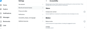
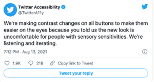
WCAG 2.1 Colour Contrast Validation for websites and e-learning (inc Education)
ISO 300171 DSE Colour Contrast Calibration Mitigating Vision Stress (Digital Literacy)
ISO 30415 Diversity and Inclusion Standard (Accessibility and Inclusion)
But enough of the problems and regulations, to the apps for the solutions!
(And a massive shout out to the folk that created them).
1) Screen readers.
Screen readers convert what’s on the screen to sound or braille, be those images, text, buttons, and so on and are most often used by vision-impaired people.
What many don’t realise is that screen readers can read faster than most humans.
According to Axess Lab, a Finish developer called Tuukka Ojala
set his reading speed to 450 words per minute. The average person reads at a rate of around 150 words per minute.
That’s quite the speed!
You’ve probably already noticed that you can speed up some podcasts and YouTube videos; well, now you can speed up reading your screen.
Why would you use one if you are not vision impaired?
If you want to read articles and don’t have the time, then a screen reader can increase the speed of ‘reading’ by reading it aloud to you at say twice the average rate – you get the information and you save time, and you could be doing other things simultaneously.
Axess Lab has created a fantastic resource explaining what a screen reader is, and they have a video showing one in action.
If you are considering a screen reader – this is the most recent review that we’ve found. From 2019, it compares 5 of the top screen readers.
2) Google Translate
You might consider this a bit of an odd one, as google translate is for languages other than our own, but is it?
On the app is an icon for sound. So, if you are unsure of how to pronounce a word, simply type it into google translate, press the sound icon, and the app will ‘speak’ the word correctly pronounced.
Why do we need to hear how a word is pronounced? Because we learn language through vision and sound.
Here’s an example.
A friend’s daughter can pronounce the name of THAT village in Wales.
How? Because she heard it repeated over and over again.
https://youtu.be/_3b2F-bkAdM ( and I bet you didn’t know the entire name was made up to be a tourist attraction?)
However – put medical terminology in front of the same girl and ask her to say it out loud? Not so easy!
According to an article in Scientific American, “we hear written words in our head.
Sound may have been the original vehicle for language, but writing allows us to create and understand words without it. Yet new research shows that sound remains a critical element of reading”.
Give it a try the next time you’re unsure of how a word is pronounced.
3) Dictation apps – voice to text
Dictation apps mean you speak while the computer/phone does the typing.
Using ASR – advanced speech recognition, they can be faster, easier, no clumsy fingers, no one finger typing, and you can concentrate on what you are trying to say, rather than figuring out where the letters are on the keyboard.
Great for people with dyslexia, reading and learning difficulties.
Great for replying to messages and emails when you are washing up – yes, looking at you, J!
Also great for people who wish they had a typist who could do it all for them.
These apps are also invaluable for people with RSI, arthritis, and physical disabilities, where typing can be uncomfortable or challenging.
Softwaretestinghelp.com have put together a comprehensive guide to the best dictation software out there, entirely up to date as of the 18th of October 2021. And yes, both Google docs and Apple have free software for this (in the top 3 according to the review).
4) Windows 11 accessibility
Windows 11 is gradually being rolled out, and according to their blog, it “is the most inclusively designed version of Windows.”
What will remain from Windows 10 are: Narrator, Magnifier, Closed Captions and Windows Speech Recognition.
What’s new? Microsoft boasts new sound schemes, including different sounds for Light and Dark Themes, combining vision and sound.
They’ve upgraded their colour contrast settings, so those with light sensitivity and people working for extended periods can enjoy different colour themes, including new Dark themes and what they call reimagined High Contrast Themes.
Closed Captions have been re-designed and are now easier to read and customise. In addition, windows Voice Typing uses state-of-the-art artificial intelligence to recognise speech, transcribe, and automatically punctuate the text.
As Windows 11 rollout is ongoing – we will await feedback from users, but what is fantastic is that accessibility is improving.
5) Display Screen Optimiser (DSO).
Compatible with Windows 10 and using innovations and discoveries from the world of dyslexia – the Display Screen Optimiser is there to help prevent screen fatigue (also known as computer eye strain or computer vision syndrome).
Spending hours online causes the following symptoms: Tired, dry eyes: double vision, headaches, blurred vision, and poor focus.
But you can mitigate these symptoms and the long-term harm they cause by changing the background colour of your screen.
What’s unique about the DSO is that it doesn’t rely upon you to choose a colour; instead, you need to take a 15 minute – admittedly challenging – reading test, and it finds the best-coloured background for you.
A few people have been surprised at the colour they needed – (deep purple or bright orange, anyone?) But they’ve also been pleasantly surprised at how less stressed they felt once they started using it.
See Jason’s testimony as a case in point. He spends hours staring at Excel spreadsheets every day, and the DSO has undoubtedly improved his energy and concentration.
This page talks you through the entire reading challenge and how to download the colour theme.
6) Enable Captions
There are two types of captions – closed captions and subtitles.
Closed captions were created to allow deaf and hard-of-hearing people to experience the video/movie/TV show, including background sounds and speaker changes.
Subtitles assume the viewer hears the audio and, as a result, do not highlight background sounds or speaker changes.
Most of us will see subtitles as we scroll through our various streaming subscriptions and on some social media, as it’s a clever way to see a snippet of the video without having to have the sound on. They’re also great to use if the person speaking has a voice that grates on your nerves!
Are they easy to enable??
Social media or streaming services have a settings option; usually a simple enable captions on/off button.
But what if you want to add captions to your videos?
Many find it challenging and tiring, and thankfully the days of having to write out that transcript in full have gone, as there are apps everywhere for this, from free to paid, and we’ve added a link to a top 5 review below.
Having captions enabled is a game-changer if you are hard of hearing or if there’s background noise, if the language spoken is not your first language, if you are in a noisy place, or perhaps you are somewhere where you need to be silent?
And putting them on your videos means your videos are more accessible for everyone, which means the reach will probably be further.
Here’s the review of 5 Best Android Apps, because yes – you can even do this now on your phone!
7) Keyboard and mouse.
These should probably come under the assistive technology label, but we have included them to help accessibility.
There are a plethora of keyboards available, and some of the ergonomic ones are intriguing.
Designed so there is barely any wrist movement, almost eliminating the risks of RSI. The linked post is a resource to show if a different type of keyboard would benefit you, even if just as a preventative measure.
Some keyboards are designed for vision issues, so the keys/letters are easier to see.
Then for the mouse, these too have had a radical re-design. Some look like the control of an RAF stealth bomber, designed to fit in with the human body and natural movements.
Unfortunately, the uber-cool and sleek mouse designs that come as standard can be devastating to the body if used long term.
Some more advanced pc users use their PCs with keystroke operations to limit mouse use, and some even write their own code for it!
8) Apple short cuts app: iPhone and iPad.
Creating shortcuts can be worth the time – if, on balance, they save you time, make your phone or iPad easier to use and result in personalisation for your specific needs.
In this video: https://youtu.be/U5MtSH60uEI Mathew Cassinelli walks you through shortcuts he’s made to his iPad, explaining some of the features available, e.g., brightness, white point, dark mode, text size, reducing motion, transparency and contrasts, and more.
There are so many features that can help with our day-to-day life; it’s just that many of us don’t know about them.
9) Apple Watch
Probably not the first accessibility tool to think about, as the screens are small, and one might think not easy to navigate or use, yet Apple watches come with accessibility built-in – here’s a quick rundown of how they can assist you.
• VoiceOver
• Zoom
• Grayscale
• On/Off Labels
• The X-Large watch face
• Text size
• Reduce motion
• Mono audio
• Taptic Engine provides a gentle tap on your wrist every time a notification comes in.
So, nine apps that barely scratch the surface of what’s out there to improve our lives but they are certainly a start.
All it takes is a little investigating, learning how to use them, and then the stress levels should start to fall as your life becomes just that little bit easier.