minus font size Text reset font size Size plus font size


Background
 
 
HIDE BARS

Twitter – helping or harming your eyesight?

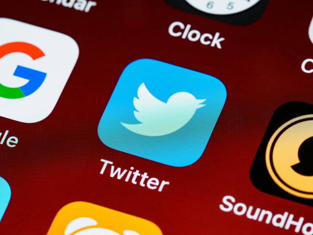
Twitter is like marmite – you either love it or hate it. But no matter where your personal opinions are,  Twitter has over 300 million active users a month, and last year (2020), it generated over $3.7 billion in revenue.

That’s a lot of eyeballs generating a lot of money.

So let’s look at the eyeballs and how twitter’s accessibility policy made the headlines during the summer.

In August 2021, and with much fanfare, Twitter announced accessibility changes to their platform with the idea that it would make Twitter more accessible.

Accessibility is the capacity for everybody to have access to something, regardless of any conditions they might have.”

They created their own font – cheesily called Chirp.

They also created higher contrast between text and background colours and reduced visual clutter.

These don’t sound much; they were welcomed by many and have provided a cleaner reading experience for some.

But if you have visual issues, these new changes prove challenging and highlight that websites can cause physical harm.

As Sheri Byrne-Haber wrote in her article for UXDesign.

  1. Animation and multimedia flashing can trigger epileptic seizures. Pseudoflashing (black and white optical illusions) that don’t actually move but appear to be moving can do the same. Someone who seizes might fall, which can cause a skull fracture. This is literally the only WCAG guideline where failing to follow it can result in someone’s death.
  2. Font changes and certain contrast can trigger eyestrain and headaches.
  3. Certain types of motion, such as parallax and optical illusions, can make some people motion sick. 

So what are the problems?

Twitter’s new font is said by many to be squished up, making it harder to read.

The stark contrast of black against white, instead of blue against white, is causing migraines in some users, and too much white space can be jarring on the eyes, again triggering pain.

Interestingly, this is not the first time Twitter has made attempts at accessibility.

In 2019, Twitter installed a new colour contrast button for high contrast – so only suitable for those with low and poor vision.

You can find it in settings.

Twitter
Twitter colour contrast control

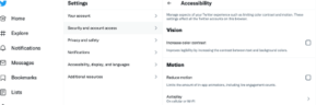
And it’s the colour contrast issues that we are concerned with and are highlighting because the colour contrast on Twitter has been changed for you – with no option to reduce it.

As the Verge stated: Accessibility isn’t one size fits all.

We describe in one of our blogs how colour contrast refers to the “tone, brightness and amount of text, images and background on a web page or website. So essentially, it’s looking at how easy is it to read regarding the colours, the fonts, and the background colours and images.

It’s important because:

“Colour contrast can help reduce the distortions of the printed word and can increase reading ease and speed.”

But as we know all too well here at ScreenRisk, colour contrast is very personal. What works well for one person will have others running out the door – as Twitter found out.

Looking through the media regarding the Twitter story, Verywell health online website wrote the following:

“While having high contrast between font and text can make it easier for people with low vision to read, some users with photosensitivity (including those who get migraines or tension headaches) have said that Twitter has made the contrast on the site so high that it’s triggering their symptoms.”

“They’ve effectively just transferred the issues with colour contrast to a new group of users, rather than resolving them,” Jessica James, an accessibility consultant at Erudite Agency, tells Verywell.

With revenue in the billions and over 300 million users a month,

Twitter has grown from a relatively small platform in 2010 with around 50 million users a month to where it is now. Their users will be diverse in many ways, which begs the question,  how did they get it so wrong? 

There are a couple of possibilities.

1) They are unaware of the level of users that have visual stress and disabilities.

In 2020, approximately 2.28 million individuals in the United Kingdom were classified as having moderate-severe vision loss, with around 171 thousand Brits registered blind.

6.3 million people in the UK have Dyslexia, and those stats are from 2017. Research shows that dyslexic people tend to read faster when presented with lower-contrast text.

8.5 million people in the UK have visions issues.

How many are using Twitter? Do Twitter even know?

2) They didn’t engage with or listen to the people that it would affect.

In  June 2020, journalist Devin Coldway wrote an article highlighting that Twitter didn’t have a dedicated disability/accessibility team.

In it, he quoted a team member that said, “volunteers behind accessibility at Twitter” were “frustrated and disappointed” at the lack of consideration for people with disabilities, prompting astonishment that there is no dedicated team. He clarified that they are paid employees (not outright volunteers) but that “the work we do is notionally on top of our regular roles.” So the work he and everyone else has done has essentially been in their spare time.”

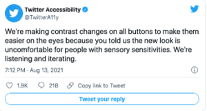
This article may have shamed the company into doing something because, in September of 2020, Twitter shared a blog post titled  Making Twitter more Accessible. They announced the creation of two new teams and highlighted their accessibility account @TwitterA11y.

 Twitter is not all bad.

According to one website – “Twitter far exceeds the minimum contrast standards set by the Web Content Accessibility Guidelines (WCAG), which provides recommendations for making websites accessible to disabled people”.

And they are making changes to the latest tweaking of colour contrast after customer feedback was so vocal.

Twitter image
Twitter reply to users

WCAG or Web Content Accessibility Guidelines are a set of guidelines seen as the benchmark for website accessibility. They look at improving access to websites for those with visual issues, who are deaf or hard of hearing and those with learning disabilities.

WCAG 2.1 regulations were designed to look at contrast ratio, especially the luminance or brightness between colours, and help those suffering from visual, auditory, physical, speech, cognitive, language, learning, and neurological disabilities access web content more readily.

(We have an entire page dedicated to digital accessibility where we explain the guidelines and  regulations) 

 To those campaigning for website accessibility, WCAG covers the basics, and they are merely guidelines.

The only companies that must follow them are governments and healthcare agencies,

However, for a virtual, private, or high street business, being WCAG compliant is not a necessity.

 Twitter doesn’t have to follow any of them, that they do is testimony to them.

But what this entire situation has highlighted is that accessibility is not one size fits all, that we are all diverse, unique and have our own struggles, and one of the tech giants could, if they so choose, make huge strides with accessibility on their platform.

The question is – will they?

Is your office lighting losing you money?

Poor lighting, flickering lights, too bright, too dim, these all impact our well-being and the company bottom line.

But it’s a surprisingly easy thing to fix.

What is poor lighting?

When we think of poor lighting, we think of dimly lit rooms, even semi-darkness, but a space that’s too bright also qualifies as being poorly lit.

Throw unevenly distributed and or flickering lights into the mix, combine that with the flickering of digital display screens, and together they create a ‘doppler effect’, a well-known hazard in the workplace.

In 2012, Health and Safety International produced an in-depth article related to eye health in the workplace.

The report highlighted a list of factors, and the ability to see well at work depends not only on lighting but also on:

      • The time to focus on an object; fast-moving objects are hard to see
      • The size of an object; very small objects are hard to see
      • Brightness: too high or too low. Reflected light makes objects hard to see
      • Contrast between an object and its immediate background; too little contrast makes it hard to distinguish an object from the background
      • Insufficient light – not enough light for the need
      • Glare – too much light for the need
      • Suboptimal contrast
      • Unequal and poorly distributed light
      • Flicker Poor lighting can cause several problems, such as misjudging the position, shape or speed of an object can lead to accidents and injury
      • Poor lighting can affect the quality of work, particularly in a situation where precision is required, and overall productivity
      • Poor lighting can be a health hazard – too much or too little light strains eyes and may cause eye irritation and headaches

Optimizing the amount of natural light in an office significantly improves health and wellness among workers, leading to gains in productivity.”

Most papers refer to commercial productivity when looking into office lighting, which is understandable as we work to be productive.

But as we are a company concerned with eye health, we want to look a little closer at the effects lighting has on the eyes.

The studies that looked at ocular health found that poor lighting affects the degree of fatigue on the eyes and overall health.

Workers in office environments with optimized natural light reported an 84 per cent drop in symptoms of eyestrain, headaches, and blurred vision symptoms, which often result from prolonged computer and device use at work and can detract from productivity.


The impact of lighting has been documented for hundreds of years in educational establishments, but aren’t offices similar to classrooms? Shouldn’t the lighting be treated in the same way?

There you are in class, sitting in rows, at a desk. There you are in an office, sitting in cubicles, at a desk.  Each situation involves concentration and reading/writing; both probably have sub-optimal lighting.

But let’s first indulge in some lighting talk.

Fluorescent lighting and compact fluorescent light bulbs (an energy-saving version of the former) are familiar to many of us from school and work.

Both are known to cause vision stress, eye strain, dry eyes, double vision, headaches, poor concentration, and increased error rates.

This is due to their production of an artificial source of ultraviolet (not Blue) light known to cause cataracts and macular degeneration, which is why there is now a push towards LED lighting in addition to their energy-saving qualities.

Fluorescent lights may be an old and well-known technology, yet they contain mercury, age significantly when turned on and off (probably why offices leave them running all night – environmental impact anyone?), and are omnidirectional, so the light goes everywhere. Not always the best solution for your eyes.

On the other hand, LEDs have a long life span, are energy efficient, provide high light quality, can easily be directed, and have low maintenance. Plus, you can turn them off without worry if this will kill the bulbs.

The ‘temperature’ of the light is another factor. Warmer light with more of a yellow/orange hue is better for the evening, allowing us to relax and wind down. Office lights are generally ‘cooler’ to help keep us more focused.

Indeed, anglepoise lamp manufacturers are now jumping on the working from the home bandwagon, suggesting ‘warmer’ lighting alongside the daylight from a window, and why not? Lighting in the home office is just as important as the work office.

The window company Velux is now heavily involved in research. As they state on their website, they “are committed to taking a leading role within the building industry to create better environments for working, living and learning”.

Whether an office’s light source is natural, artificial, bright and blue, or dim and yellow, the type of light that employees are exposed to not only impacts mood, circadian rhythms, and physical health but also affects productivity and creativity

The political football

When looking at the lighting in schools, the focus tends to be on mood and concentration, academic performance, and alertness.

Eye strain is barely mentioned, with one website stating that reading in dim light merely tires the eyes but doesn’t cause lasting damage. However, Dr Richard Hobday, PhD, Engineer, and author of The Light Solution, is convinced that poor lighting in schools is triggering myopia, short-sightedness.

A hundred years ago, school designers knew poor lighting caused myopia. Still, in the 1960s, myopia was dismissed as a genetic or inherited condition and had nothing to do with illumination or close-up work.

Currently, myopia is attributed to too much indoor near or close up work, the school environment and lack of outdoor time. Also, in the digital age,  exacerbated by too many hours scrolling on the smartphone.

Hobday writes, “At the beginning of the last century, high levels of daylight in classrooms were one of several measures thought to prevent myopia, and some eye specialists campaigned for what they referred to as ‘ocular hygiene’ in schools. They stated that children had to learn how to see properly, without straining their eyes, if they were to preserve their eyesight.”

Indeed, a recent pilot study from China found that schoolchildren and teachers prefer brightly lit classrooms that reflect more natural daylight. Why mention China? Asia is currently experiencing a myopia rate of 80% in their children.

The solution

Humans have known for hundreds of years that levels of lighting are essential. We know poor lighting is not only responsible for deteriorating eyesight (yes, Granny was right!), but it’s also responsible for fatigue, low productivity, and a decline in wellness.

We receive 85% of our information through our sense of sight.

Therefore, we need optimal lighting in the office and at home. In addition, we need to mitigate the effects of poor lighting and staring at a screen all day.

Optimal lighting is 300-500 lumens.

Lumens (denoted by lm) measure the total amount of visible light (to the human eye) from a lamp or light source. The higher the lumen rating, the “brighter” the lamp will appear.

Whether working from home or in the office, we need lighting adjusted and moved to suit our needs.

Adjusting office lighting and installing systems and features to protect our eyesight will achieve two things.

  • Reduce the levels of visual stress and binocular eye strain.
  • Reduce levels of fatigue and improve levels of productivity.

To conclude: Reduce flickering lights, reduce flickering computer screens,  and invest in a reasonably adjustable LED lighting system. Follow the HSE guidelines and regulations for office workstations and invest in a DSO to prevent screen fatigue.

Much the same way you’d adjust to driving a new car.   The first ergonomic thing you do in a strange vehicle is to change your seat so you can reach the controls safely and make yourself comfortable to reduce stress.  Then you adjust mirrors and find out where the indicator and windshield wiper controls are.

Adjusting the lighting in the home/work office is just as important.

What can I do when ‘don’t do as I do, do as I say’ is dismissed by my children, as clearly, I’m spending as long on screen as they are?

Hmm, good question.

Years before covid arrived on our shores, the WHO classified a global pandemic of a different kind.

One of Display screen users’ 3D vision loss.

A few years later, in 2018, regulations were released to help mitigate this 3D vision loss, in the guise of WCAG 2.1 Colour Contrast Validation Standard for e-learning & websites. (HSE RR5612007)

It was created to recognise the 2007 statistics of 58% of those using digital display screens in the workplace presenting with a range of visual and physical repetitive stress injuries, often referred to as MSD’S – Musculo-Skeletal Disorders.

In 2020, MSD’s which are conditions affecting muscles, nerves, tendons, joints, cartilage and spinal discs, often caused by repetitive stress injuries and adaptations, often caused by manual handling and Display Screen Equipment use – have persisted as the second highest cause of ill health’.

The number of children now presenting with 3D vision loss has skyrocketed and is linked to overexposure to the near and close up, prolonged periods of display screen use, coupled with lack of time outside in natural daylight.

So, it’s not without reason that wellness and health experts are screaming at you to put your phone down, your laptop away and “disconnect” and want you to do the same for your kids.

No one anticipated the 2020/21 pandemic and how that would increase screentime.

Yet here we are, and still today, no one in ‘power’ mentions the pandemic is increasingly disrupting children’s eyesight, in effect mirroring the visual repetitive stress injuries seen in the workplace.

We know the addiction to social media is endemic (it’s designed to be).  Netflix got many of us through lockdowns, and zoom was essential for family contact and work. But what if reducing screentime or exposure control is not an option?

We’ve all read the articles about reducing screen time for your children, but what do you do when life is lived online or through a screen, and you can’t reasonably reduce the amount of time online?

According to a recent study, the incidence of ocular problems has dramatically increased in line with the continuous rise in digital media consumption.

An estimated 49.8% (4.8 billion) and 9.8% (0.9 billion) of the global population will have myopia or high myopia.

Myopia is short-sightedness. But it’s more than simply wearing glasses because distant objects appear blurred. It’s also about distance and depth perception.

Which impacts the way we live our lives.

It’s not able to see loved ones faces at a distance. Driving becomes more challenging, and navigating life becomes more difficult and expensive due to eye checks every year.

But children were learning online before 2020, and with digital literacy programmes sponsored by Apple, computers have been steadily making their way into schools. Then, with the pandemic, online schooling became the norm.

Preschool? Screentime is there, too, with a third of preschool toddlers having their own tablet.

UK  children spend an average of 23 hours a week online or looking at a screen.

UK adults spend over 5 hours a day – and we don’t believe this solely refers to the time at work.

Digital display screens are here to stay, so we need to become savvy about mitigating the harms they do because exposure control alone, limiting time online, is challenging.

So, we won’t tell you to get your kids off their screens. Instead, we will give you the information to make informed decisions for yourself and your children.

The Eye Science of fatigue is similar to sleep fatigue in terms of triggering the HPA Axis of hormones directly linked to stimulating our stress responses.

This means it activates the survival fight, flight or freeze reactions to a real or perceived threat.

In adults, this activation can result in cyclical behaviour.

For example, knowing you can’t reduce the stressors/fatigue related irritability in the workplace, you go home in a mood, too often self-medicate, unwind while still over-stimulated by staying on-screen, and then can’t sleep—the cycle repeats.

Translate this behaviour to children, and they come home moody, slump in front of the pc, and stay up watching videos or playing video games, messaging friends, and can’t sleep.  The cycle repeats.

So how do you do best for your child, knowing they will be online for most of the working week and that it impacts their physical, mental and emotional health?

With less than a couple of weeks to go before it’s ‘back to school’, the first step is to be aware of the school environment and policies regarding screens.

Talk to the school – do they have a policy regarding phone use?
  • Is there one for the amount of online time allowed per session, per day?
  • Do they have enforced vision breaks every 20 minutes?
  • Are they aware of calibrating digital display screens to reduce vision stress and eye strain?
  • Do they know how to make reasonable adjustments – e.g. re-calibrate Screen Colour Contrast, increase the font size, avoid glare and/or ask for help to access accessibility features?
  • Ask too about their school accessibility policy and whether they actually have an Accessibility Statement. For example, do they have a policy of complying with Accessibility Regulations for e-learning and digital display screens? (Spoiler: it’s been over two years since introduced so they should be compliant).
  • Are they compliant with sufficient ambient lighting policies surrounding day and/or supplemental artificial work-lighting, and are the display screen positioned so free from glare?

The aim is to reduce the eye fatigue that leads to general fatigue and the cycle outlined above.

Kids use their phones in school, and they use PC’s – so teach them how to adjust the screen brightness to reduce glare. The glare from an overhead light or screen makes it much harder for our eyes to focus, which cause the eye muscles to become tired as they overwork – much like doing too many reps at the gym.

Laptops, again if it belongs to your child, adjust the screen performance – the brightness, font and text size to suit them, and of course, get them their own personal DSO themed background colour that reduces the colour contrast.

The DSO reduces fatigue and mitigates against the likes of screen fatigue, which will impact their learning.

We have an entire page dedicated to mitigating the risks of digital display screens, plus a post that outlines 14 quick and easy things you can do today.

Of course, reducing time online is essential; using the 20-20-20 rule of after 20 minutes look away for 20 seconds, at something 20 feet away is a must, perhaps you could pass this onto your kid’s school too?

Schools will have a lot o their plates in 2021,  the attainment gap is widening, and some now say children from more deprived areas are a good 22 months behind their more affluent peers. However, further damaging eyesight and increasing stress for children due to poorly calibrated screens don’t need to be part of the issue.

If you’ve reached this far, this video might be worth your time.  We are addicted to our smartphones; we miss out on human interaction when we’re online, and perhaps we can all benefit from turning off the devices now and then?

Ultimately, it’s the human interaction, interpersonal relationships in person or on-screen that is essential for children’s inclusion, growth, learning and development, not their smartphones.

Why your digital display screen should come with a safety warning.

The current understanding is that screen fatigue/computer vision syndrome is temporary. You give your eyes a rest, pop in a few drops, they recover, you carry on.

However, we know millions throughout the ages have ruined their eyesight due to what we call ‘working with the near and close up’, which can be interpreted as reading a book, writing, or working on a digital display screen, hour after hour, day after day.

Dante, the Italian poet, writer and philosopher, who lived from 1256 to 1321 suffered from Myopia (short-sightedness), which he put down to working with the near and close up.

Probably in a dark room lit by candlelight.

Well, too much brightness we believe can do the same damage, and we are also of the opinion that screen fatigue will have an accumulative effect, much like the near and close up work, and could result in worsening eyesight.

(We have a White Paper all about this )

We firmly believe that digital display screens should come with a product warning for your eyesight.

A quick Google search for safety requirements for digital screens comes back, rather interestingly, with a list of articles about digital signage… with titles such as – How can digital signage improve Health and Safety in the workplace?

Not what we were looking for.

So, another search term and another try, and we hit the Health and Safety blurb, this time about laptops and as they have digital screens, we took a look.

And yes, here we go –Unison, a UK Union have created documentation for safe laptop use:

They found:

  • 89% of those who suffered headaches also suffered eyestrain
  • 81% of those who suffered back pain also suffered eyestrain
  • 80% of those who suffered back pain also suffered headaches
  • 79% of those who suffered back pain also suffered neck pain
  • 69% of those who suffered back pain also suffered pain in arms and hands.

Working with a digital display screen is not too healthy it would seem.

The hazards are discussed, there is advice against theft and violence, plenty about work-related stress, with a  checklist.  Tucked in there is this:

“Are users provided with eye tests and glasses where needed? This is important because of working directives: The law says employers must arrange an eye test for display screen equipment (DSE) users if they ask for one and provide glasses if an employee needs them only for DSE use.”

A tacit admission that DSE work is hard on the eyes?

The Health and Safety Executive UK  state :

DSE work does not cause permanent damage to the eyes. But long spells of DSE work can lead to:

  • tired eyes
  • discomfort
  • temporary short-sightedness
  • headaches

Yet we know overworking muscles can lead to long term and persistent damage. RSI of the wrists/carpal tunnel syndrome is a case in point.

We can find nothing about adjusting the laptop for the individuals eyes apart from the odd blog post. And this is something that drives us a little bit insane, because it is one of the easiest and efficient things to do when it comes to eye care, and everyone should know that they need to do it.

We suggest this is actually a safety issue.

Product safety “is the ability of a product to be safe for intended use, as determined when evaluated against a set of established rules.

“The legislation sets out clear test and documentary requirements that manufacturers and distributors placing equipment on the European market, must follow to demonstrate that their products meet defined safety criteria and are safe for the intended use. “

How does this relate to the laptop/digital display screen user?

If you use a digital device and you are NOT made aware of the possible harms that could arise from long term use, this will become a problem for you, your employer and the manufacturer. But the onus will probably land on you.

Admittedly this is a grey area.  In the USA where suing is the ‘thing,’ there are now thousands of court cases against websites for not being accessible enough. Employees are taking employers to court for lack of care in this area because they are noticing the harms of working long hours with DSE.

Post-COVID digital eye strain is becoming a genuine issue.

Next stop – Microsoft and their product safety warnings online.

And  almost at the bottom of a very long page is this:

“Good binocular vision is required to view stereoscopic 3D content. Consider consulting an eye doctor if you are not able to view the 3D effect clearly and comfortably. HoloLens can be worn over most glasses and used with contact lenses. If you have a pre-existing vision disorder, please consult a doctor before using HoloLens. A small percentage of people have a pre-existing vision disorder that may be aggravated when using HoloLens.”

However, HoloLens are mixed reality smartglasses – so not screens then.

Nothing about computer vision syndrome/screen fatigue that we can find in the safety literature.

If you can find it, please do let us know, as we would be delighted to see it.  

We have found nothing in the safety requirements about adjusting the brightness of the screen, nothing about taking breaks, nothing about looking after your vision when working/using a digital display screen.

Should this advice be included?

Knowing what we know now, we believe very much that it should.

It should be one of the first things that you do when you get a new phone, tablet, laptop or PC. You go in and adjust the screen and settings to accommodate your eyesight because if you don’t, you could be open to harm.

Regulations set out to try and mitigate the harms of screen fatigue/computer vision syndrome, but how many know about them?

Compliance with WCAG, particularly ISO 30071.1 DSE Accessibility Regulations, Colour Contrast Validation & Calibration respectively, is required as a reasonable adjustment to prevent and/or mitigate to some degree, the highly predictable risk of Computer Vision Syndrome and/or Screen Fatigue, that results in “visual repetitive stress injuries” (WHO ICD-10), as a direct result of DSE operators under pressure to carry on regardless, which can and does result in presenteeism.

Our founder, Nigel Dupree has said, regarding this very issue:

“So, unless I am clearly deluded, this is a predictable and known “DSE Product Safety issue” and, expediently ignoring occupational health regulations and omitting to be compliant with enabling employees to make reasonable adjustments is negligence.”

There is little to nothing about eyesight care in the safety instructions that we can find. Plenty about overheating, locking it away and musculoskeletal issues – but hardly anything about eyesight.

Yet it is our eyes that do the majority of the work when using a digital display screen.

Here’s what you need to do:

Adjust the screen brightness.

Change the size of the font.

Modify the browser setting so that you can read websites with ease.

Use our colour contrast validation tool that optimises your screen and decreases the excitation in your brain, and thereby helps to restore good binocular vision.

We give a very detailed explanation about this in our White Paper – here’s a brief excerpt:

Binocular Vision disorders arise when the eyes target and focus on different places, the brain is then left to process or interpret conflicting images. If it is unable to fuse them together as a single stereoscopic image when faced with these two separate images, the brain compensates by suppressing one image, fully or partially. This is known as suppression or binocular rivalry driving monocular adaptation.

When reading, these issues present as word displacement, reversal of letters and words, shadowing in the spaces between words, or just alphabet soup.

Binocular vision(BV) disorder can be a condition present from birth but can also be caused by injury or trauma to the head, brain damage or stroke and is also well documented as being caused by headaches, anxiety, and other stressors.

Issues related to BV disorder, as with myopia, are amblyopia and strabismus: all are caused by muscle fatigue, an imbalance between eye muscles, or weakness and potential habitual eye-turns designed to reduce the stress of sustaining 3D vision.

Basically, our eyes are not meant to look at screens that are full of stripes, vertical and horizontal lines, harsh colour contrast and flashing images. These excite, possibly too much the areas of the brain to do with vision.

Research has shown that having an individualised colour contrast background soothes the excitation, is easier on the eyes and makes the entire experience of working with a digital screen more pleasant.  People find it easier to read and presenteeism is reduced or banished.

Taking the steps outlined above will reduce your risks of computer vision syndrome and will save your eyesight as time marches on.

We believe all digital display screens should arrive, as standard with a manual on how to mitigate the effects of computer vision syndrome and have an individual colour contrast option as standard.

Do you know someone like Giselle?

Image for Giselle

She spent her early years in special schools simply because she wasn’t enabled to read.

She was labelled with so many acronyms it made your head spin.

Special Educational Needs, Learning Disability,  and Dyslexic. (ADHD, SEN, SpLD and more…).

Effectively excluded from learning yet her dream was to run her own business.

She started saving her pocket money, then her wages until she bought a business and within five years had paid off the mortgage and owned the building outright, plus the stock.

Giselle didn’t let her eyesight stop her, but think how much easier it would have been had she not seen text like a dollop of alphabet spaghetti?

One day she met Nigel who noticed her unstable binocular vision. He said, “I might be able to do something about that if you are up for it?”, and she said yes.

Giselle tried his Binocular Eye-Trace Kit and, sure enough after a few seconds her eyes were struggling to sustain “convergence and accommodation”, (making sense of the words) on-screen.

Her eyes were back-tracking and re-reading to make sense of the sample passage yet, when the screen background or “Colour Contrast” was customised for her, her reading rate went from 145 words per minute to a fluent 280 words per minute.

Needless to say, this was very emotional for her.

30% of children in the 21st Century are now at risk of eye-strain. You might be, if you notice at the end of the day your eyes are tired from staring at a screen.

If all children are to become functionally literate and fully participate in text-based life-long learning in the digital age, one that’s increasingly dependent on e-learning both during COVID-19 and post COVID-19, they need to have the right tools!

Colour contrast validation is one of those tools.

Find out more our Display Screen Optimiser and the charity work we do to help others that are dismissed as acronyms, where in reality, they simply needed better tools to help them read…

Is eyesight affected by computers?

Quora Answer to: Does eyesight get affected through the PC? My mother says it was not inherited from her…

…Go to original article

Screenshot of www.quora.com

Quora Answer to: Does eyesight get affected through the PC? My mother says it was not inherited from her as she only got bad eyesight from after my birth. Is computer usage one of the problems?

…Go to original article