Twitter is like marmite – you either love it or hate it. But no matter where your personal opinions are, Twitter has over 300 million active users a month, and last year (2020), it generated over $3.7 billion in revenue.
That’s a lot of eyeballs generating a lot of money.
So let’s look at the eyeballs and how twitter’s accessibility policy made the headlines during the summer.
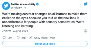
In August 2021, and with much fanfare, Twitter announced accessibility changes to their platform with the idea that it would make Twitter more accessible.
“Accessibility is the capacity for everybody to have access to something, regardless of any conditions they might have.”
They created their own font – cheesily called Chirp.
They also created higher contrast between text and background colours and reduced visual clutter.
These don’t sound much; they were welcomed by many and have provided a cleaner reading experience for some.
But if you have visual issues, these new changes prove challenging and highlight that websites can cause physical harm.
As Sheri Byrne-Haber wrote in her article for UXDesign.
- Animation and multimedia flashing can trigger epileptic seizures. Pseudoflashing (black and white optical illusions) that don’t actually move but appear to be moving can do the same. Someone who seizes might fall, which can cause a skull fracture. This is literally the only WCAG guideline where failing to follow it can result in someone’s death.
- Font changes and certain contrast can trigger eyestrain and headaches.
- Certain types of motion, such as parallax and optical illusions, can make some people motion sick.
So what are the problems?
Twitter’s new font is said by many to be squished up, making it harder to read.
The stark contrast of black against white, instead of blue against white, is causing migraines in some users, and too much white space can be jarring on the eyes, again triggering pain.
Interestingly, this is not the first time Twitter has made attempts at accessibility.
In 2019, Twitter installed a new colour contrast button for high contrast – so only suitable for those with low and poor vision.
You can find it in settings.

And it’s the colour contrast issues that we are concerned with and are highlighting because the colour contrast on Twitter has been changed for you – with no option to reduce it.
As the Verge stated: Accessibility isn’t one size fits all.
We describe in one of our blogs how colour contrast refers to the “tone, brightness and amount of text, images and background on a web page or website. So essentially, it’s looking at how easy is it to read regarding the colours, the fonts, and the background colours and images.
It’s important because:
“Colour contrast can help reduce the distortions of the printed word and can increase reading ease and speed.”
But as we know all too well here at ScreenRisk, colour contrast is very personal. What works well for one person will have others running out the door – as Twitter found out.
Looking through the media regarding the Twitter story, Verywell health online website wrote the following:
“While having high contrast between font and text can make it easier for people with low vision to read, some users with photosensitivity (including those who get migraines or tension headaches) have said that Twitter has made the contrast on the site so high that it’s triggering their symptoms.”
“They’ve effectively just transferred the issues with colour contrast to a new group of users, rather than resolving them,” Jessica James, an accessibility consultant at Erudite Agency, tells Verywell.
With revenue in the billions and over 300 million users a month,
Twitter has grown from a relatively small platform in 2010 with around 50 million users a month to where it is now. Their users will be diverse in many ways, which begs the question, how did they get it so wrong?
There are a couple of possibilities.
1) They are unaware of the level of users that have visual stress and disabilities.
In 2020, approximately 2.28 million individuals in the United Kingdom were classified as having moderate-severe vision loss, with around 171 thousand Brits registered blind.
6.3 million people in the UK have Dyslexia, and those stats are from 2017. Research shows that dyslexic people tend to read faster when presented with lower-contrast text.
8.5 million people in the UK have visions issues.
How many are using Twitter? Do Twitter even know?
2) They didn’t engage with or listen to the people that it would affect.
In June 2020, journalist Devin Coldway wrote an article highlighting that Twitter didn’t have a dedicated disability/accessibility team.
In it, he quoted a team member that said, “volunteers behind accessibility at Twitter” were “frustrated and disappointed” at the lack of consideration for people with disabilities, prompting astonishment that there is no dedicated team. He clarified that they are paid employees (not outright volunteers) but that “the work we do is notionally on top of our regular roles.” So the work he and everyone else has done has essentially been in their spare time.”
This article may have shamed the company into doing something because, in September of 2020, Twitter shared a blog post titled Making Twitter more Accessible. They announced the creation of two new teams and highlighted their accessibility account @TwitterA11y.
Twitter is not all bad.
According to one website – “Twitter far exceeds the minimum contrast standards set by the Web Content Accessibility Guidelines (WCAG), which provides recommendations for making websites accessible to disabled people”.
And they are making changes to the latest tweaking of colour contrast after customer feedback was so vocal.

WCAG or Web Content Accessibility Guidelines are a set of guidelines seen as the benchmark for website accessibility. They look at improving access to websites for those with visual issues, who are deaf or hard of hearing and those with learning disabilities.
WCAG 2.1 regulations were designed to look at contrast ratio, especially the luminance or brightness between colours, and help those suffering from visual, auditory, physical, speech, cognitive, language, learning, and neurological disabilities access web content more readily.
(We have an entire page dedicated to digital accessibility where we explain the guidelines and regulations)
To those campaigning for website accessibility, WCAG covers the basics, and they are merely guidelines.
The only companies that must follow them are governments and healthcare agencies,
“However, for a virtual, private, or high street business, being WCAG compliant is not a necessity.“
Twitter doesn’t have to follow any of them, that they do is testimony to them.
But what this entire situation has highlighted is that accessibility is not one size fits all, that we are all diverse, unique and have our own struggles, and one of the tech giants could, if they so choose, make huge strides with accessibility on their platform.
The question is – will they?
 Text
Text 

