minus font size Text reset font size Size plus font size


Background
 
 
HIDE BARS

What on earth does display screen optimisation have to do with colour therapy?

In a world where ever-increasing hours are spent on display screens of all shapes and sizes, it seemed odd that they all deliver text in black on a white background.

This is why we need to look at colour therapy.

Is it bottles of two-toned colours lined up on shelves in a holistic clinic?

Perhaps it’s interior design for institutions to modify behaviour?

It’s actually related to your health, and more specifically your eyesight.

The ancient Egyptians were using colour therapy back in 3100BC.  The Greeks built solariums for it, and practitioners of the Ayurveda medical system will be well versed in it.

Yet it is a relative newcomer to the west, (some say around 1916) and is still treated with a degree of scepticism.

However, by 1941 colour therapy was becoming more popular, and today, there is an active College of Syntonic Optometry that’s been operating since 1933, with researchers discovering over the last 100 years just how colour impacts your health.

Alongside this, doctors have been gaining more insight into the Autonomic Nervous System (ANS) and how an imbalance within it could be the cause of most diseases.

Together, they’ve discovered that colour can correct the imbalance. (That was where we started when we thought up the idea of display screen optimisation).

So, what is colour therapy, and what relevance does it have to your health?

Firstly, colour therapy is yet another methodology and proven science that underpins our work and the mechanisms behind the Display Screen Optimiser (DSO).

This post aims to explain why we urge you, via the DSO to use a background colour, that is unique to you when using Microsoft applications.

The academic name for colour therapy is syntonic phototherapy.

 Syntonics or optometric phototherapy is the branch of ocular science dealing with the application of selected light frequencies through the eyes.

It has been used clinically for over 70 years in the field of optometry with continued success in the treatment of visual dysfunctions, including strabismus (eye turns), amblyopia (lazy eye), focusing and convergence problems, learning disorders, and the after-effects of stress and trauma”.

By studying how the human body reacts and interacts with colour, we now know certain colours calm what can be an overexcited, or exhausted visual system.

Examples: green is considered restful, while blue is considered peaceful, and we can even detect these colours through our skin.

Note: (A fair part of the information shared in this post is taken from this article written by Raymond Gottlieb, O.D PhD.)

Gottlieb describes light as a healing agent.

Noncoherent, nonpolarized, non-narrowband light, is delivered into the eyes to treat visual dysfunctions, brain injury, headache, strabismus, eye pathology, learning disabilities and mood”.

As described by  the Optometrist network  website,

Coloured filter goggles are placed on the eyes for the duration of the light therapy treatment— usually up to 10 minutes (our note: some say it can be up to 20 minutes). The filter colour applied to the goggles is determined based on the presenting visual problem.

Why use the eyes if we can ‘see’ colour through our skin?

The eye is one area of the body where blood is directly exposed to daylight.

The light/colour therapy utilises this area to irradiate (as in to illuminate – shine a light), which in turn relaxes the blood vessel walls, increasing blood flow and reducing hypoxia (low oxygen).

Haemoglobin is similar to chlorophyll in structure, and both are reversibly altered by light”.

What appears to be happening is that the light, by reducing hypoxia, influences oxygen-carbon dioxide exchange, vasodilation, neurotransmission, oxidation, inflammation and other basic physiological functions.

Syntonics, Gottlieb believes, may work through the eye by optimising the above and our internal bodily rhythms.

He writes, “Multiple physiological rhythms are vital to the health and functioning of the organism.”  By rebalancing these, we restore health.

This post gives a very simplistic explanation of how colour therapy works.
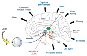
Hand drawn image showing how light enters the brain and affects the body
Light and the brain and body

Image from: pointsdevue.com

In a nutshell: a specific-coloured light, shone in the eyes for a prescribed amount of time, calms the autonomic nervous system.

This rebalances bodily rhythms that are out of kilter, and therefore restores harmony to the body, which then positively affects health.

(Can you see now what we are doing with the DSO?)

Some of the benefits noted from syntonic phototherapy are:

Improved visual attention

Increased energy

better sleep and reduced eye strain.

Syntonic phototherapy is especially helpful with visual problems.

Myopia, treated in Russia, used low-intensity red and infrared light, for 6 minutes per eye on 10 consecutive days.

In a more recent study, involving 264 children aged 8 to 13 years, where the researchers concluded:

“Repeated low-level red-light therapy is a promising alternative treatment for myopia control in children with good user acceptability and no documented functional or structural damage”.

This leads us to Physics and vibrational frequencies, and the ‘how’ of colour therapy.

Colour is simply light of different wavelengths and frequencies.

It’s made from photons, and we see the visible spectrum made up of 7 colours.
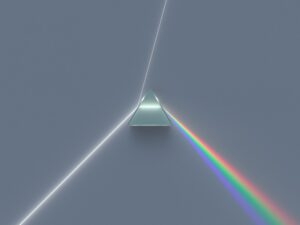
Light through a prism

Image from byjus.com

Each colour has its own frequency and wavelength, measured in waves per second.  Counting the number of waves determines the frequency.
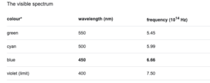
Vibrational frequency of colours
Chart showing the vibrational frequency of colours

Image from: Britannica.com

You have probably heard the phrase everything is energy, and indeed we are energetic beings, that also emit vibrational frequencies.

“If you want to find the secrets of the universe, think in terms of energy, frequency and vibration”.

Nikola Tesla (1942)

A body out of balance affects the autonomic nervous system,  so affecting your “frequency “.

As the Scientific American magazine writes, “The Hippies Were Right: It’s All About Vibrations, Man!”

Therapists believe that colour frequencies and vibrations can harmonise and rebalance the frequencies and vibrations of the body.

Knowing and understanding the theory behind colour therapy,  we developed our unique software (DSO) that chooses, objectively, the optimal colour for your visual system when working on screen to balance it,  ensure it doesn’t become overexcited, exhausted and throw you off balance and into computer vision syndrome/screen fatigue.

To find out your optimal and unique colour, take our reading challenge and then download your tailor-made theme.

Every individual has their own optimal screen background colour which calms the visual system and helps to restore convergence, visual stability, and stereoscopic vision.

Resulting in greater comfort reading text on the screen.

9 FAQ’s re the effects screens have on your eyes.

Double vision after time on screen?  

To understand why this happens, we need to look at Binocular vision.

Binocular vision occurs when using two eyes with overlapping fields of view, allowing for good depth perception.

It allows us to see in 3D which is vital for coordination and hand-eye skills.

Depth perception is incredibly important (you wouldn’t be able to catch a ball without it), plus the fusing of two images gives us a wider view.  One eye can give us roughly a 130-degree field of vision. With two eyes, we can see 180 degrees.

However, digital display screens make the eyes work hard.

It’s like a gym session that lasts the entire time you are on screen.  This tires out the eye muscles that are involved with binocular vision, to the degree that the binocular vision stops working as well, hence the tired eyes and double vision.


Tired eyes after scrolling?

Let’s look a little more at those poor muscles we mentioned when describing binocular vision.  

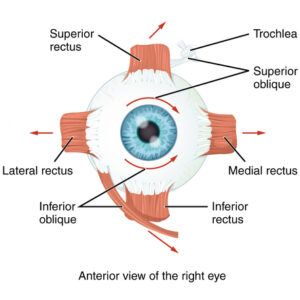
 The eye muscles involved in reading and writing are called the extra-ocular muscles.

There are six extraocular muscles.


The contributions of the six extraocular muscles are to vertical and horizontal eye movements. Horizontal movements are mediated by the medial and lateral rectus muscles, while vertical movements are mediated by the superior and inferior rectus and the superior and inferior oblique muscle groups.


Every movement that your eye makes, be that looking up from keyboard to screen, looking from one side of the screen to the other, these muscles are responsible.

And, as we’ve already mentioned, looking at a screen for longer than you should, tires out these muscles, leading to screen fatigue – dry eyes, blurred vision, double vision ( as mentioned above), and headaches.

image of the extra ocular eye muscles
Eye muscles


Asthenopia. What does this word mean?

It means eye strain. It’s the medical name used in Ophthalmology to describe the fatigue or tiring of the eyes, usually characterized by discomfort, dimness of vision, and headache, caused by overuse of the visual organs, dysfunction of the ocular muscles, and incorrect refraction.

You will see it referred to a lot in articles about computer eye strain, and it involves those muscles we’ve just mentioned.


Is my bright screen damaging my eyes?

In a nutshell, yes.

From one of our blog posts:

“ (eyesight) is effectively disabled by “Glare”. Think of how you screw up your eyes and want to look away at bright headlights in the dark.

If there is also a flickering light which can trigger photophobic reactions, or very high contrast and/or very low contrast that causes discomfort,  this prompts visual stress with avoidance strategies such as looking away,  and natural “adaptations” due to eyestrain will appear.

They must, as your body is trying to defend itself. The warning signals of this will be loud and clear – pain, headaches, blurry or worse double vision, dizziness, migraine, even nausea and vomiting”.

We know more now since the pandemic started, but this quote is from TIME magazine in 2014.

Dunaief says. “There’s evidence that bright light can damage your retinas irreversibly. That might mean staring at a computer screen that is very bright could damage your eyes.” He says there’s also some experimental evidence indicating regular exposure to computer-strength light could be damaging in similar ways.

We firmly believe your digital display screen should come with a warning. 


Why do some colours hurt my eyes?

The human eye evolved in nature and is perfectly suited to looking at it and its natural colours. That we can apparently see over 4 million colours  ( some sites say over 7 million), is another interesting fact. But there are colours that  will make some of us look away in discomfort,

This post from social media is a case in point:

I don’t like bright or flashy colours. I just despise these colours with a strange passion. These colours hurt my eyes every time I look at them.

Pure lemon yellow is said to be the most fatiguing colour.

Why?

It’s all down to physics and the wavelengths of different colours and how your visual system interprets them.

Again, this is well known, as these two websites show.

 Worst colour combination for designers and this one,

 Eye pain pallet Please do NOT look at it if you know that bright, neon colours cause you visual pain/stress.


Can colours cause visual stress?

Yes, as we have seen in the snippet above. And we have an entire post about it and why it’s important to calibrate your screen, not only for brightness, glare and font size, ( all things that can cause visual fatigue/stress if not optimised for you), but glaring colours tire you out.


Best background colour to reduce eye strain?

For this, we need to look at colour contrast.

Colour contrast refers to the tone, brightness and amount of text, images and background on a webpage or website.

The simplest explanation of colour contrast is black text on a white background. If you have black text on a pale purple background, you still have colour contrast, but it is to a different ratio than black on white, and your visual system will react differently to it. Some will find it easier to read, others won’t.

And when it comes to colour contrast, you need to let your visual system decide this.

As we are all unique, your visual system is unique, and what works for you will not work for anyone else. Plus, a colour you may love, your visual system may not love it as much if it’s a background colour – for hours.

So, we suggest you find out using our Display Screen Optimiser and find the optimal coloured background for your Microsoft/Windows applications.

It takes just over 15 minutes, has a downloadable theme for Windows, and within the hour you can start to prevent your eyesight from being badly affected by your screen.


Exercises/hacks to prevent screen fatigue?

Most of us work with PCs, laptops etc, and despite the advice to not spend more than an hour or two per day looking at one, that’s not feasible in 2022.

 But there are things you can do to mitigate the harm.

The most well know is the 20-20-20 – and we advise this strongly.

The 20-20-20 involves looking away from your screen, at something 20 feet away, for 20 seconds.

There are also apps to remind you to take a break from your screen and we have a list of things you can do now, to help your eyes and prevent screen fatigue/computer vision syndrome/computer eye strain.


How far away should my screen be?

 This is interesting, as we have regulations about setting up your office space, the ergonomics of it and how to do it – refer to DSE Regulations 1992. But what about your eyesight? Well according to one post we found, it doesn’t matter how close you are to your screen visually, it matters more about how you feel, and how easily you can read/see the screen. And when you think about how close we are to our phone screens, they can sometimes almost be in our faces.

This means it’s going back to the symptoms we have described so far and taking a break from your screen to let your eyesight recover.


What does Screen Fatigue feel like?

Imagine, if you will, feeling as if an invisible force is slowly squeezing your head.

And it’s applying just enough pressure to be annoying but not painful. It’s probably making you feel a bit irritable.

Your head feels tight, your eyebrows are scrunched up, your facial muscles are becoming more rigid, and you have that inner tiredness.

Chances are you also feel uncomfortable in your chair, your body is heavy, and you simply need a break away from the PC as you struggle to focus.

But you can’t leave, as you still have the afternoon to get through with at least one more zoom meeting.


Walking to the door and back gives minimal relief, as the symptoms start again as soon as you sit down.

You’ve tried coffee to keep you going.  You have a bottle of water by your side, and maybe you are one of the lucky ones that get to go outside for their lunch and away from the office glare – that glare that no matter how many times you try and readjust your pc, always seems to be bouncing off your over bright screen.

As the afternoon wears on, the tightness in your head begins to build up into a headache, and you know that soon your eyes will start to feel tired and dry. Some of you will feel as if they are burning around the edges.

You start to rub your eyes often; you’re yawning and feel uncomfortable.

You manage to get through the zoom meeting, but you notice that the screen is getting a bit blurry, and by the end of the call, you see two of each attendant.


You sit back and try and look at something 20 feet away for 20 seconds, but it only brings minimal relief.

And by the end of the day, you are physically drained, mentally tired and want to get home.

Where you might chill with a glass of wine, spend the evening looking at more screens, and then doom scrolling lying in bed until the small hours, feeling drained but too wired to sleep.

And then you get up the following day and repeat.

You spend your time willing the weekend to arrive so that you don’t have to sit in front of your digital display screen feeling frazzled and sore because your screen hasn’t been individualised for you.


It is, in fact, harming your wellbeing.

This is what screen fatigue – or computer vision syndrome feels like.

Your eye muscles are fatigued from the screen. A screen that’s comprised of a bright white background with high colour contrasts and probably a decent amount of glare.

This tires the entire visual system that then starts to deplete the body, mistakes are made, and productivity decreases. Still, sleep procrastination goes up, and there you are, on the hamster wheel of screen fatigue, not knowing what’s wrong but knowing things are not right.

If this describes you, click here to go to our self help page and make the adjustments to your screen that we suggest.

Then sign up for the individualised colour contrast validation tool because your body and mind need all the help they can get.

These are a few steps to improving your wellbeing, productivity, and maybe even your sleep. And all in, it won’t take longer than 30 minutes, but they’ll be the best 30 minutes you’ve spent on your screen for a long time.


And don’t just take our word for it.

Read a couple of case studies from people that have found a world of difference when they started using the correct, individualised colour contrast background, for them.


What’s missing from your screen?

Most of us will know about increasing the font size if needed.

A few might know about reducing the brightness on a standard, very high contrast white screen.

But how many of us are aware of addressing the user operator’s (as in you) “personal, custom and reasonable adjustments for accessibility”?

For example, the WCAG Website guidelines offer us and suggest Colour Contrast Validation.

But what does this mean in real life and in relation to your screen?

How does it affect you?


The WCAG describe it as reducing the discomfort of e-learning material or any material presented on-screen using colour contrast as a tool.

Colour contrast is essential, as poorly contrasting colours can cause us physical pain. This is why some people will screw up their eyes and even look away if they find a colour causes discomfort.

Plus, those with preexisting visual impairments, Neurodiverse and Dyslexic suffer a 4-to-7-fold increased risk of eyestrain and early onset binocular vision stress when using a screen, or “the near or close-up”, before they even get to thinking about colours.


So, add some colour contrast that’s painful for them, and there’s no way they will engage on screen.

This stark comparison has been found in as little as an average 20-minute task on any standard, unmitigated for best or optimal Colour Contrast Calibrated screen.

But it’s not just the WCAG that is mentioning this.

“Brightness and contrast” are mentioned in Working From Home Guidance along with fostering user operators to adjust “My Computer My Way”, but, interestingly, carefully avoiding the “why”.

It appears they are simply suggesting this small action is “Removing Visual Barriers” to digital exclusion in the workplace.

They are not looking at the possible long-term harms that an unadjusted computer screen can cause.


Screen fatigue is simply one consequence.

There are more.

Looking at the “chain of causation” (joining the dots), 30% of teenagers are still leaving education pre or post ’16’ to enter the UK adult population with reading rates of an 11-year-old. There is evidence that this is partly due to difficulty reading, and often when traced back, is due to early-onset binocular vision stress, caused by too much time on the near and close up and not being diagnosed early enough.

Take that to the next level: The economic cost of functional illiteracy is estimated to be not far short of a £1 bn.

The cost of presenteeism (20% lost productivity) is also in the billions, with 58% of DSE Operators experiencing CVS or Screen Fatigue.

Myopic and asthenopic (eye strain) disease is predicted/projected to affect 50% of the population by 2050.

Effectively we will all be one-eyed with the loss of 3D vision.

This all sounds more doom and gloom, yet the solutions are simple and easy.


What’s missing from your screen are the adjustments and additions that can mitigate visual stress and screen fatigue/computer vision syndrome.

Reduce visual stress by reducing the brightness, adjusting the screen, and correcting the colour contrast.

And yes, we can help with that.