 Text
Text 

Only this isn’t really a ‘hack’. it’s probably more a preventative, a screen enhancement that behaves like a hack, because after a 15-minute screen reading/scanning test, a download of some software, the hack is installed and up goes your productivity.
Sometimes by as much as 20%.
58% of display screen equipment operators, on average, recover a day a week of productivity.
This hack doesn’t rely upon shortcuts, self-discipline, motivational speeches – nope, the ‘hack’ does it all for you.
Plus this hack is one way of managing your energy, and not your time.
But first, what is productivity?
Is it a formula?
Certainly, many have been written and trashed.
Is it input/output?
Possibly, but the best description we can find, one that doesn’t make us feel like a cog in a machine comes from James Clear, author of atomic habits. He writes – Productivity is getting important things done consistently.
A goal many of us aspire to.
So, what are we talking about? And isn’t a 20% increase a tad optimistic?
According to the science no, but this is why we have written ‘up to’ and ‘average’, because we are all different and have our own quirks, and that’s important to bear in mind.
Plus, not all screens are the same.
Still curious about the hack?
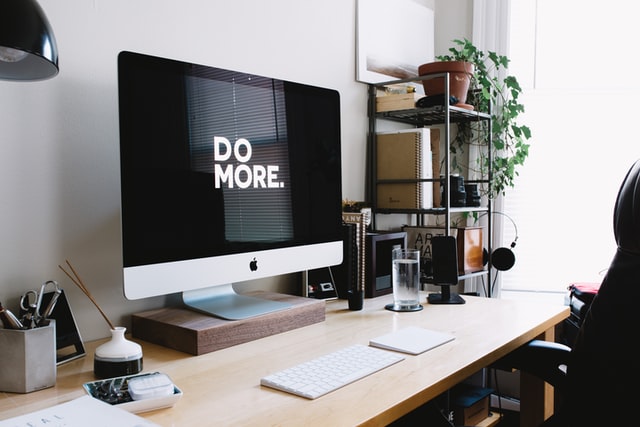
It’s simply finding the best/ optimal colour contrast, for text, for you.
A unique, individualised coloured background for your laptop/pc/tablet.
We know it doesn’t sound like much – a change in the background colour, and whoop! Up goes your productivity, but colours and sound waves have an impact on our brain, emotions and psychology.
Why else do designers agonise over the colour of branding? Because colour impacts us on many levels.
Having the correct coloured background for you, quietly working away while you pound the keyboard or surf the net, impacts you in ways we are only just starting to understand.
We are humans living in the 21st Century, yet our bodies are still designed to be hunter-gatherers out on the tundra. Our eyes are made for scanning the horizon, often. They are for looking at our hands as they make flint tools – basket weaving, catching fish – whatever it was that stone age people did. That’s where our eyes are still languishing.
Shoving them in front of a screen for hours at a time, day after day was not in the design brief. Staring at a screen means looking at and importantly focusing and refocusing, repeatedly – at sharp colour contrast, black text on white background, garish neon, flashing images, vertical and horizontal stripes.
Nothing like scanning the horizon of the tundra.
Did you know that text is created from a string of stripes?
M N H I W – as an example.
Sir Ken Robinson beautifully explains it in this video. It’s a TED talk, so not long and well worth a watch.
Our eyes are magnificently rising to the challenge when it comes to screen use, but it’s exhausting for them as they constantly have to refocus. You look at the screen and all that’s on there, then back down to the keyboard, then back to the screen – for hours – or you’re scrolling. Just think how hard that is on your eyes? This is why many of us now know the intimate symptoms of screen fatigue, computer vision syndrome, or computer eye strain.
We know what screen fatigue feels like – the burning, dry eyes, the headaches, the blurred vision…
Here’s a quick 4-minute video that explains more about screen fatigue and how it affects your eyes and eyesight.
So, what does the correct coloured background do?
It calms the eyes and the excitation that all the sharp contrast cause in your brain. It’s the excitation and the constant refocusing that tires us out.
There’s a reason they named the tiredness and aching you feel after being on a screen all day screen fatigue – It’s because of the effect the screen has on you!
We wrote another post about why your screen should come with a safety warning – check it out if health and safety and looking after yourself is important to you.
You can also read more about the science in our White Paper.
Essentially having the correct coloured background calms the brain and makes it easier for the eyes to focus and refocus while you are working on screen.
If you really want to have a higher chance of that productivity hack working, then try the Display Screen Optimiser.
Why this one? Because of several things:
- It provides more than a generic choice of 10-12 colours.
- It’s objective – it doesn’t care if you hate/love orange – what it cares about is making it much easier on your eyes to read and work online – and if that means orange is your colour – then orange is your colour.
- It’s a simple theme that can be downloaded and easily uninstalled if you don’t get on with it.
- There is customer service and tech support – (you don’t get that with a chrome extension!)
If your eyes don’t get as tired, it means you don’t get as tired, which means you make better decisions, think clearer, and are more productive as a result.
Fatigue is slowly killing us – but thankfully we are waking up to this fact. You don’t have to make your eyes tired; you can mitigate this.
Dare we say this could even be part of your business strategy? By having the individualised colour across all your devices, for all of your staff, (if you have staff) you can continue moving forwards, safe in the knowledge that not only are you reducing the risks of screen fatigue – you’re also increasing your productivity.

