minus font size Text reset font size Size plus font size


Background
 
 
HIDE BARS

Do screens really damage your eyes?

The short answer is yes.

But there are reasons behind this, and it doesn’t have to be yes if you understand how they damage your eyes, and what you can do to avoid that damage.


But first, let’s talk about blue light because it’s very relevant here.

Digital screens emit blue light.  According to UPMC, a medical health care agency in the USA, Digital devices release blue light, which can reach the inner lining of the back of your eye (retina). Studies show that blue light can damage light-sensitive cells in the retina. This can lead to early age-related macular degeneration, which can lead to loss of eyesight.”

Let’s unpack this.

White light/daylight is made up of all the colours of the rainbow, and this includes blue light. According to studies, blue light has shorter wavelengths than the other colours, and as a result more energy.  This means the blue light has a higher frequency, so it travels faster and is, according to Science Direct – absorbed better.

How this then translates to your eyes is that it hits the retina faster and quicker than the other colours, is absorbed better, and as a result, it may prematurely age the eyes –   which is macular degeneration. The symptoms of this are tired, dry eyes, which can be a precursor to eye damage.

But we then need to look at blue light in relationship to children.

Because children are not outside playing in the daylight as much as is optimal, they are actually lacking blue light, and as such, some screen time may be beneficial, but plenty more research needs to be done in this area.

What we do know is that whether an adult or a child, blue light can disrupt the circadian rhythm, and if used late at night – under the covers in bed, digitals screens can and do disrupt sleep patterns.

This leads us to ask – is blue light really the culprit here in screen fatigue and eye damage, or is it the close-up, prolonged viewing of sub-optimally calibrated, back-lit, bright white background to the text, causing eye-muscle fatigue, plus an inability to sustain convergence and accommodation ( focusing)  for prolonged periods of time?


Whichever is the case, eyes are not meant for prolonged hours and days looking at a screen.


Eyes are designed to scan the horizon and look at the work that you are doing with your hands, about 20 cm away from your face, plus have the full coloured spectrum of light evenly distributed, not one colour laser-focused.

Here’s another little-known fact, our brains and eyes are not even designed for reading!

“We’ve only been doing it as a species for 6000 years,” says Snow. “Our brains have not evolved to read. It’s a biologically unnatural thing to do.”


What does this mean for our eyes?

When you are looking at a screen your eyes are working very hard to do something they have not evolved to do, and they are fighting against unnatural light – be that the blue light or the generic out of the box bright white light.

Our eyes don’t blink as much as they should when looking at a screen. (We should be blinking every 15-20 per minute, but this is cut in half when looking at a screen.)  This means your eyes are not being hydrated, which increases dry eyes.

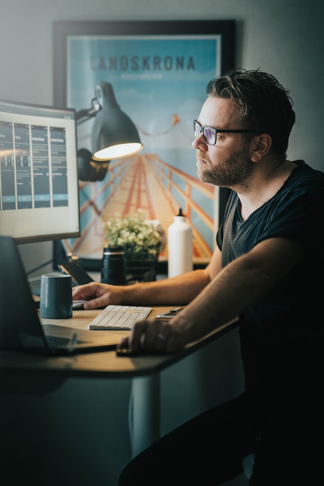
Then add flashing colours, moving images, strange colour contrasts, all fairly close up if on your phone/tablet/laptop, moving slightly further away if looking at a pc or TV.

This close-up smorgasbord of everything eyes are not meant to do or deal with, overworks them. They constantly need to refocus, zoom in and out, and like any muscle, work it too hard and it gets tired. Together this causes screen fatigue, which long term can damage your eyesight.

Here’s an analogy:

Think of Arnold Schwarzenegger in his heyday – 1974

Body Building
Arnold Schwarzenegger

Bodybuilders do ‘set reps’ – a set number of exercises, then they rest.  professional body builders work out from 1 to 4 hours a day, targeting different muscles.  1-4 hours, that’s it!  They don’t spend 8-10 hours a day training one set of muscles.

They don’t work the same set of muscles day in day out.

Now consider that the average person is looking at a screen for 13 hours a day, and you realise our eyes work out more than Arnie ever did!

The only times we allow our eyes to rest is when we sleep.

What happens if you overwork muscles?

They become damaged.

Our eyes need to rest. They need time away from the screen.

Research is showing that screen fatigue – the cluster of symptoms from looking too long at a screen are not temporary.

The damage can become permanent.

How many of you are noticing a rapid deterioration with your eyesight, the longer you work with a screen?

But we often don’t know about something until we start to experience symptoms.

If you are experiencing any of the following – tired eyes, dry eyes, blurred or double vision, headaches and or neck ache after looking at a screen, you need to take action.

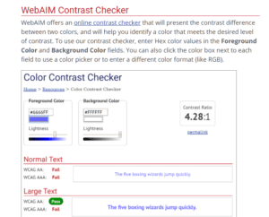
We have a list of things you can do straight away to help mitigate the risks of screen fatigue, so do have a read, plus we have our colour contrast validation tool that can really help – sign up for it here. It only takes 15 minutes, and we are pretty confident you’ll notice an improvement.

Screens can damage your eyesight, but they don’t have to if you educate yourself and do things to mitigate the damage.


Optimised Colours

Different coloured backgounds for the same texts

We are often amazed that people can even read some of these texts!

Find your optimal colour with the Display Screen Optimiser

Colour Contrast

Colour Contrast 101 – why is it important for eye health?

When we refer to colour contrast, we mean the tone, brightness and amount of text, images and background on a webpage or website.

Essentially, it’s looking at how easy is it to read regarding the colours, the fonts, and the background colours and images.

These all impact our vision, and ultimately the health of our eyes.

The regulation that colour contrast falls under is WCAG 2.1, which is why you will see it mentioned plenty of times throughout this site.  It’s an important proponent of website accessibility and on-screen eye care.

A quick look at this website and you will see numerous technical definitions used for colour contrast when creating webpages. There are plenty of numbers, codes and geek speak but also some excellent examples of poor colour contrast that make reading the text much harder.

Colour Contrast
Colour contrast checker

poor colour contrast

Above is an image we have put together to illustrate poor colour contrast and poor use of text. The word ‘action’ is in outline, and in that blue colour on that pink background, it’s hard to read and many of us will need to look away.

WCAG 2.1

The WCAG 2.1 regulations tackle contrast ratio, especially the luminance or brightness between colours.

1.1 is white on white which means you can’t read it. But a ratio of 21.1 is black on white, and you certainly can read that – though you might be surprised that that can be damaging long term to the eyes.

4.5: 1 is the minimum colour contrast suggested in the latest regulations.

Font and outline also play a role as we showed in the example above, and this excellent video below, put together by the University of Southampton explains colour contrast and accessibility very well.

Is it a lifestyle thing?

Colour contrast if done well, will mitigate (reduce) the harm done to our eyes,  a harm that is being done by stealth, and very much down to the way we live our lives.

We now spend on average 4866 hours a year using either a phone, tablet, tv or pc.

Divide that 365 and it’s around 13 hours a day.

But were you also aware that 1 in 12 men and 1 in 20 women have some degree of colour vision deficiency?

This means before they open their laptop/phone they are at a disadvantage when it comes to the digital world.

Plus, 6.3 million people in the UK suffer from dyslexia, with 1 in 6 people with a reading age of 11.

That’s a lot of people struggling to read.

difficulty reading
difficulty reading

What do these stats, (which are real people with real lives) have to do with colour contrast?

Get the colour contrast right, and it mitigates the above issues, plus soothes irritated and tired eyes.

Colour contrast can help reduce the distortions of the printed word and can increase reading ease and speed, plus, as already mentioned it mitigates the harm done by looking at a screen all day, where the eyes are dealing with sharp colour contrasts, vertical and horizontal lines, flashing images and screen glare.

When did they discover colour contrast was a thing?

Colour ‘therapy’ for reading goes back to the late 1950s, but it was in the 1980s that Meares & Irlen, two Australian graduates discovered coloured overlays improved reading fluency.

“Scotopic theories” (meaning vision in low light setting) and coloured overlays were then picked up by a businessman called Peter Irons who unsuccessfully put forward his own theories called TintaVision, but thankfully this was then followed by Professor Arnold Wilkins from Sussex Uni, who in 2014 developed the more successful “Colorimeter”. His Colorimeter helped readers to subjectively find the right coloured tinted glasses.

tinted glasses
tinted glasses to aid reading

Meanwhile, back in 2004, we had the first iteration of ScreenRisk’s colour contrast validation tool, the only objective Display Screen Optimiser. This was then improved upon and patented in the UK & US in 2016, as a novel, therapeutic treatment for eye-strain, myopic and asthenopic disease.

Asthenopia, (also known as eye strain) can be and is being induced by over-exposure to the near or close-up, (think phone in front of your face, working too many hours on screen), and/or exacerbated, ( made worse)  by the standard poorly calibrated out of the box, display screen settings, i.e. back-lit bright white background or contrast to text display screens that haven’t been altered since the factory settings.

Why highlight the words subject and objective?

The objectivity of testing is vital. Colour contrast therapy works when it’s individualised. Objectivity means you don’t choose a colour you like – it means the software chooses a colour that works for you. One that will soothe your eyes, that will aid in reading and working on a screen.

You might not like the colour orange, but what if an orange tone is an optimal colour for you?

One of our beta testers had this to say about the optimal coloured background for him:

“ I have found dark purple to work best for me. But really the darker the screen and environment, the better.”

How does colour contrast therapy work?

Scientists are still looking into how coloured backgrounds and tints can help with reading,  and there is still plenty of debate around it, but what they are finding is that it reduces the excitation to the brain.

The following excerpt is taken from our White Paper:

“Professor Wilkins gives the example of the word MUM, made up of vertical stripes. This sensory input can cause overexcitement in the visual cortex, causing cognitive and related visual discomfort which is measured by an increase in oxygen use. The body’s natural response is to turn away from this discomfort. High oxygen use is a sign of high energy expenditure, which can then lead to fatigue. However, when you are learning to read, or having to read, to turn away is nowadays seen as an inability to focus and concentrate, it is not seen as a natural physiological response. Coloured overlays dissipate excessive excitation and lower visual stress. This calms down the central nervous system, and increases ease of access to the text, and thereby reading speed, which is transformed from halting to fluent.

ScreenRisk is all about mitigating the risk to our eyes – but the secret to it is to individualise the coloured background because we are all as unique as our faces.

If you look at the market today, there are apps to change the background colour of your screen, and they do a fine job, initially.

Google Chrome has an app called Screen Shader, made by Marc Guiselin.  You might want to give this a try and see what you think.

But none of us are the same, our DNA shows us that, and what works for one person, might not for another – which may explain why colour contrast apps don’t work if not all of the colours are available.

Remember our guy above who needed the dark purple?

Many apps have a limited choice of 12 colours.

Just think how many colours and hues are missing from that?

A few questions to ask yourself…

Questions to ask yourself when surfing or working online regarding colour contrast.

    • Can you read the text?
    • Is the text over a picture and so obscured?
    • Is the colour too pale, too strong?
    • Does it make you screw up your eyes in order to focus?

Our colour contrast validation tool is specifically designed as a therapeutic intervention for early-onset eye-strain. It was initially created for the visually impaired, Neurodiverse and Dyslexics, but we are finding more and more are signing up for it due to our modern lifestyle of living life through our screens.

If you come away at the end of the day suffering from screen fatigue,   a colour contrast validation challenge might not be a waste of your time, and it might just save your eyesight.

You can sign up for it here, it will only take you about 15-20 minutes.

Do you know someone like Giselle?

Image for Giselle

She spent her early years in special schools simply because she wasn’t enabled to read.

She was labelled with so many acronyms it made your head spin.

Special Educational Needs, Learning Disability,  and Dyslexic. (ADHD, SEN, SpLD and more…).

Effectively excluded from learning yet her dream was to run her own business.

She started saving her pocket money, then her wages until she bought a business and within five years had paid off the mortgage and owned the building outright, plus the stock.

Giselle didn’t let her eyesight stop her, but think how much easier it would have been had she not seen text like a dollop of alphabet spaghetti?

One day she met Nigel who noticed her unstable binocular vision. He said, “I might be able to do something about that if you are up for it?”, and she said yes.

Giselle tried his Binocular Eye-Trace Kit and, sure enough after a few seconds her eyes were struggling to sustain “convergence and accommodation”, (making sense of the words) on-screen.

Her eyes were back-tracking and re-reading to make sense of the sample passage yet, when the screen background or “Colour Contrast” was customised for her, her reading rate went from 145 words per minute to a fluent 280 words per minute.

Needless to say, this was very emotional for her.

30% of children in the 21st Century are now at risk of eye-strain. You might be, if you notice at the end of the day your eyes are tired from staring at a screen.

If all children are to become functionally literate and fully participate in text-based life-long learning in the digital age, one that’s increasingly dependent on e-learning both during COVID-19 and post COVID-19, they need to have the right tools!

Colour contrast validation is one of those tools.

Find out more our Display Screen Optimiser and the charity work we do to help others that are dismissed as acronyms, where in reality, they simply needed better tools to help them read…

Getting Kids Reading

Remove the main fear, disadvantage, anxiety, barrier, handicap, disability to reading for leisure, pleasure and, worst of all, school/work on-screen or otherwise…

…Go to original article

Screenshot of ww2.kqed.org

Simple’ssss

Remove the main fear, disadvantage, anxiety, barrier, handicap, disability to reading for leisure, pleasure and, worst of all, school/work on-screen or otherwise……
If text is easily and fluently accessible, then anyone is happy to read ? Continue reading “Getting Kids Reading”

The Hourglass

Silly me, of course, it has to be this way around when peddling austerity as, for sure, they will want to make money out of running a nudge campaign when few employers are going to actively volunteer for a fundamental change of mind-set or ethos in their management or governance.

…Go to original article

Still as relevant as ever?

Silly me, of course, it has to be this way around when peddling austerity as, for sure, they will want to make money out of running a nudge campaign when few employers are going to actively volunteer for a fundamental change of mind-set or ethos in their management or governance.

…Go to original article

Maintaining the status quo regardless of accepting the under the line costs of poor performance, productivity, presenteeism and Occupational Health preferable to “change”. The old “hair-shirt” principle of ‘it doesn’t matter how uncomfortable it’s familiar’ and same old, same ole mediocrity.

I knew the Hour-Glass Economy was going to see a downward spiral in everyone’s quality of life though deskilling the masses but, didn’t imagine the route to change would take this path although, hitting them in their pockets maybe the only way shift entrenched management what what ?

Is eyesight affected by computers?

Quora Answer to: Does eyesight get affected through the PC? My mother says it was not inherited from her…

…Go to original article

Screenshot of www.quora.com

Quora Answer to: Does eyesight get affected through the PC? My mother says it was not inherited from her as she only got bad eyesight from after my birth. Is computer usage one of the problems?

…Go to original article

Binocular Vision

How do you know if you are “stereoblind”, someone without perception of depth?

Often there are tell-tale signs from lazy-eye to eye-turns, blurred or double vision for those experiencing eye-strain leading to stress related loss of 3D vision…

…Go to original article

Screenshot of www.quora.com


How do you know if you are “stereoblind”, someone without perception of depth?

Often there are tell-tale signs from lazy-eye to eye-turns, blurred or double vision for those experiencing eye-strain leading to stress related loss of 3D vision…

…Go to original article

DSE Regulations

Are they “Fit for purpose?”


Real Children

I speak about a race of real children, not too wise or too good, but bounded up and down by love and hate, oh may their early joys be nature and knowledge, rightly honoured by that name, not purchased with loss of power.

Wordsworth – Prelude V.410-425

Oh may their early joys be nature and knowledge. Knowledge, rightly honoured by that name, not purchased with the loss of power. Don’t just sit there, DO SOMETHING ABOUT IT!

IT Checks for Schools

Keeping your network, school data, teachers and learners safe is a complex task, fraught with dangers. A specialist IT partner is ideally placed to keep abreast of the latest security risks and will ensure that your infrastructure, data security and pupil access to appropriate materials are kept up to date and as secure as possible. If you have a skills gap in your IT team, an IT partner can provide this resource for you much more efficiently with a blend of on-site and remote support services.
Partnering with an IT support provider ensures your IT costs are predictable, and your technology is cost-effective and future-proofed. It also helps stop those expensive IT investment mistakes that must be avoided as we try to cope with ever-increasing budget pressures.
A complimentary IT health check is available to schools at www.rm.com/changingIT

Dyslexia Tests

QSDyslexiatest Website Image

QuickScan Dyslexia Questionnaire and QuickScreen Dyslexia Test

QuickScan and QuickScreen – Two OnLine dyslexia tools.

QuickScan is an online questionnaire that provides an insight into learning modalities and other aspects of study skills as well as dyslexia.

QuickScreen is a more in-depth diagnostic-style test that looks at ability and performance in a range of literacy skills.

QS Dyslexia Tests (QS) provide two online products for dyslexia screening for young people and adults and will flag up indicators for dyslexia.

The dyslexia screening tools are ideal for both:

  • individuals at home –  and
  • organisations – for their recruits, staff or students with a management portal, detailed reporting and annual licenses

Whether you are a personal user, educational establishment or workplace organisation, you have the option to use one or both of these screening tools depending on your requirements and results.

Please note there are costs associated with both tests.

But if you are signed in as a Display Screen Optimiser subscriber you can have a free go on QuickScan on the Tools Page

Why are we mentioning another company and website on our site? Because coloured overlays, in our case background colours for your digital display screen, help with dyslexia too.

In fact, this is how they were brought mainstream.

From working with people with dyslexia, we now know that coloured backgrounds also help mitigate the risks of screen fatigue.

For more information about QuickScan and QuickScreen, hop over to their website.

For more information about coloured overlays, and how colours can help you to improve your reading speed, improve your productivity and mitigate the harms of screen fatigue:

We suggest further reading from our blog – Colour Contrast 101 why is it important for eye health and then this excerpt from our white paper – Colour optimisation and visual stress